When considering what you want to include in your logo and the budget it’s a great idea to look at successful logo designs already out there. You may also find it interesting to take a look at some of the most expensive logos ever created. Granted, we are not saying you have to spend this much to create a great logo, but it’s interesting to see just what some of the big brands spent to get their corporate identity captured in a logo.
10 Big Budget Logo Designs from the Big Brands
To help with the process of coming up with a great logo design, let’s take a look at some the best and most expensive logos already out there in the world today.
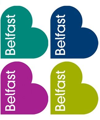
1. City of Belfast – Belfast, Ireland thought their logo was important enough to spend $280,000 on! And the interesting thing is that it doesn’t have beautiful green clovers or leprechauns dancing around the way you might think an Irish logo would. Instead, it is just a big black heart with the word “Belfast” in white. Hmmm. Some say the black heart represented their violent past that they had moved beyond, and the heart was a symbol of love.
2. City of Melbourne – Melbourne, Australia was willing to spend $625,000 on their logo! It featured an attractively-designed “M” that was intended to illustrate a sense of corporate power.

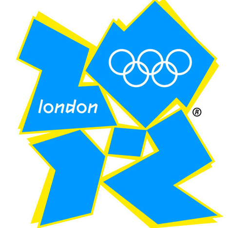
3. 2012 London Olympics -The Olympics is always a big deal. And to make sure it stayed that way, the Olympic committee of London spent $625,000 on it. Its basic hot pink and yellow color choices, though, give one pause.
4. Pepsi logo – Pepsi has a big budget to spend on a logo. But they paid $1 million just to change the stripes of their red, white, and blue circle to a slightly different angle on a dark blue background. Oh well. Whatever works! Pepsi did this in an attempt to improve upon their logo and partly to compete for the famous Coca-Cola logo which is a household name on practically every continent of the world.

5. BBC (British Broadcasting Corporation) – The BBC held the longest record for keeping their logo, but they finally changed it in 1997, choosing a deep metallic purple background with block letters in white. The logo has served the company well and promoted its world presence nicely. It better have. The cost was $1.8 million!
6. Anz – The Australian and New Zealand banking group pulled out all the stops to create a new logo that featured the “ANZ” in a blue font that appeared to be moving. They also added a graphic at the end. The price tag? $15 million.

7. Posten Norge – There are postal logos, then there are postal logos! Norway felt that the time had come to lose the crown and horn in search of a more basic modern theme. And it cost them $55,000,000! I wonder if the postal carriers had any funds left for uniforms after that.

8. Accenture – Accenture had to change their logo because they parted ways with the Anderson Consulting Group which they had been a part of for so long. They are a well-known outsourcing and management group. But the logo they ended up with was just a simple lower case “Accenture” with an accent mark on top. It drew criticism from many who said they thought the meaning was lost in its simplicity. And for this simple logo, they paid a whopping $100,000,000!

9. BP (British Petroleum) – In 2000, BP changed their logo to represent a more “earth-friendly” look with green and yellow color combinations. However, in 2010, this backfired on them when the company claimed responsibility for one of the worst oil spills in the history of the planet in the Gulf of Mexico. This is a clear example of how your logo should represent what your company stands for, and you better be able to back it up. As a result of the spill, there has been a myriad of “mock logo designs” emulating BP’s earth-friendly logo that then turns into a black pit of oil on the water. BP tried to “come clean” and increase its public service ads since that time. Perhaps they will have another logo soon. Oh, and by the way, for their logo disaster, they put down a cool $211,000,000!
10. Symantec -Symantec, the world-famous network securities company, used to be known as “VeriSign,” until they invested a total of $1,280,000,000 for their new Symantec logo. (Source)

Notable Logo Designs for Consideration
As you can see, some of the world’s biggest brands believe their logo was so important that they were willing to spend a fortune on its redesign. This shows the importance big names place on their logo and what an integral part it is of their overall branding.
It’s interesting to note, however, that some of the other huge brands, including one of the wealthiest companies in the world, spent a mere fraction of that. Look at a few of these examples:

Google – They have pretty much kept their logo the same through the years, and they just had their in-house designers do the changes. One of the original developers was one of the original co-founders of the company.
Nike – This sportswear giant only spent $35 on the Nike “swoosh” (the checkmark underneath the Nike sign) but look how well it’s served them, compared to BP’s “green-friendly” disaster!
Twitter – You won’t believe this but it’s true! Twitter outsourced their new “birdie” to be done by a freelance designer who was only paid around $6 for the design. But that little birdie helped make the Twitter logo come alive by appearing to illustrate movement, which is a part of Twitter’s branding: mobility.
Microsoft – Microsoft, with all of its funding and reserve, spent nothing on their redesign, again just relying on their in-house staff to redesign it.
The Making of a Legend
Finally, we saved the best for last. We wanted to take a look at perhaps the most successful log of all times: Coca-Cola to see what they spent on their logo. After all, it is a household name.
The original creator of the Coca-Cola logo was Frank M. Robinson, a business partner of the company’s founder in 1886. The interesting thing is that Coca-Cola has barely changed their logo over the years. The changes that did take place have been minor and some variations in some of their peripheral product lines such as Coca-Cola souvenirs and collectibles.
The nicely-written script font and the simplicity but the beauty of white over red has served Coca-Cola well over the years. So, the point of this is, when you find a great logo, stick to it. But building a legend takes time. Make subtle but significant changes to your logo as the need arises, and as the climate around you changes.
Be aware of the trends of the market, the choices people make, and what they purchase. But stay true to your brand.
Creating a Great Logo Design for Your Brand
By choosing a logo that actually reflects the inner philosophy, ideals, and goals of your company, you will put your brand out there in a way that will gain respect and to help you create your legend over time.
For advice and help in getting your logo in the best shape possible, it’s best to trust an expert. It’s a decision that shouldn’t be made half-heartedly or given to a $6 freelancer (though it worked for Twitter). On the other hand, there’s no need to spend millions of dollars for a logo that might not even work! (Think BP!)
So to get started, contact our professional logo designers at LogoDesignTeam. By working alongside our team of professionals, we will make sure you end up with a stunning logo that truly reflects your brand in ways that will help you on the road to success. You can see one of our best logo design deals below.
Remember, your brand is the first face of your business. It’s the visual image people have in their minds of your company and what it stands for.
Make it good.
Will Shakespeare said it first, but it bears repeating:
“What’s in a name?”
Answer: Everything!
Touch cord with people that makes them love your brand. Because a face is hard to forget.
Contact LogoDesignTeam today!

