A logo is a representation of your brand. That is why it is necessary that the logo gives off the same vibes that you want people to receive when you describe the organization that the logo represents. Thus, the logo design should be treated with utmost importance. Logo designs and branding have always had the potential to stir up strong criticisms, both amongst the general public and in the design community itself. Let’s have a look at 11 examples of bad logo design which have created downright hilarious unintentional results:
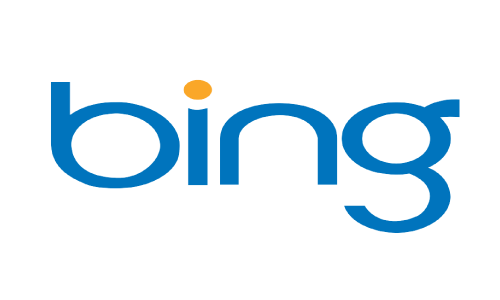
1. Microsoft Bing
Microsoft has always been known for its bad logo design. It is no surprise that Microsoft Bing was given the honor of creating the “worst-designed logo of 2009”. The problem was that the peculiar shapes resulting from the arduous horizontal scaling were too unattractive and unflattering.
2. Verizon
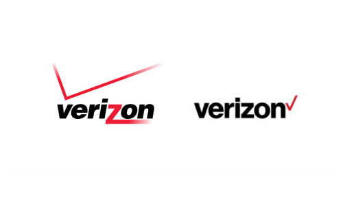
Verizon is a top-notch telecommunications company with a terrible logo design. In their previous logo design, there was a big red V that looked out of place. The “check” looked more like a signal being dispersed. In the new logo, the “check” looks like the logo is designed for an election company or a school supply company.
3. MSN
In MSN’s new logo, the body of the butterfly was removed and wings were rounded off to roughly stretched ellipses. Ever since the new logo was launched under Windows Live, the MSN brand has lost some of its ‘mojo’.
This is a great example of a bad logo design – taking crucial things away will lead to bad results, if not executed properly.

4. London Olympics 2012
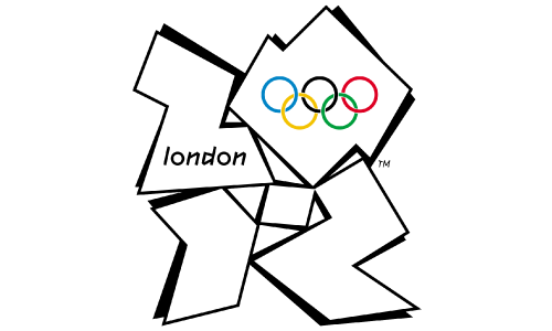
The logo of London Olympics 2012 was too dissonant and didn’t reflect any of London’s famous landmarks. Some people said that there was a passing resemblance to a distorted Swastika. Mostly, the logo looked too garish with its clumsy typography and queer shapes. The logo was so bad that its designers were embarrassed when the logo was unveiled!
5. Pepsi
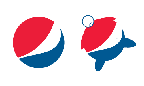
Every time you see the Pepsi logo, you can use it as an inspiration to ‘NOT drink’ the high-fructose syrup anymore. The fat man is one of the most popular logo memes of all time. You just need to add arms, a head and legs to the logo, and it begins to seem like a fat man with his belly protruding from his shirt.
So, you can never accuse this beverages giant of giving false information to the public. The logo itself communicates the harmful effects of drinking their beverage!
6. Gap
The new logo of famous clothing store GAP has left its fans aghast. While the previous white-on-blue logo was widely accepted, the new black-letters-next-to-a-little-blue-box design has left branding experts discombobulated and befuddled. The crux of the problem was that Gap just hurriedly stuck the logo on their website without even telling anyone or coming out with an explanation as to why they were rebranding.
7. KFC
The company name “Kentucky Fried Chicken” was changed to “KFC” in the early 1990s in order to retreat from the fatty connotation of the word “fried”. The KFC logo primarily refers to the founder of KFC – Colonel Sanders.
Over the years, the KFC logo has undergone several overhauls, but it has still maintained a consistent visual identity, preserving the striking features of the Colonel’s face and accommodating various visual shifts of the fast food industry.
The first logo featuring Colonel’s visage was designed in 1952. In 1978, a new logo was launched with a minor change of typeface. In 1991, the company came out with a new logo featuring the abbreviation “KFC” as a measure to promote the brand as a healthier eating choice. This logo was later overhauled again in 1997.
In April 2007, KFC unveiled a new logo which featured the Colonel wearing a red cook’s apron instead of his white suit jacket. This new KFC logo had a friendlier and distinctive visage of the founder, and at the same time, it retained his definitive black bow tie, glasses and goatee.
Although Colonel Harland Sanders died in 1980, he still continues to be an important part of this restaurant’s branding and advertising strategy. Even though KFC has changed its logo four times in the past forty years, with each re-design it becomes more and more about Colonel Sanders.
So, although the new logo is fresh, it’s still all about the Colonel. There is no distinctive out-of-the-box thinking.
8. Starbucks
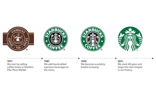
Starbucks, founded in 1971 as a local coffee bean retailer, is a global coffee giant which is headquartered in Seattle. The company has now massively grown in scale to become the world’s biggest coffeehouse chain, comprising of a large number of stores in 62 countries.
Before 1987, the logo of Starbucks featured a true “Starbucks siren” spreading her two fins.
Prior to 1992, Starbucks cropped the siren’s bottom half, and you could see that she was holding her two fin-legs so they spread apart.
In 2011, the Starbucks logo was redesigned to celebrate the 40th anniversary of the company. This streamlined logo design had an enlarged image of the siren in green color. This design was not well received by Starbucks admirers and fans and faced harsh criticism from design experts.
9. Airbnb
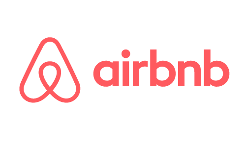
Vacation rental service Airbnb recently launched a new logo that generated a huge wave of criticism for its bad logo design. Some critics compared it to female anatomy and some likened it to a triangular paperclip. Branding and advertising experts aren’t pleased with the design either.
10. Hillary Clinton
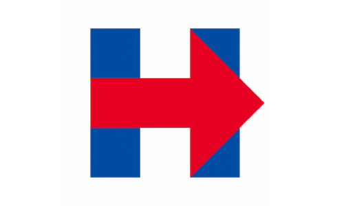
When Hillary Clinton revealed her new campaign logo in 2015, people criticized its design. Some people said that it looked like a hospital sign. Many people said that its big red arrow symbolized a shift to the right. Many people rejected the simple design because it looked amateurish.
11. University of California
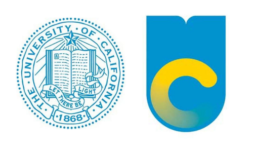
University of California’s very own ‘Gap’ moment came in 2012 when it modernized its logo. The new logo was dubbed a ‘toilet bowl’ and panned by everyone. Although it was designed for communication material and the university never intended to replace the official seal – the damage was done, and in a short span of time, it was withdrawn from use.
Bad Logo Design
If a significant brand’s logo design goes wrong, it generates a lot of “buzz” and trends for all the wrong reasons. Usually, just a trick of the eye transforms the logo into something completely unintended and different. Many a time there are unfortunate associations which can have a detrimental impact on the branding. This makes it all the more important to choose a logo designer wisely.
Despite the countless branding blunders we’ve discussed, remember that creating a perfect logo is still entirely possible with the right resources and approach. Whether you’re a small business owner on a tight budget or a seasoned entrepreneur looking to rebrand, you can make the process less daunting with a logo maker. These tools are designed to simplify the logo creation process, allowing you to design a logo that truly represents your brand without any prior design knowledge. In fact, to make the process even more accessible, you can use this logo maker coupon code to enjoy significant savings on your next logo design. Avoid falling into the branding mishap pit by investing in a tool that empowers you to shape your brand’s visual identity effectively and professionally.
Logo Design Team has been trusted by brands across the world over the years to take them places. We have a professional and creative team of 120+ logo design experts who have created more than 1 million logos for brands, both big and small, across multiple industries. Our logo design experts ensure that you are 100% satisfied with the results, or else you get a complete refund!

