Have you ever noticed that symbolism abounds in logo designs? In today’s age, when humans have incredibly short attention spans, it is essential that your logo stands out. Symbolism is a simple and effective way to achieve this. Here are some ingenious logos that employ dual symbolism to convey their brand message.
Symbolism is instrumental in helping brands sum up their core values and mission by using just a few images and words. This results in the birth of modern logo design ideas that ultimately gets imprinted as beautiful brand logos in the minds of the customers if designed well.
These hidden images either convey the nature of an enterprise or are a smart representation of its name. The hidden logo meanings may appear obvious in some cases but are usually subtle in most cases.
Here are some of the most well-known companies ingenious logos & logotype design that carry underlying meanings in their designs.
1. FedEx Logo
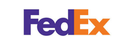
Not many notice it at first glance, but the white space between ‘E’ and ‘X’’ in the FedEx logo makes an arrow, suggesting a business moving forward. It also denotes ‘speed’ (in delivery), which is one of the key features and differentiators of the company. It conveys to customers why to choose FedEx over others for their logistics woes without explicitly having to say so in words.
The logo of the famous shipping company is one of the best-known designs that carry a hidden symbolism. Even people who have been seeing the FedEx logo for years might miss catching the hidden image. The design has received more than 40 awards and has been ranked as one of the best logos in the last several years.
2. Pittsburgh Zoo & PPG Aquarium Logo
At first glance, the logo design of Pittsburgh Zoo & PPG Aquarium seems to contain the image of a tree and the birds connoting a zoo. But, a close look at the white space on both sides of the tree reveals a lion and a gorilla staring at each other, indicating wildlife.
This logo is another example of excellent use of white space to convey what the brand is all about.

3. Amazon Logo
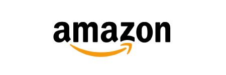
Thousands of people see the Amazon logo every day. However, not everyone notices the subtle meaning it conveys. The arrow from A to Z conveys subtly that the brand offers just about anything and everything from A to Z. Also, the orange arrow hints at a smiling face, conveying a happy customer.
So, the logo perfectly sums up what that the Amazon experience is all about.
4. Baskin Robbins Logo
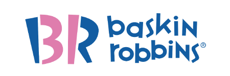
The “B” and “R” in the new Baskin Robbins brand logo, introduced in 2005, are made of two colors – blue and pink. When you focus on just the pink color, you will notice the number “31”, which denotes the number of flavors the brand offers!
So, primarily, the logo showcases the company’s belief that its guests should have the opportunity to relish a new ice cream flavor every single day of the month!
5. The Bronx Zoo Logo
The Bronx Zoo is the largest zoo in North America and the design featuring two giraffes and birds pays homage to the Bronx, the home city of the zoo.
The logo is another clever use of negative space, where you can see New York’s iconic skyline of tall buildings between the legs of the giraffes.

6. Tour de France Logo
The revamped Tour De France logo was launched in 2003 to mark the event’s 100th anniversary. It is written in a brush script, thus giving it a fun and playful feel. The word “Tour” in the logo shows the image of a person cycling. Moreover, the vibrant yellow color symbolizes the yellow jersey that is awarded to the winner at each stage. It’s a simple and excellent representation of the event and is one of the most widely appreciated logo designs.

7. The Spartan Golf Club Logo
Just like all other versatile logos, the Spartan Golf Club logo uses a great dual symbolism. At first glance, the design shows a golfer who has just completed a drive. However, when you look closely, the side profile of a Spartan warrior appears. A deserving inclusion in this list of ingenious logos.

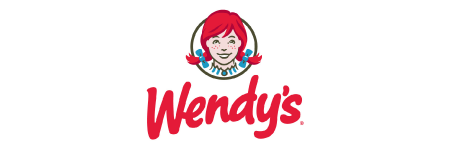
8. Wendy’s Logo
The design highlights a “home-cooked” and personal feeling. If you look at Wendy’s collar, you will see the word “mom” written there. While you may not notice this for years, it subconsciously leaves an imprint on your mind anyway and you will always associate it with the brand.
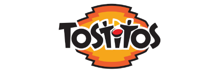
9. Tostitos Logo
Initially, the design seems to just carry the name of the brand in front of a vibrantly colored backdrop. Upon closer examination, however, you would see that the two “T’s” of the Tostitos logo represent two persons dipping their tortilla chip into a salsa bowl on top of the letter “I.” It’s a subtle yet great illustration of the brand.
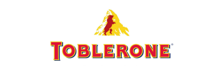
10. Toblerone Logo
The origin of Toblerone lies in Bern in Switzerland. It is a city that is associated with bears. No wonder, if you look at the mountain image in the logo closely, you would see a bear. The image is another smart usage of symbolism in a logo design.
11. Goodwill Industries International Logo
The community-based organization works towards making people’s lives better, and the Goodwill Industries International logo design reflects that perfectly. The “g,” written in lower case, is symbolic of a smiling face and is used twice in the logo to indicate happy people.

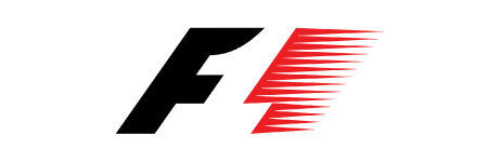
12. Formula One Logo
The logo design of Formula One reflects the core values of sports. The red color stands for energy and passion, while the black color represents determination and power.
If you focus on the negative space between the two colors, you will see the numeric “1”. The F1 sign, along with red racing stripes, makes the logo true representative of the brand.
13. Sony Vaio Logo
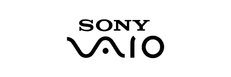
The logo design of the Sony Vaio is an excellent example of a hidden meaning within the company image. The logo combines the ideas of analog and digital technology into one.
The ‘V’ represents an analog wave and the ‘I’ and ‘O’ represent binary from the digital world. It, therefore, is a great representation of what the brand is all about.
14. Unilever Logo
The latest Unilever logo smartly integrates 25 icons, representing different offerings or aspects of the business as well as its commitment to promoting sustainable living, to form a “U.”
While you only tend to notice the “U,” symbolizing Unilever, from a distance, a closer look will reveal various symbols, some of which include:
- The Sun (represents the brand’s origin in Port Sunlight as well as its association with multiple brands from their portfolio such as Slim-Fast, Flora, Omo, whose benefits are communicated through the use of radiance)
- A lock of hair (associated with their shampoo business)
- A spoon (representing food and nutrition)
- Recycling (showing the company’s commitment to sustainable living)
- Clothes (serves clean and fresh laundry)
The logo design, therefore, connotes some of the core values and products in the myriad of icons that make up the U. It is an attractive logo that creates a memorable impression.

15. London Symphony Orchestra Logo
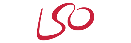
When you first look at the design of the London Symphony Orchestra, you see LSO, the acronym of the brand in a beautiful script font. However, upon close examination, you will see the shape of a conductor, his baton and his other arm; thus making for an apt depiction of an orchestra! The logo is yet another brilliant representation of symbolism.
To get cool logos designs have to be professional
Professionally created logos have a different appeal because they are unique. Also, when you are seeking the service of professional artists, chances are your logo will turn out just as you thought (or even better). There are innumerable benefits of getting your brand logos created by an artist or a team is unparalleled and read all about it in the link given.
If you are looking for a great logo design for your company, The Logo Design Team is the best one-stop-shop for all your design requirements. We have an expert team of designers working with us who have delivered more than 1 million ingenious logos to clients worldwide. We can craft you brilliant logos for your business that will leave a lasting impression in the minds of your customers.

