Your business card says a lot about you. It tells people what you value as a business, which services or products you think are the most valuable, and gives your all-important contact information.
Business cards are like a miniature snapshot of the personality of your business. They need to project the image you wish to communicate in a way that resonates with your target audience.
To help you think about what kind of look you might want, we have highlighted 17 business cards that you need to see to believe. Some are really bad, and others are really good. The rest are somewhere in-between. But they are all examples of what a do-it-yourself approach usually results in. Also keep in mind, each business card is owned by their original creator or the brand mention on the card — they were not created by LogoDesignTeam.
Keep in mind that we are simply stating our opinion of these business cards from a professional standpoint. The business cards may work for these people, but some are examples of what not to do when designing your business card.
Not So Good Business Cards…
1. Eager Accounting Student – This business card by an “eager accounting student” tried to capture the geographic location in which she lived to perhaps add some beauty to her business cards. It is attractive and does manage to capture the beauty of Tampa, Florida. But what does this have to do with Accounting services? This design makes one think that the business owner is very interested in enjoying the beauty of Tampa in luxury from all the money she is going to make in Accounting, but there is no sense of what she can do for customers.

2. John Smith Enterprises – The color is the problem with this design. Well, that and the rainbow effect that ends up looking so cheesy. The vibrant colors detract from the information on the card and we also have absolutely no idea what JSE sells or deals with but it better have to do with paints or color or the card is a moot point.
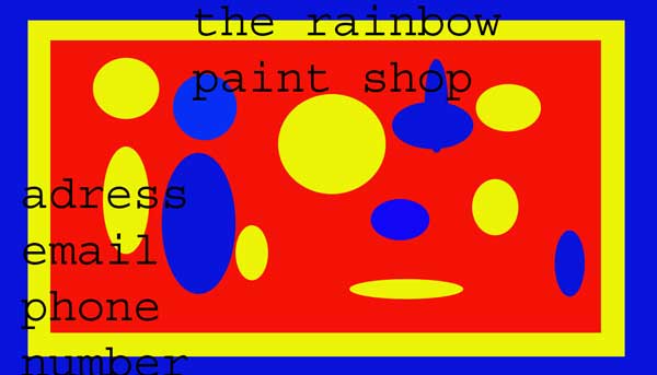
3. The Rainbow Paint Shop – When someone once said, “Keep it simple,” I don’t think they had this in mind. This card is so simple that it’s laughable, and yet that’s not even the main problem. It also features bizarre color patterns that look like a first-grader did it. Perhaps they did. If someone was handed this business card, they would have to believe already in the company, or it would end up in the trash almost as quickly as it was obtained.
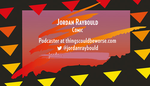
4. Jordan Raybould – Jordan claims to be a comic, but I don’t think his business card should be part of his act. He has marked out his email because it changed, I suppose but has put nothing in its place. Also, the colors and patterns are laughable, at best. Also, his tagline, “Things could be worse,” which is meant to be an ad for his podcast, has an especially dark humor element given the look of his business card.
5. Call Me – We have no idea what the purpose of this card is except that someone wants us to call them. The name is so low on the card that Call Me is likely the name that will be associated with this business more than the owner, John Ferguson. This card seems to have an almost sinister air about it. What are we calling about? Who are you? There is no motivation to call.

6. Playing at Business – This business card asks an interesting question but it’s not a business card. There is no personal information. It is like a preacher who titled his lesson, “Playing at Business or Making Money,” then never showed up to preach the lesson. Who do we contact if we want to make more money? Your guess is as good as mine.

Pretty Good Business Cards
7. Render – This business card has a dynamic design and it’s modern in texture and color. The orange background on the front features a logo the reminds the recipient of what the business does. The back has all of the essential contact information without being overbearing.

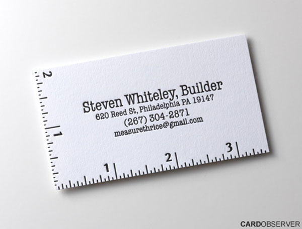
8. Steven Whiteley, Builder – This card is the poster child for simplicity, but it captures the idea perfectly. He’s a builder. If you’re looking for a builder, it might be worth a call. That’s what he says on his cards, and he gives his contact information. Plain and simple. And somehow perfect.
9. Painter – Here’s another example of simplicity that works. It’s a beautiful business card, but it’s simple to the core. The top part of the card appears to have been painted with the business owner’s paint, and the bottom part is reserved for the contact information.

10. Crazy Cat Lady – Genie Alisa is this lady’s name but the business card featured here is more like a collage of all of the things that compose who she is. Very creative in style and artistic, this approach may win over people who are creative at heart or who want to know who you are on a personal level. It doesn’t do a very good job of telling much about her business, however. So you have to hope that the curiosity of the recipient will be enough to get them to call. But we have to say these cards are magnificent and different and may be a real attention getter.

Very Impressive Business Cards
Below you will find a selection of very impressive and unique business cards. If you currently have a brand or business of your own, think about how you can get creative with your design and even make something no one has ever done before. The examples below will give you all the inspiration you need.
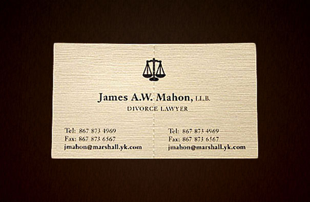
11. James Mahon, Divorce Lawyer – This divorce lawyer takes the term “splitting property” literally and features business cards that divide into two pieces to drive the point home. The idea is to suggest that each spouse could have a copy of his contact information, and they could fight over him too, I suppose.
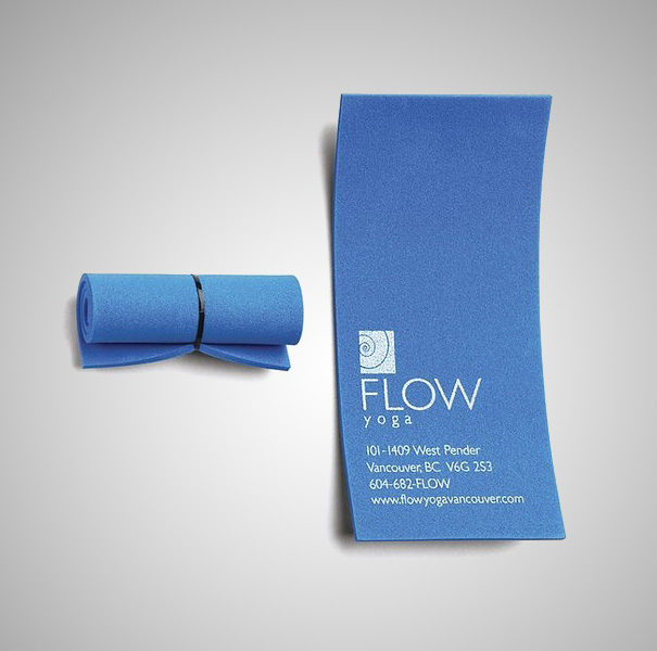
12. Yoga Mat – This Yoga Mat company wants to get the point across so that you don’t forget their industry. They sell yoga mats! The card is interesting, to say the least, and it is rolled up nicely just like a yoga mat, but it’s a bit inconvenient to carry in one’s pocket or wallet and could be easily lost.
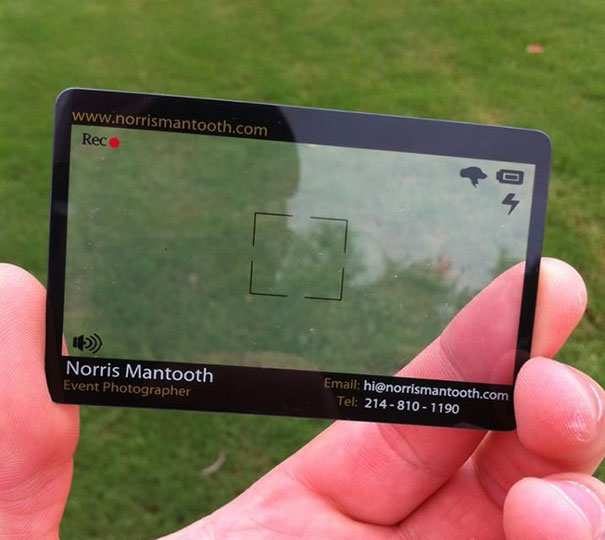
13. Event Photographer – This was one of my very favorites, but it has such limited space to put contact information that I had to include it under “somewhere in-between” in quality. It’s very innovative in the idea, though and features a real-looking viewfinder and recording button to symbolize event recording.
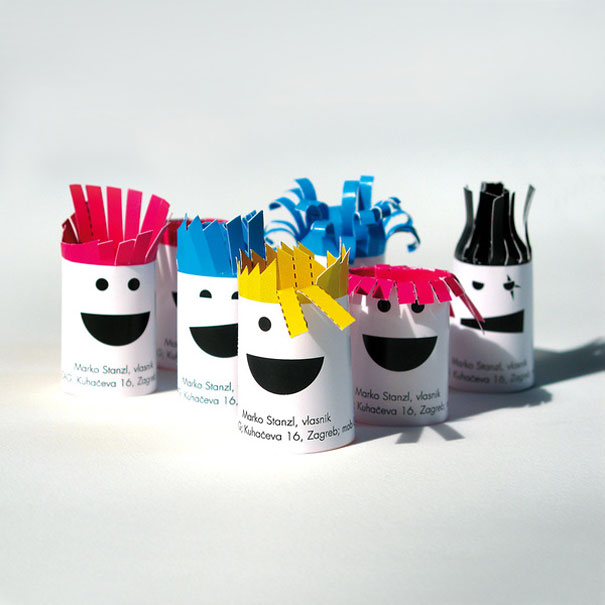
14. Hair Dresser – This hair dresser business card is more like paper dolls or a paper mache activity. You cut out strips to symbolize hair and insert them in the cards to hand out. The only problem with these is that when you give them to people, they don’t know whether to try to bend them and put them in their wallet or use them for a place setting.
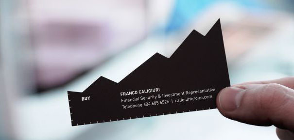
15. Business Investments – Here’s another one that doesn’t quite fit the mold. It’s a cut-out of a stock line graph indicating financial growth. It has two sides: Buy and Sell. Contact information is shown on both.
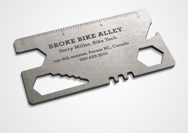
16. Broke Bike Alley – This card is made to resemble metal and features the owner’s information on the front. Nicely embossed on a metal-look surface, it looks like a tool that is used to fix bikes, which is appropriate.
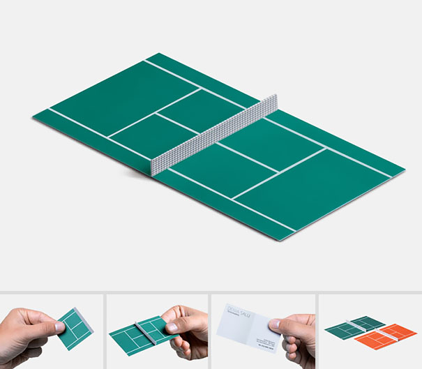
17. Tennis Anyone? – This one gets our award for innovation because you could play table tennis on it with a small paddle! It’s cute to the extreme but practical, probably not.
Need a Creative a Business Card Design of Your Own?
Business cards should be innovative and should truly reflect the spirit and the goals of your unique business. However, they should be careful not to cross the line of “extreme” so that they are no longer practical.
Like your business, your business cards should be easily kept in someone’s wallet or purse for later retrieval while maintaining the elegance and unique personality of your business.
LogoDesignTeam.com can help you brainstorm and create the perfect business card for your business needs. A great business card can get you leads and customers and turn your bottom line upwards.
But don’t take it on yourself.
Let us help you make a great first impression! Because your company needs it. And we are there to make it happen. Contact LogoDesignTeam here!

