Your logo is the face of your business. Crafting a design that creates an impact and delivers the right message is a creative process that requires both artistic flair and technical knowledge. A great logo design creates a professional image of a company, makes it stand out and piques the interest of the target audience.
But mastering the art to produce a genuinely compelling and attention-grabbing logos sometimes might seem little critical for designers. Excellent logo design is essentially is a combination of design skill and knowledge of updated artistic theory. Any designer who wants to produce the centerpiece should have an in-depth understanding of the company, its target audience and the recent trends in the industry.
Here are some simple design tips to help you make logos that will resonate with your customers.
1. Have a look at other logos
Before you begin working on a logo concept, make sure to research your market thoroughly. Check the logo designs of your competitors. This will help you know the branding conventions in your particular sector, and you will know what you are competing against. However, keep in mind, some of the best designs have been those that have eschewed trends.
Also stay away from clichés. Speech bubbles to represent discussions and apple for education are ideas that have been used time and again, so try thinking of some new ideas. Don’t fall into the trap of recycling current trends.
2. Know your target audience
Who does your business cater to? Knowing your target audience is important to design a suitable logo for your brand. A logo design for a teenage girls’ clothing store will be vastly different than an image for a business that caters to professional males. Your design needs to be recognizable by the customers, and resonate with them.
A powerful logo is one that carries a hidden, deeper meaning too that appeals to the target audience.

For example – Airbnb’s logo design conveys an idea of belonging. The design represents the idea that the business brings people together and makes them feel belonged wherever they may be in the world.
Remember, too much abstraction in the design will work against you. If your logo is obscure, the message that you are trying to send across will be lost, and so will your target customer. Keep in mind, consumers today are accustomed to stimulating media, and you must not be too demanding on your audience.
3. What’s your message?
A logo is more than just an image for the brand; it’s a message for the target audience. Take the time to figure out what is your logo supposed to tell the consumers. How do you want people to view you? Do you want to come across as lighthearted or serious?
Also, to create the right logo, it is important to know the different types of logos that are usually used.
- Font-based logos
- Abstract graphics
- Illustrative logos
Research these three types and find the one that would convey your message best.
While there may be several things that you would want your customers to associate your brand with, focus on the one thing that is the most important. This will help you narrow down to the single most important aspect of your business that you want to showcase. And, don’t tell in your design how your service or product works. Instead, tell them how it helps them.
Every great image has a story. A logo is not just a good sketch. While it is not possible to tell your entire story in just one or two words or images, your design can at least hint at it. A clever designer will be able to weave your story in your logo design in a way that is pleasing and compelling.

Eat Innovations tells their story right in the logo. There is a spoon that is aligned with the open part of the small “e”. It denotes that they serve food. There is also a “speech balloon” located at the upper side of the “e”. It indicates that it is a good place to chat with people over food.
4. Keep it simple
While this looks like a simple tip, it is probably the most important rule in designing. Simplicity makes an image easily recognizable, memorable and versatile.
Simple logos are everywhere and they have stood the test of time. There are several examples of such logos – Nike, Google, Coca cola.
It can be quite challenging to design a simple logo. As you have fewer elements to work with, each of them should be positioned perfectly to create the right impact. The best way to go may be to refine the design down to its core. If there are features of the design that does not serve any purpose, remove it.
However, while you must keep your design simple, play it too safe and you might end up with an image that is uninspired and unmemorable. It takes an expert designer with technical ability, experience and creative flair to create a distinctive look that will draw your target audience.
Again, if a logo has a complicated design, it can be difficult to identify and thus will not be able to engage an audience the way a simple image can. An effective logo is clear and distinctive so that it sticks to people’s minds. It has to be unique and stand out.
Refrain from adding unnecessary details to your logo. If a logo is too complex to comprehend or fails to build an instant connection, it is wasted. Consider leaving your audience with just one thing to remember about the design. All great logos have one single feature that helps them stand out.
5. Be unique
A logo is what helps distinguish a business from its competitors. You want your logo to stand out from the myriad designs out there.
Creating a unique design is much more than avoiding imitation. It’s about designing something totally out-of-the-box. It can be tempting to just reproduce an industry icon in the image, but it’s more important to think creatively.
Mercedes does not have a car as its logo neither does Apple have computer in its image.
 6. Know the brand
While your logo is just an image, it’s actually an introduction to your brand. The logo needs to connect to a specific audience which you must keep in mind while designing.
More than anything, know what your design means. Every logo has some kind of a history and is filled with purpose and meaning. For example – the Apple logo is missing a “byte”.
When you understand your brand, your logo design becomes the most concise expression of the brand personality.

7. Color is key
Color plays a crucial role. It connects to the emotions of the viewers in a unique manner and makes it a powerful marketing tool when making decisions. According to some studies, 85% of shoppers base their decisions just on color.
The right use of color can enhance brand recognition by almost 80%. Therefore, when designing a logo, it’s important to consider the psychology of color and color therapy.
While choosing colors, keep in mind, using too many colors can lead to visual conflict in the image, which in turn would make it difficult for the readers to focus on any one idea. Therefore, adhere to a minimum and do not use more than three colors in the image. The icon of WhatsApp is a great balance between two just colors.
Here is a brief list of what each color represents:
- White: Purity, simplicity
- Red: power, energetic, sensuous
- Yellow: Positivity, joy, sunny
- Purple: spiritual, mystical
- Black: strong, powerful
- Orange: Friendly, lively
- Green: Organic, growth
- Pink: fun, happy, flirty
- Blue: Serene, professional, medical
- Brown: historical, rustic
The tone of the colors is another important consideration. An effective design will work in black and white as well as in color.

8. Pick your fonts carefully
In the same way that colors convey a message, so do fonts. Typography can make or break a design. The best way to go is to keep it classy, simple and most importantly, readable. Avoid getting gimmicky.
If you are looking to include your business name in your design, you need the right font. When it comes to fonts, there are several choices to pick from than what Microsoft word offers. Don’t think that you have to choose common fonts such as Times New Roman.
9. What’s in a name?
A logo comprises two elements: a symbol and a wordmark. Some businesses choose to go with logotype entirely, for example IBM, Ray-ban, FedEX.

Whether you can use a Logotype would depend on the kind of name your business has. If your company has a unique name, you can go with a Logotype. However, if you have a generic name, then you would need something to identify the company by, and that can be achieved with a logo mark.
10. Avoid the temptation to “borrow”
This should go without saying, but don’t copy, steal or borrow any designer’s work. Often some designers will just copy an image, change a few colors and pass off the work as their own. While you may be inspired by someone’s work, the whole point is to be unique and original.
Also, your competitors may have great designs, but what works for them might not work for your business. Instead of following current trends, strive for a design that will build brand equity through the years. Be careful to avoid trendy styles that may go out of fashion quickly.
11. Size considerations
When it comes to logo design, size is an important factor. A logo has to be attractive and be legible in all sizes. A design is not effective if it loses definition when scaled down for envelopes, letterheads and other promotional items.
Note, that the smallest scale is the most difficult to get right, so start by promoting it in small sizes and see if it is still legible. The logo has to look good in larger formats as too such as billboards and posters, and electronic formats such as the web as the TV.
12. Create balance
Balance is a crucial aspect of a logo design as our minds are naturally inclined to perceive a balanced image as pleasing. Keep your image balanced by keeping the “weight” of the graphics, size and color equal on each side.
Though you can break the rule of balance occasionally, keep in mind, your design will be viewed largely by masses and not just by those who have a sense of great art, so a balanced image is the safest approach.
It’s a good idea to follow the grid. A grid holds the design together. Whether you work in the web or in print, you need to understand grids to build a good logo.
Another key point is to use the right shape. Different shapes imply different things, and you would do well to choose a shape that goes well with your company image. Square connotes strength, and symmetry shapes convey responsibility and rationality. Irregular shapes on the other hand are fun and quirky.
Famous logo design shapes are not chosen by accident. Whether you opt for triangles, circles or other shapes, you can benefit from a thorough understanding of the psychology of shapes. Whatever shape you opt for, make sure it works well with your design.
13. Go easy on effects
There are several graphic design programs available that carry many effects and filters that you can use in your logo, but don’t get carried away by them. While you can play around and see if they enhance your design, keep in mind that simplicity is key.
Although it might be tempting to employ detailed illustrations and complicated 3D effects in a design, chances are that it will not work well. Clean designs, with limited colors are almost always more effective than complex illustrations.
Logo designs today are designed to be responsive and minimalist. So, don’t overuse logo design effects, they just don’t make an impact anymore.
14. A good logo is symbolic
A strong logo carries some symbolism, both hidden and obvious.
To incorporate the right symbolism in the design, start by writing ten words that highlight the chief features of a business. The words can be adjectives, feelings, time periods or objects. Then use those words and illustrate their meaning through illustrations, decorations and typography.
There are two smart techniques that you can employ in your designs. Two of the popular ones are visual double entendre and negative space.
In visual double entendre two images are combined to create a unique design. Such logo designs catch the eye of the viewer and make them linger on the design for some time and remember the little trick that it carries.
For example, see the logo of Spartan Golf Club. It first shows a golfer swinging his club and second, with the usage of negative space, it features the side profile of a Spartan warrior.

Negative space is also another widely used technique that can lend a unique touch to your design. It’s a good idea to consider negative space while designing your logo. It can have a powerful impact on the viewer and make them remember it.
15. The design should be applicable
Make your design pertinent to the industry you are focusing on. Do a basic study of the symbols, colors and icons that are popular in the sector.
While your logo need not be an exact representation of your brand’s goods and services, it should apply to your company in some way. If people are not able to find any connection between the company and its logo, your branding efforts will go in vain.
For example, McDonald uses the golden arches, which relates to its name.

Burger King has their most popular product incorporated in their logo, making it relevant and memorable. In both the cases, the designs can be intuitively connected to the brand as there is some association with the same.

16. Ensure a versatile design
Businesses change and evolve over time, and you need a logo that can do likewise alongside. If your design is focused on a niche, it will no longer work if your business has expanded beyond that niche.
Craft a design that will stand the test of time. It’s a good idea to use a theme that relates to your company, but does not confine it to a specific industry.
17. Keep it flexible
A great logo is able to work across a wide variety of applications and mediums. You want it to be flexible enough so it looks perfect wherever you may place it – websites, T-shirts, business cards and anywhere you fancy.

18. Timeless design
You want your design to be relevant through the years. For this, your design should be timeless. It should be something that can last 10, 20 and even 50 years. When designing your logo, go for something that will never fade out of style.
You need to think long term. Think of all the places that your logo design could be used in the future. If you do not take all these into consideration, you can face a lot of trouble later on if your image is out of sync with some advertising platforms. An expert designer can create a logo with its future in mind.
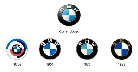
If you already have a logo, consider updating it at intervals. Even the best companies update their logo every few years. Though the changes are subtle, yet the designs are tweaked to make them more relevant and appealing.
Take a look at how the logo of BMW has evolved over the years.
 19. Public testing
Once you have developed a design, it’s extremely important to show it to different people and gauge their reactions. Something that looks great to you might appear very different in the eyes of your target audience. Any useful feedback you receive can be included in the design.
20. Hire help
Creating logos is much more than just choosing a font and pairing it with an image. It takes a lot of research and careful considerations to design an appropriate logo for a business.
Unless you are well-equipped with first-hand knowledge of logo design principles, you should hire a professional designer. While it’s easy to skimp on spending, especially when you are just starting off, a logo is an investment in your future.
If you would like an outstanding logo for your business, hire a reputed agency such as Logo Design Team to craft you the right image for your business. With more than 10 years of experience in designing and over 200,000 completed projects, we have the right expertise to help you build the right brand image for your company with our wide range of design services.
Logo design is a craft, an essential component in the overall scheme of business. Get the design right, and it will work wonders for you, attracting your target audience and encouraging them to associate with you. While there are no strict formulas for making the perfect logo, keeping these tips in mind can help give shape to what you have in mind.

