When working on your logo, it’s good to know what other brands have done to propel their logo forward and get it noticed.
Some logos are distinct in how they have succeeded. McDonald’s, Coca-Cola, and Apple, for example, are so ingrained in our psyche, that they have become a household name. If we see an advertisement for McDonald’s, we automatically see their products, their logo, and Ronald McDonald in our mind’s eye, whether we see it on TV or not.
This kind of mental connection with a product and a brand is the goal of logo creation. For an online brand, this is even more true, since many online brands do not even have a physical presence in the “real world.” Their logo is ultimately essential to getting their branding out there to their target audience.
But beyond that, sometimes we have to turn to Shakespeare for inspiration.
In many of this now world-famous classic works, he used what he called “double entendres.” These were words that had double meanings. They meant something for one person or group of people and something else completely to another person. There were also a variety of sources for that interpretation, including political, romantic, and military. In short, he knew how to turn a phrase.
As a brand, you need to be able to do this a bit too, at least with your logo.
Here are 21 brand logo designs with hidden meanings to give you some inspiration.
21 Logo Designs that Will Make You Think Twice
1. Amazon
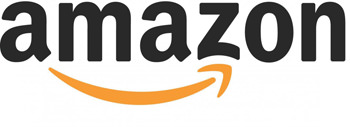
If you never noticed the Amazon logo, look at it again, but more closely. Do you notice the smile? It’s no accident. Amazon put this there to communicate warmth and friendliness, happy shopping, and all things warm and fuzzy. Did it work for you? Oh and now that they have introduced their Amazon “smiles” campaign to donate a portion of your purchase to the needy, it works seamlessly with their logo.
2. FedEx
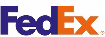
If you only look at the FedEx lettering, you are only getting half the picture. They have also placed an arrow pointing to the right in the middle of the “E” and “X.” This is symbolic of their speed and precision which they claim to focus on in their deliveries.
3. Hershey’s Kisses
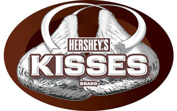
Here is one many people do not notice. There is a Hershey’s Kiss placed strategically between the “K” and the “I” on the Hershey’s Kisses container. Kisses are usually sold in bags and you’ll find the logo on the front of the bag. So next time, look more closely. There’s more to a Kiss than meets the eye.
4. Carrefour
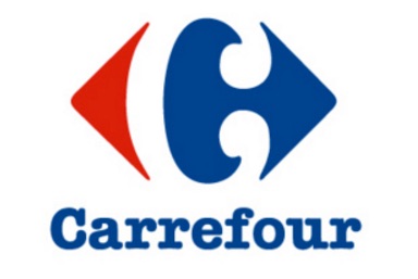
This French company specializing in French marketing, has a red and blue arrow pointing in opposite directions. But that’s not all. They’ve also skillfully created a “C” to stand for their company name by making use of the negative “white space” between the two.
5. NBC
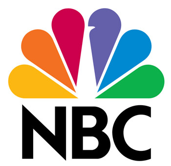
The NBC network logo features the NBC letters with a peacock in the background. You have to let your eyes adjust before you can see the peacock’s neck, though. It’s all white. I guess the idea is that they are proud of their network.
6. Goodwill
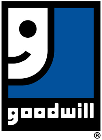
The Goodwill organization logo features a blue and black background with a smiley face on the left margin. However, if you look at the bottom more closely, you will also find another smiley embedded with the Goodwill lettering. You may miss it if you don’t notice the “G” on the far left bottom part of the screen, which is half cut-off.
7. London Symphony Orchestra
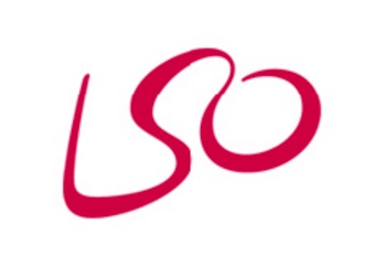
The London Symphony Orchestra is a very simple but artistic-looking logo that features a wavy red line. It loosely spells out “LSO” but what is less noticeable is how it appears to emulate the exact movements of a symphony orchestra conductor when he is leading an orchestra in a performance. Fitting indeed.
8. Circus of Magazines
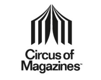
This is a large publication that features a large number of various publications in the same place. It looks like a circus tent at first glance, then you can see that the folds of the tent at the opening look like pages of magazines. It gets the point across either way.
9. Bipolar
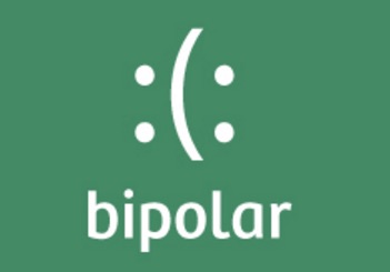
A company devoted to helping victims of Bipolar Disorder, their logo features a dark green background with a smiley and frowney face adjacent to each other. This communicates the up and down moods that people with this disorder often face.
10. Families
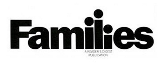
This organization that focuses on family issues and concerns, features the word “Families” in dark, bold print. Then on second glance, you can see that the “i,” “l,” and last “i” look like a father and two children.
11. Iron Duck Clothing
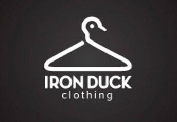
Their logo looks like a hanger facing right. But you can also see a duck logo on the top part of the hanger that resembles a wood duck image.
12. Yoga Australia
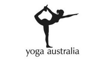
This yoga organization features a lady doing yoga and bending forward. As she stretches, her foot and arm meet, forming a perfect image of the
continent of Australia.
13. Mister Cutts Barber Shop
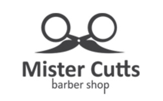
The logo of this company features a pair of upside-down scissors that look like a man’s spectacles with a moustache. Very clever indeed.
14. Sushi
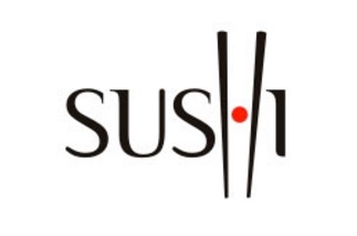
This company, dedicated to creating Sushi and oriental cuisine, features a pair of chopsticks right in the middle of their logo.
15. Twins
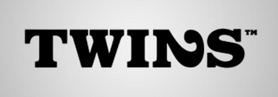
This company that specializes in products for people with twin babies, features a sideways “2” that symbolizes two.
16. Night Golf
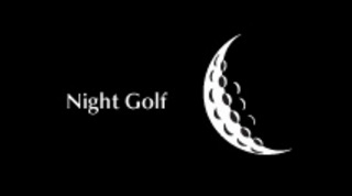
This clever logo features a far away look at the moon that happens to be made of a golfball.
17. Book Cover Cafe
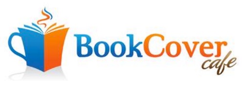
This logo features a lovely blue background with a smoking coffee cup that resembles a book, illustrating coffee and reading, which you can get both of at this location.
18. BirdLove
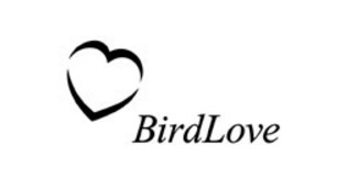
The logo of this company, dedicated to birdlovers, features the words, “BirdLove,” with a heart to the left that is slightly disconnected. The looks gives the illusion of two birds, one flying right-side up and the other flying upside down.
19. CloudCorner
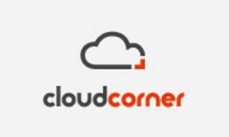
This cloud-based online server to house your files and store media and other data, features a logo of a cloud with a sharp corner, indicating that you are buying your own little corner “in the cloud.”
20. CodeFish
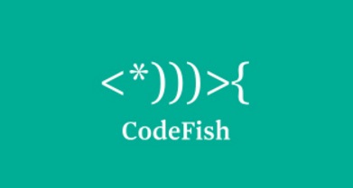
This logo looks like a fish skeleton. But wait, it also looks like raw computer language code. It’s both! The company focuses on getting businesses the code they need for software development or web development.
21. Crowd Promotions
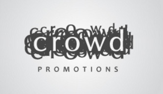
The logo of this company dedicated to promoting businesses and projects with crowd funding, features multiple layering of the word “Crowd.” Well, you get the idea.
How to Create a Memorable Logo for Your Brand
These logos all have one thing in common: they have two meanings. The meanings are not disconnected, however. That is very important to note. It would mean nothing if the extra hidden meaning was not reflective of the brand or if it was not somehow tied into the logo. But they all have a common meaning that reflects back to the overall philosophy of the business.
They also connect to the viewer with graphics in a sense and draw their eye more than if the logo was just simply stated. Making something a bit more of a mystery is appealing to some people.
If you need help designing your logo, call on us at LogoDesignTeam.com. We have years of experience helping businesses just like you find your voice with a great logo design.
Whether you want to have a hidden meaning or be upfront about your ideas, we can help.
Avail our best selling packages and let us help you create the ultimate user experience and company branding message you’ve always dreamed of! Or contact our graphics design team today, we’ll be glad to listen you out.

