What makes an effective logo design? What criteria should you use to create a logo that will stand up to industry standards? More importantly, how will your logo stand the test with your customers and visitors so that they will remember your brand?
It helps to see examples of others who have created a great logo when working on your own. This gives you an idea of where to start and may inspire you to create your logo for your business.
In this post, we will take a look at some examples from big brands that have been highly successful for these companies and analyze what makes them successful.
5 Great Brand Logos that Worked for the Brand
The following brands have a logo that has worked for them over time. Look at each of these brand logos and how they have evolved over time. Then read our notes on why we think they have been successful. See if any of these top winning logos for famous brands inspire you to create your winning logo for your brand.
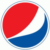
Pepsi
Pepsi-Cola started with a brand logo that resembled one of the first Coca-Cola logos, which featured a simple thin-lined red scripted font over a plain background. It was not very appealing and did not do anything to help Pepsi’s brand stand out.
So in 1905, they made the font bolder and more prominent. The 1905 logo was a great improvement from the original 1898 version, but it lacked color. So in 1938, Pepsi started to add blue to their color scheme. They have kept the red, white, and blue colors since that time.
Once of their most famous logos was the one they created in 1987, which features what resembled a Pepsi bottle cap which featured the red, white, and blue contrasting colors and the logo has continued to change and improved over the years to have a more modern look. They added more dynamic backgrounds and special effects to the logo in 2003. Their latest logo in 2008 featured a plain navy blue background with a red, white, and blue logo and the “Pepsi” name.
Why does it work?
The Pepsi logo works for them because it symbolizes the spirit of America with the red, white, and blue color combination, and it keeps things simple and clean-looking to focus on the product.

Apple
Apple has a logo that is synonymous with quality and discovery. The apple, the forbidden fruit from The Garden of Eden, was part of the inspiration for the famous Apple logo. The original logo was not as distinct about the apple, so they quickly changed it to the lone apple in 1984 which featured rainbow colors.
The rainbow colors indicated the company’s love of color with the Macintosh computer line. But in 1998, they created a black apple with the bite out of it, followed by the 2010 silvery white apple with a bite out of it in 2010.
This has remained the working icon since that time.
Why does it work?
The Apple logo works because it is simple and it symbolizes the high-quality values of the company and the idea of forbidden fruit. It has become a household logo in that everyone recognizes it instantly when they see it.
Steve Jobs’ idea of keeping it simple has worked, and the company has changed their logo very few times compared to other companies.
Ford
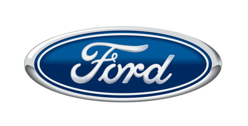
Ford Motor Company started in Detroit in 1903. Their original logo looks very antique-looking now, but it was a good start. In 1910, they replaced it with a black “Ford” logo on a white background. They went through a few more changes from 1960 to 2003. Their latest logo featured a dark blue background with an oval-shaped logo and white lettering.
Why does it work?
The Ford logo works because it is simple but also illustrates the fine quality of Ford automobiles that people have come to know. It is attractive and simplistic yet bold in its way. Ford is a commonly-known company that doesn’t need a logo that is too complex. This simple blue and white logo work well for Ford.
Coca-Cola
Coca-Cola has a logo that was created originally by Frank Mason Robinson, the Coca-Cola founder, John Pemberton’s bookkeeper. They redesigned the logo in 1890; they redesigned their logo to be a bit more complex with swirls that looked like cherries. This logo did not stay because it did not illustrate the brand in its best light and people didn’t get the “cherries” connection.
With time, they learned to keep their logo simple and settled for the red scripted logo on a blank background, and it has served the company well since that time.
Why does it work?
The latest Coca-Cola logo has worked for the company due to its attractiveness and simplicity. Another thing that has helped Coca-Cola improve its branding is the variety of collectible products with the Coca-Cola brand name on it. It captured the sense of “Americana” with this additional branding. There’s no doubt that the stability of the Coca-Cola logo has helped it become a household name all over the world and it is the most recognized brand in the world.
Nike
Nike is known for its famous logo featuring a checkmark and the words, “Just do it!”
The first logo and the company began in 1964. One of their earlier logos was designed in 1971 and was not as strong as the one that you see on Nike products now.
The 1985 version featured a black square background with a white checkmark and “Nike” lettering. In 1995, it was replaced with a black checkmark only.
The checkmark is synonymous with the company’s branding, and they often use the checkmark only to indicate their branding.
Why does it work?
The Nike logo on their site features the checkmark primarily. But some of their products do include the “Nike” name as well. The logo works for the Nike company because they have been able to blend their brand with their logo well. They are all about high-quality sportswear and shoes, but they also inspire athletes and others by their positive message of “just do it!”
Getting Your Own Logo
So what can we learn from these top brand’s logos? From Coca-Cola to Apple and everything in between, we see that what made these logos successful for the brand is their simplicity along with their ability to blend so well with the brand to capture something that resonated with their customers.
You too can achieve your brand in an efficient logo through careful design and attention to detail. You may go through some changes in your logo over time, but you should always keep your logo true to your brand.
To get help with this, contact us at logodesignteam.com.
We can help you brainstorm ideas on how your logo will best benefit your company and illustrate your brand.
So think about what is important with your brand and contact us. We can help you make your mark in the world.
“You don’t just live in life. You create it. You shape it. You make your mark upon it.” (Steve Jobs)

