Vintage logo designs or retro designs are considered to be the hottest trend today. Many startups prefer using retro design for their logos because graphic design experts put forth that vintage logo can turn any brand into a more credible one. Customers perceive that brands who use such epochal logos are more trustworthy compared to others.
However, creating a vintage logo or ‘old school logo’ is exceptionally tricky. The classic logo design employs several rules and elements. As a modern logo designer, you must understand these features from scratch while creating a retro logo.
Let us discuss about the elements of vintage logo designs and understand why we should give value to vintage logos these days.
One of the reasons for taking vintage logo inspiration and employing the design elements to your modern logo – going back to your roots give you more traction.
People always react to evocative stories and if your company logo is designed to give them that feeling, they will surely be mesmerized by you and want to come to you again and again. Recently we can see popular brands like Kodak, Naimoli Contractors, Cheesesteak Media going retro.
They chose old logos over a trendy one because marketers have realized that creating retro logos can be the basis of a solid branding strategy. Why not you too join the league and plan something out of the box from the below-mentioned examples.
Before that let us throw some light on the different retro styles. The five varied retro styles include:
- Victoriana: Designs that draw inspiration from the Victorian period.
- Steampunk and Retrofuturism: The steampunk design style derives inspiration from the 19th-century industrialism.
- Letterpress: This style is the design of a hand-drawn look.
- Baroque: This is a 17th and 18th-century style comprising of detailed decorative elements.
- Gothic: The Gothic design style derived from the medieval period encompasses decorative and architectural styles.
Here are 5 Exemplary vintage logo designs, go through them and utilize what suits you:
The available graphics elements will help you make the template vintage depending on your needs. Take a look at all the elements of vintage logo:
1. Shapes and illustrations are common vintage logo elements
One of the interesting and common Vintage logo elements is different sized circles. If you take a look at retro logos through eras, what will amaze you is- logo designers over the centuries have used simple shapes to achieve maximum impact. To draw attention to bright colors and eye-catching patterns were widely adopted on various parallel forms.
For example, the BMW logo has been reflecting historic prestige over centuries. This is one of the most excellent examples of vintage design; it’s a logo with a circular pattern. The colors are bright, giving the entire emblem a unique look. What’s fascinating to know is the logo did not change much since 1917. Just the logo has taken the modern form by becoming progressively flatter. Added depth to the logo with the light source shining on the letter ‘B’ makes it a stellar one.

2. Color schemes of retro logos
One of the most noticeable elements of retro designs is the limited use of the color palette. In the days bygone color printing used to be extremely expensive and hence designers had limited hue options to choose from. Therefore, the most commonly used setting was two-toned coloring. Usually, the focal color was selected and then blended with another color to create a unique theme. The selective palate of retro colors meant nudes or dull tones.
For example, the Google logo, the greatest logo design example of all times used stylistic trends. One of the best components of this Search Engine Giant’s logo is its flattening and minimal approach, which is used for clarity. The Google logo has always been at the top of the design game. In modern times, the logo didn’t change much since 1998. This logo has been inspiring millions as it ensures their relevancy and reflects the real brand value.

3. Typography plays a pivotal role
We know that typography plays a pivotal role in any logo design. Any logo, whether classic or not is incomplete without the right use of Vintage fonts. In earlier days, things were simple. Hence designers used uncomplicated texts to add a unique flavor to their design. The textual design included duplicating, using pixel stroke or repositioning of fonts to make it more appealing.
For example, take a look at the Goodyear logo. The 1901 logo has a text that reflects the retro look. It’s amusing to know that the Goodyear logo has not changed much since its origination.
4. Borders provide a different perspective
One of the fascinating aspects of retro logo designs as well as retro site designs is the extensive use of borders. Borders add a different perspective to a logo. Whether you want to frame any significant pictures or you want to highlight any vital content – borders with solid colors and ornamental designs were always a worthy option.
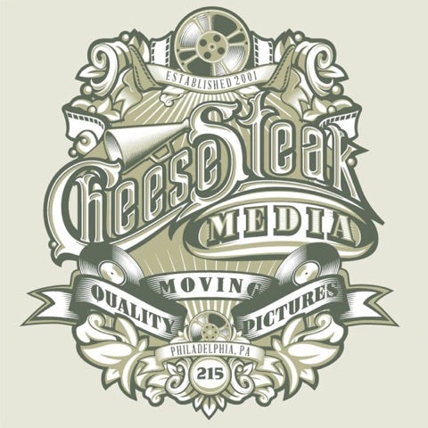
For example, Cheesesteak Media has a stylish logo which is framed by a thick, winding border that intertwines with pieces of film. This thoughtful deployment of the border in the vintage logo an appreciative look.
5. Textures and noises enhance retro logo look
Textures and noises play a decisive role in making a classic logo memorable. These features provide the logo with a rugged old look. Vintage logos have an old and worn out expression and this becomes possible with the correct and subtle use of noises and texture for the background. If you want to create an old school logo, use vintage shapes and borders with stained inclusions and accents. Clever use of shadows adds to the drama of the retro logo’s look.
Look at the example below. Textures and patterns add a unique touch to your design and make your logo a piece of artwork.
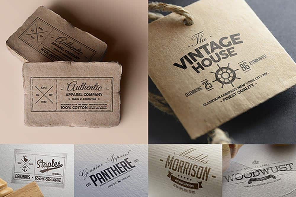
Image Source: Inkbot Design
Once you take a look at the elements of a vintage logo, probably you are convinced that creating an old logo is just like building a modern logo. However, you need to understand that the only thing that sets the procedure apart is the retro vibe. It’s interesting to note that vintage logos achieve what modern logos can’t do in a long time.
Final Touch
The vintage design came into being to promote clear visual communication. Retro designs are always known for having the ability to produce minimal concept. For this reason, to date, this logotype is one of the favorite design styles of many graphic designers. After looking at the different elements of a vintage logo, you can also choose to create a logo with a retro look. There’s no denying that present-day customers always look for something different, hence to impress and satisfy their changing tastes why not impress them with a hint of nostalgia?
If you want more to learn about the vintage logo styles, Logo Design Team has pros who are adept in providing you with an apt design complimenting your band.

