With the tech world continuously evolving, it takes a lot of time and effort to keep up. No wonder Steve Jobs paid celebrated designer Paul Rand $100,000 to design Apple`s memorable logo. What is fascinating is that a number of logos in the tech world contain hidden meanings and symbols. Here are 7 technology logos that have hidden meaning and that have created a strong impact on their customers.
1. Apple Inc. Logo
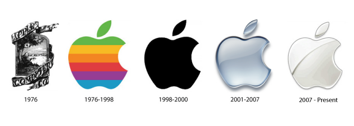
In 1976, the “two Steves” – Steve Wozniak and Steve Jobs built a homemade computer, the Apple I. The first Apple logo was a convoluted image of Isaac Newton sitting under an apple tree.
It was designed by Ronald Wayne, who was one of the co-founders of Apple Computer. Not many people are aware of this – in 1976, after working for only two weeks at Apple, Wayne relinquished his stock, 10% of the company, for a one-time payment of $800 because he thought Apple was too risky! (Had he persisted with Apple, Wayne’s stock would be worth billions today!)
Jobs thought that the complicated logo directly affected the slow sales of Apple I, so he gave the responsibility of designing a new logo to Rob Janoff, who came up with the idea of a rainbow-striped Apple logo, which was used from 1976 to 1999. Apple President Mike Scott once claimed that this was the most expensive logo ever designed.
There are many stories behind the bite on the Apple logo. Some say it is a nod to Alan Turing, the father of modern computer science, who had committed suicide by eating a cyanide-laced apple.
Janoff, however, clarified in an interview that though he knew about the “byte/bite” pun (Apple’s slogan back then was: “Byte into an Apple”), he designed the logo to prevent the apple from looking like a cherry tomato.
In 1998, at the insistence of Jobs, who had just made a comeback to the company, Apple replaced the rainbow logo with a modern-looking, monochrome logo.
2. Google Logo
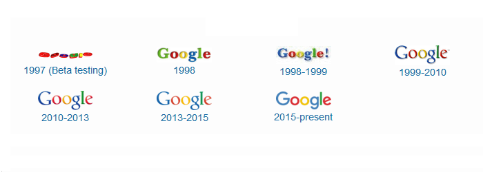 In 1996, Stanford University computer science students Larry Page and Sergey Brin developed a search engine that would later become what is today a worldwide acclaimed brand – Google. That search engine was called BackRub because it used to analyze “back links” to determine the relevance of a particular website.
Later, they renamed their search engine Google, based on the word Googol (meaning 1 followed by 100 zeros). Two years later, Larry and Sergey reached out to internet portals but couldn’t get anyone interested in their technology. In 1998, they started Google, Inc. in a friend’s garage, and the rest is history.
Google’s first logo was created by Sergey Brin, using the free graphic software GIMP. An exclamation mark was later added mimicking the Yahoo! logo. The Google logo that the company uses today was designed by Stanford’s Consultant Art Professor Ruth Kedar in 1999.
To mark holidays and major events, Google uses specially drawn logos known as the Google Doodles. The first Google Doodle was a reference to the Burning Man Festival in 1999. Nowadays, Google Doodles are drawn by Dennis Hwang.
3. IBM Logo
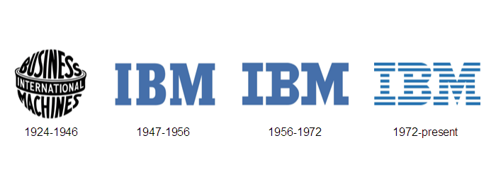 In 1924, IBM adopted the name International Business Machines Corporation and a new modern-looking logo. At that point of time, it was in the business of making employee time-keeping systems, weighing scales, meat slicers, and punched-card tabulators.
In the late 1940s, IBM transformed itself from punched-card tabulating to computers, led by CEO Thomas J. Watson. To symbolize this radical change, IBM changed its logo for the first time in decades.
In 1956, the leadership of the company passed down to Watson’s son, Paul Rand and he changed IBM’s logo to have a more solid, grounded and balanced appearance and at the same time the change was subtle enough to communicate that the baton of leadership has passed from father to son.
In 1972, IBM’s logo was changed, when Paul Rand replaced the solid letters with horizontal stripes to suggest “speed and dynamism.”
4. Microsoft Logo
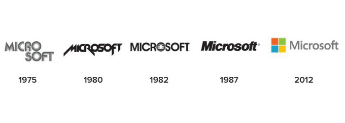 In 1982, Microsoft proclaimed a new logo, with the characteristic “O” that employees named the “Blibbet.” When the logo was changed in 1987, Microsoft employee Larry Osterman had even launched a “Save the Blibbet” campaign. In those days, Microsoft cafeteria served “Blibbet Burger,” a double cheeseburger with bacon.
In 1987, Scott Baker designed the “Pac-Man Logo” for Microsoft. This iconic logo has a slash on the ‘O’ that makes it look like Pac-Man.
5. Nokia Logo
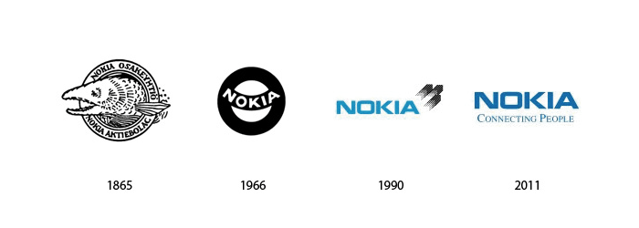 In 1865, Knut Fredrik Idestam launched a wood-pulp mill in Tampere, south-western Finland. It took the name Nokia after the mill was moved to the bank of the Nokianvirta River in the town of Nokia. The word “Nokia” in Finnish means a dark, furry animal we now call the Pine Marten weasel.
What we now know as “Nokia Corporation” was actually a merger between Finnish Rubber Works, the Nokia Wood Mill, and the Finnish Cable Works.
Before manufacturing telecommunications and cell phones, Nokia made paper products, bicycle and car tires, shoes, television, electricity generators, and so on.
6. Xerox Logo
Xerox Corporation came into existence almost 100 years ago to manufacture photographic paper and equipment.
In 1938, Chester Carlson invented a photocopying technique known as electrophotography, which he later renamed xerography, and like many inventions ahead of its time, it wasn’t received well. Carlson spent many years trying to convince General Electric, IBM and other companies to invest in his invention but no one was interested.
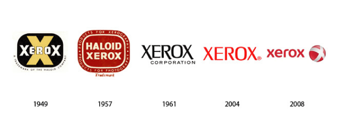
Good fortune struck him when he went to the Haloid Company, who helped him develop the world’s first photocopier, the Haloid Xerox 914. The copier was so successful that later Xerox dropped the Haloid from its name.
In 2004, Xerox was riddled with a settlement claim from the Securities and Exchange Commission for cooking its books, and after settlement of that claim, Xerox tried to re-invent itself with a new logo. Four years later, it tried to break free from the image that it’s only a copier company and adopted a new logo.
7. LG Logo
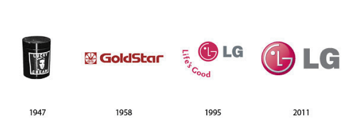
LG originated as two companies: Lucky Chemical Industrial, which made cosmetics and GoldStar, a radio manufacturing plant. Lucky Chemical became popular in Korea for creating the Lucky Cream. GoldStar eventually evolved from producing radios to making electronics and household appliances.
In 1995, Lucky Goldstar changed its name to LG Electronics. These companies adopted the “Life is good” tagline that you often see next to its logo. Interestingly, LG now denies that their name stands for Lucky Goldstar. They’re just “LG.”
Importance of Logo Design
As you have seen, these 7 technology logos have placed a very strong focus on the designing part of the logo. From the product that they are selling to the landing page that promotes it, all the way through to the logo design on their business cards, design is seen as something to be proud of in global tech companies.
At Logo Design Team, 120+ logo design experts can help you make decisions and choose a modern, sleek logo for your company. We have been in the business of logo designing for the past 10 years and we have successfully created over 1 million logos.

