Great logo designs don’t just happen. Just as important as the logo design itself, is the actual people, brand, product and service it represents. At the same time, the quality of a product or service in itself doesn’t make for a successful logo design either.
Instead, it’s the endless hours of design, brand loyalty and engagement with your audience that makes a brand successful. When someone sees a brand or logo they are truly passionate about, it makes them feel better inside. Just think about the last time you were clothes shopping… there is a good chance you wanted to go with a name brand or clothing with a logo on it that was quite recognizable.
Why? Simply because that logo and brand identity relates with you and it’s one that you want to share with others. However, other design elements may have come into play as well…
In this article, we are going to take a look at ten different elements you should consider when designing your brand logo. After all, a logo isn’t just at logo… it’s your identity!
![]()
1 – Represent Your Brand Well
When it comes to drafting new ideas for your logo and brand identity, try not to drift too far off into creativity where you lose brand representation. While it’s great to have a design that stands out from the crowd, it’s also great to have a logo that represents the brand or business model.
Two examples of this would be Apple and Starbucks. The Apple logo is obviously an apple and the Starbucks logo usually says “Starbucks Coffee” on it. Both examples are extremely unique and have played a huge part in the success of their brands — as they have also become famous worldwide logos in the process.
Later in this article, we will discuss how some brands have become so successful and great at their branding that they no longer need to use their names within their logo. Again, Apple and Starbucks are two great examples of this.
2 – Choose Your Colors Wisely
Have you ever thought about why some logos are the colors they are, while others are another? In some cases, the designer or brand might have just picked their colors and said “make it work”, while others have spent millions of dollars on trying to pick the right colors schemes to represent their brands and play with the emotions of their customers.
In our article on the emotions of colors, you will quickly understand the importance of knowing what colors represent different feelings when it comes to emotions and buyer influence. You can see a summary of our color list and their associated emotions below.
- BLACK is commonly used to show power, mystery and death
- WHITE is the opposite with hope, goodness and purity in mind
- RED is most commonly used when showing romance, danger or energy
- YELLOW is a great color for grabbing attention and showing caution
- BLUE is one of the most common used colors, and shows confidence and integrity
- GRAY brings a feeling of stability, security and authority
- GREEN is often associated with life, growth, money and freshness
- ORANGE emits feelings of innovation, creativity and thinking
- PURPLE brings a feeling of royalty, luxury and wisdom to the table
Now that you’ve seen what the different colors of the rainbow represent when it comes to buyer influence, are you still thinking of using the same colors within your draft design?
3 – Using Your Name with/as Your Logo
Some of the most famous brands and logos in the world are simply the name of the company in a fancy or original font. A perfect example would be “Coca-Cola” in that solid red font.
The more unique your brand name is, the more likely you will be able to find success with creating a logo or logotype font for your brand. Another option is to start getting creative with your brand name and coming up with a text-based design of your own.
4 – Clean Logos are Just as Effective
When it comes to creating brand logos, you can get quite creative and start playing around with some crazy design ideas. However, it’s also important to remember that simple logo designs are also quite effective.
A few good examples of very simple logo designs are eBay, Reebok and Amazon. They are all unique in their own way, but extremely creative and simple at the same time.
5 – Logo Branding is Not Created Over Night
Think about some of the most famous logos and brands in the world today. The most successful and memorable ones are the brands that no longer need to use their actual name within your logo. Familiar names you will know that have been able to make this leap at Apple, Nike and Target.
However, it’s safe to say that millions, if not billions of dollars went into the branding of these companies before they decide to simply pull the name from their logos.
Just take a look at how the Microsoft logo has progressed over the years. (source)
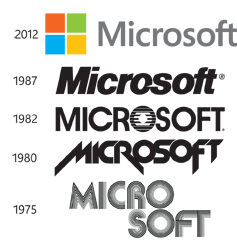
For this reason, it’s important to associate your brand name and logo together at all times, until you feel you are at a level where your logo can represent itself.
6 – Hidden Meanings within Your Design
Of all the different types of logos and brands in the world today, some of the most exciting ones have to be those that have hidden meanings within their design — many of which you’ve probably never even noticed!
A few examples of world renown logos with hidden means are:
- FedEx – Next time you see this famous logo, see if you can notice the arrow in between the “E” and the “X”. This represents how the company is always moving forward.
- Amazon.com – The world’s latest online shopping site also has a hidden meaning within their logo. Most people see the arrow under the Amazon logo as simply a “smile” — which is does represent, but it’s also there to show the site sells everything from “A” to “Z”.
- Beats Audio – The Beats Audio logo is quickly becoming a recognized logo around the world as more people are purchasing the headphones recently acquired by Apple. If you look closely, you will likely notice the “b” in Beats looks a lot like the headphones — which is exactly what the brand was hoping for.
- Formula One/F1 – With another play on negative space, the F1 logo is more than a black “F” with red racing stripes; the space between these two main focal points is the number 1.
Creating a hidden meaning with the design of your brand logo isn’t an easy task, but with a little creativity and some design work, you might just be able to create a winner.
7 – Reach Out to Your Audience for New Ideas
The last tip for creating a highly brandable and effective logo design, is to simply ask your audience, those around you and even designers for their thoughts and opinions. When trying to design a logo or draft concept for your brand, you will often put too much effort into some areas to take the design too far.
It’s now way too easy to upload a few logo designs onto your site or through social media and simply ask for feedback. This is something that every website or brand should consider before making their final decision on a logo before placing it on all products or in marketing and outreach campaigns.
Let LogoDesignTeam Create Your Perfect Logo
No matter why type of logo or brand identity you are looking to create, our design team has the skills, experience and history to create exactly what you are looking for. In fact, we won’t stop designing until you are completely satisfied with our work.
Having created logo designs, infographics and marketing materials for thousands of clients around the world, it’s become second nature to design custom creations based on our customer needs. Look through our design portfolio.
You’re unaware, your logo could be the bane of your company.
Give your company image a startling boost.
Contact LogoDesignTeam today!

