Logo redesign is a significant change for a brand. It is a daring move and should be thought out carefully before proceeding. Even a seemingly small change can catch subscribers or customers unaware and make you lose some people just because they do not recognize the new packaging or branding.
While they might seem far and few, the truth is that logo redesigns, repairs, and updates are something that happens quite often in the world around us. Tech Insider recently unveiled what they believe to be 9 of the best logo changes of the year. Among them are Bud Light Beer, The Peace Corps, and the U.S. Soccer Federation.
In this post, we will review the changes made and consider what is unique or positive about each one, as well as some of the negatives. Then you can decide for yourself as you think about your own logo.
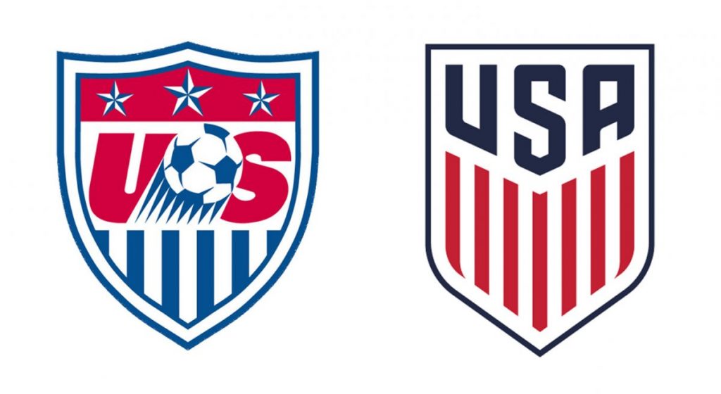
1. U.S. Soccer Federation – This design loses the soccer ball in the new edition and makes the USA a part of the logo stand out. It is somehow more powerful in this second edition but removes the soccer ball, which could be confusing to anyone outside of the soccer arena. It is attractive though and seems to do a better job of communicating a sense of American pride than the former one did. The U.S. Soccer Federation did announce the change via virtual devices to all of their interested patrons prior to the change, so the target audience would get the word before they made the transition.
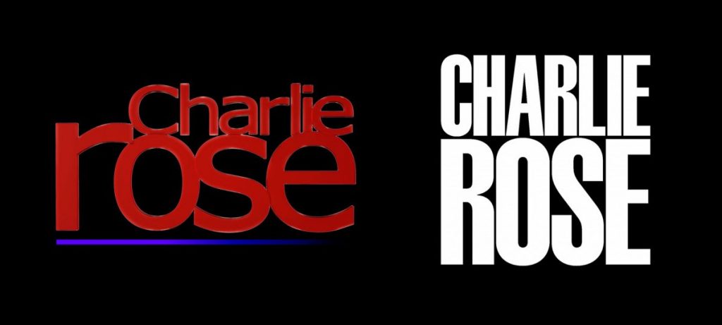
2. Charlie Rose – The well-known PBS talk show host changed his logo this year from a smaller more diminutive red font with a lower case “r,” to a more powerful white on black logo with the last name in proper case (capitalized). While the change was focused only on lettering, it does make his name seem more powerful or prominent.
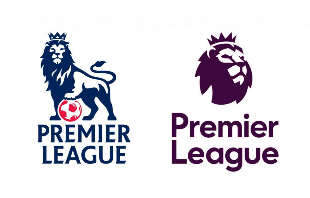
3. Premier League – The British Premier League always featured a lion with his paw on a soccer ball for over 20 years. So this change to a purple on white lion head only was drastic. The lettering of the second version is diminutive and in proper case, which lessens the sense of the power of the logo in general. But what it lacks in lettering it reinforces with the stoic lion face with a crown that is facing left.
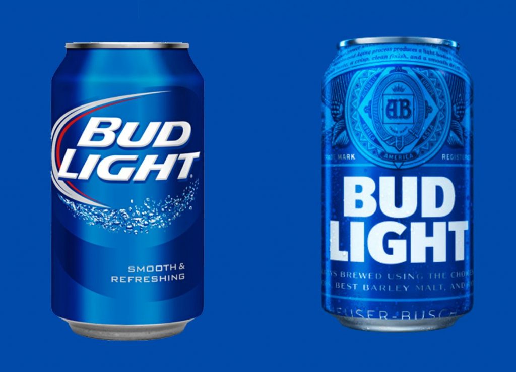
4. Bud Light – Bud Light redesigned its beer cans this year to include a more ornamental design on the top of the can, along with a bold, straight lettering on the bottom. The ornamental design at the top bears the logo of AB (Anheuser Busch), which the first version lacked and seems to give the new version a bit more clout.
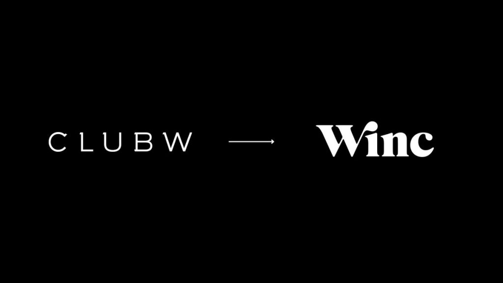
5. ClubW – Club W, a Los-Angeles wine club recently decided to change not only their logo but their name as well! In a bold but strategic move, the company announced recently it would change to Winc, with the “Win” symbolizing wine and the “c” standing for “club.” This logo change is drastic and also involves a name change, so it will be very important for this company to get the word out among its current clientele, as well as to the masses before the change.
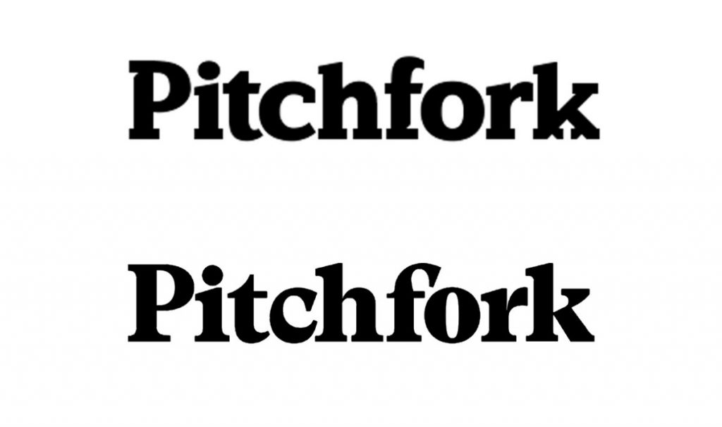
6. Pitchfork – Sometimes a brand’s logo makes such subtle changes that it takes some intense analysis to see what is different. In the case of Pitchfork, the only change is that the strange indentation font of the letters “f” and “k” have been replaced by a more normal font face. The result is a smoother looking style that doesn’t attempt to incorporate the brand’s product line into the title itself. When a logo is a title only, it is tempting to do this, but it is not always the most sound business strategy. The change is a good idea, in our opinion.
7. The Peace Corps – The Peace Corps has had its older logo for 55 years. That’s another factor you need to consider. When a logo has been around that long, it is harder to acclimate everyone to it. The original stars and stripes that capture a part of the American flag are gone in its original form in the new version. But it is replaced by a single white dove on a navy blue background carrying the stripes of the flag, which seems to indicate the same idea. The Peace Corps is a governmental institution and is well-known for its help of global problems overseas and in needy countries. The dove is more prominent in this latter version, which was officially unveiled June 2016.

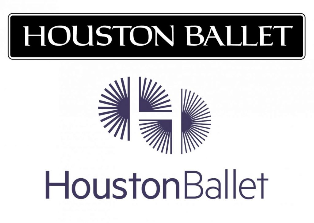
8. Houston Ballet – The Houston Ballet changed from their white on black straight design to one that symbolizes more movement. The new logo is purple and features a unique symbol that seems to move when you stare at it long enough. This more modern classy design seems more artistic in nature and may better capture what the company wishes to get across as an artistic dance company.
9. Sydney Opera House – The Sydney Opera House made a big change to their logo when they dropped the traditional ceiling icon and replaced it with a simple acronym. “SOH” in raised white lettering on a gray background is now all that people will see, accompanied by a black upper section with tiny shapes that symbolize the opera house. This is a big change but they seemed to try to keep the main elements of the previous design, even though it was in a diminutive form.

Top Logo Redesigns of 2016
There you have it: the 9 best logo design changes of the year 2016, according to Tech Insider magazine (visit their site to see all logo redesigns). We can see the appeal of each of these as Tech Insider was deciding which ones deserved this recognition, though some changes could be considered rather drastic.
When you decide to change your logo, there are some important things to keep in mind:
- Ask yourself if the change is necessary for either mobile users or your targeted market.
- Decide what the most important element of your branding is and what you will include in your new design.
- What coloring will you use to get your image across in the best way?
- Is your new logo idea compatible with the new technologies or the places it will reside?
- How will your logo look on your website?
Branding your Brand
In addition to these questions, you will need to decide how you will get the word out to your current customers or subscribers. If your brand is primarily online, you could use a mass email to your subscribers or clients and include a video or photo of the new logo design with the email on company letterhead. Some changes are so drastic, that it may be necessary to promote it nationally with a national ad campaign. You just have to weigh the cost of this with the possible loss you could suffer if you lose customers in the transition.
If you find that business is not as good as it could be or that customers are not responding to your web page the way you want, you have to ask yourself if your logo is one of the reasons.
The best advice we can give you is to get your logo assessed at a professional logo design agency. Logodesignteam.com focuses on helping you with professional logo repair, redesign, and creation from start to finish.

Your logo is one of the most important aspects of your branding and one of the first things people see when they come to your page. You can’t afford to trust this with just anyone. So check out their logo design service and then give us a call to see how we can help.
So look at your logo, and decide for yourself.
Because a name is important. And so is your logo.
We have the talents. We have the resources. We do it right. Contact LogoDesignTeam today!

