Are you thinking about rebranding your business and logo? Be careful. This is a touchy area and one that must be done with much foresight and thought.
If you change it too much, it could be disastrous. Read through these articles and blog posts about some epic design logo disasters that could only be compared to an oil spill.
Logo Failures that Cost a Fortune
This article by Canny Creative highlights ten great logo disasters that ended up costing the companies thousands or even millions of dollars. This is a mistake you don’t want to make with your company. BP, for example, put out a newer updated “green-friendly” logo that backfired on them. Just a few years later, they claimed responsibility for the largest oil spill in natural history. So much for credibility!
The examples on this page show other epic fails with logos that are nothing short of disastrous for the company. They also show how you can spend exorbitant amounts of money and get nothing back. Many of these companies even went into deep debt as a result of their logo. BP, it is rumored, spent over $211,000,000 on their failed logo!
There are several other examples of logos that companies spent lots of money on but that did not pay off. In fact, some were just changed for the sake of change, it seems. And it didn’t help the image of the company at all. Lesson learned: Don’t mess with what works. Only change your logo if you think your current one is outdated or doesn’t reflect the true nature of your business.
9 Worst Logo Changes: Business Insider
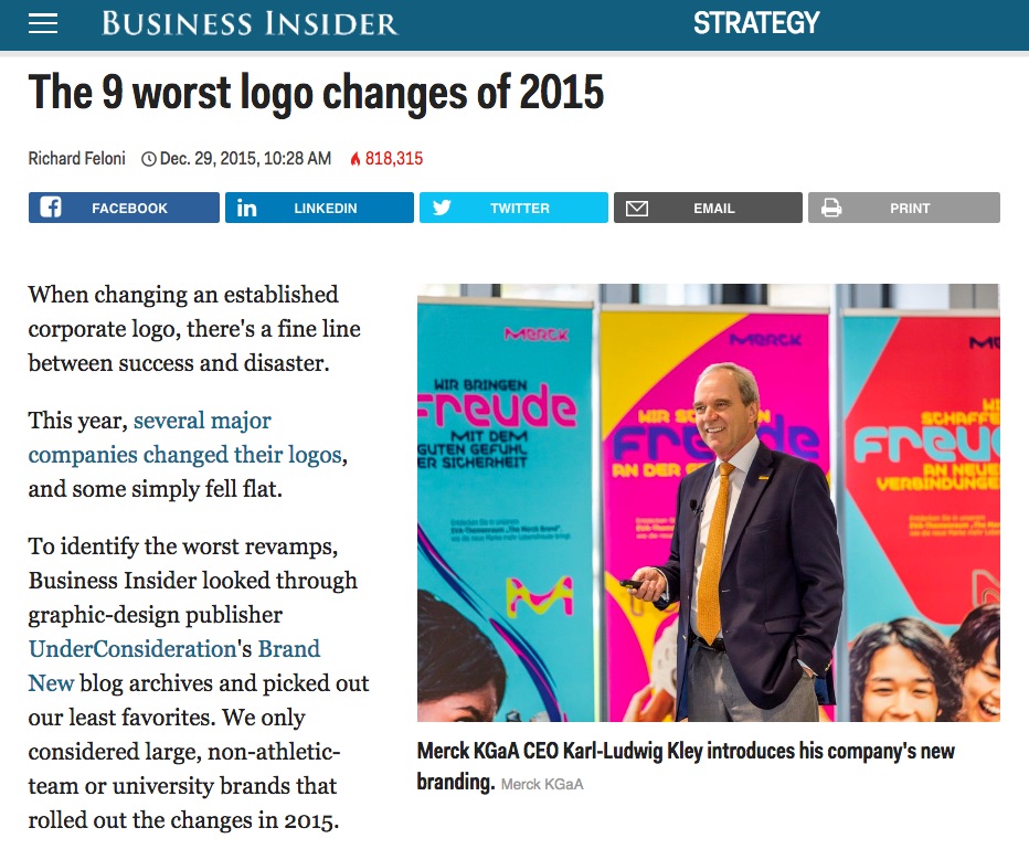
Business Insider published this article that featured the top nine worst logo changes in 2015.
Some of the worst disasters, according to BI included:
- Lenovo
- Verizon
- CBS Sports
- TBS
- Best Western
If you look at these logos, you will see that they tried to improve on an already successful logo. It seems the number one mistake we notice most is that they just tried to change it too much. If you try to improve on it by altering the color, shape, or general look too much, people become confused as to whether it is still your brand.
You need to stay true to your branding and remember that your logo is a very integral part of your brand. If you have a logo that works, make the changes very gradual rather than too abrupt. This will avoid confusion and the result will be better.
Rebranding Disasters
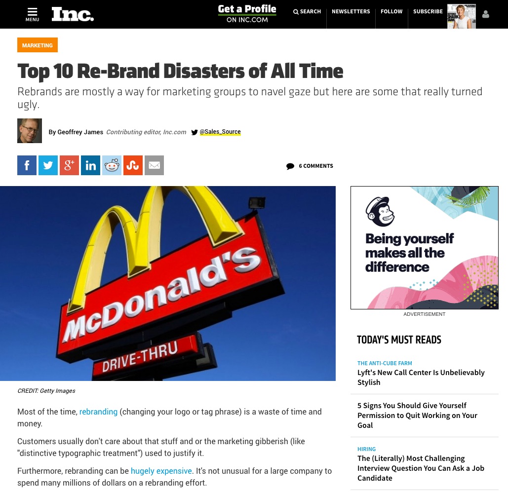
Inc. Magazine published this article about ten of the biggest logo disasters. Included in the list are:
- McDonald’s
- BP
- esurance
- Kraft foods
There are six others so read the article for full details. The main commentaries the author makes are regarding the fact that all of these companies lacked foresight in imagining what may be coming, such as BP’s eagerness to be perceived as “earth-friendly” and then causing the greatest oil spill in our time.
Other mistakes were related to overall graphic design and lack of creativity, as well as other features that were not well thought out.
If these big Fortune 500 companies can make these type of mistakes, imagine what any business might do to create a similar crisis for your brand! Don’t do it. Get the advice of professional logo designers before you make the change.
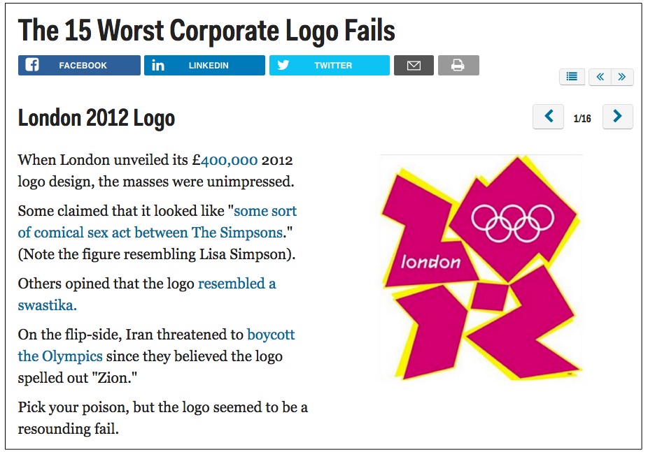
Business Insider: 15 Worst Corporate Logo Fails
Here is another article by Business Insider: The 15 Worst Corporate Logo Fails. This article focuses on graphic designs that ended up backfiring on the companies that had them designed.
Look through the various logos and see if you agree with the findings of the author in this post. Keep in mind that a second look may produce “graphic” (not graphic) content!
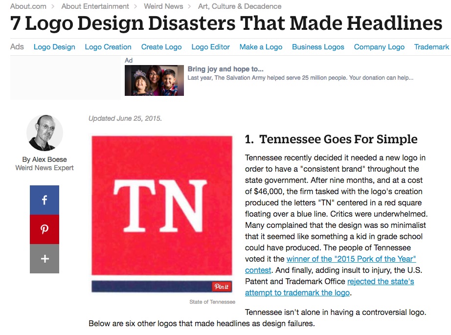
Weird News: 7 Logo Design Disasters that Made Headlines
Weird News reported these seven logo designs that went wrong. It usually involved graphic design failures or oversights, but some were also about the general concept. Many times these companies attempted to symbolize the services they offered in a logo when it would have been better to have just included a basic symbol that was better done.
These horrible-looking logo designs remind us to make sure the finished product is going to look professional and not like some Jr. High art contest.
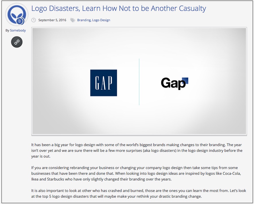
Somebody Marketing.com: Learn How Not to Become Another Casualty
In this post by Somebody Marketing, the writer shows many of the same logos that are considered fails in other articles. But they also add Netflix, which chose to change their “Netflix” logo to an “N” recently for the benefit of mobile app users.
The writer points out, however, that the move confused many customers who were still looking for the entire word spelled out and could not figure out how to find the new logo.
There you have it!
Well, there they are- six articles that prove once and for all that you need to step cautiously when you are considering changing or redoing your logo. All of these articles offer some interesting insight as to what types of mistakes are often made when designing or changing a logo.
The Importance of Excellence
In the final analysis, creating a logo or changing it once it’s created is way too important for mistakes. When we look back at some of the epic failures of these companies in redesigning their logo, we see that companies such as BP made a mistake that was “heard around the world” by focusing on something that had future implications.
Most entrepreneurs have learned that we can never predict what will happen in our business in the future. We cannot predict what problem or misadventure might become an obstacle and step in our way to thwart our plans. When BP decided to create the idea that they were earth-friendly, they had good intentions. But they didn’t have a crystal ball, or they could have seen that just seven years later, in 2010, they would be responsible for one of the worst environmental disasters of the planet.
This made their logo totally defunct. They had to remove it immediately because it became an instant joke.
Having the insight to know that we just can’t tell what the future holds is one of the most important things we must do to prevent such disasters with a logo or our branding.
The Art of Rebranding
Remembering that your logo is a part of your brand, when you do decide to rebrand your company, it helps to have the advice of professional logo designers like logodesignteam.com.
Not to toot our own horn, but we understand the potential problems involved in creating a logo. We know when the change is too great or the idea is a bit too far-fetched to work. We are creative but we are also practical.
We use our business sense, as well as our artistic design ability to create the perfect logo if you are looking to rebrand your business.
Rebranding is not an easy process and the transition must be smooth so that you don’t lose customers or confuse people. Let us know what your plans are for your brand and we’ll be happy to discuss it with you.
LogoDesignTeam.com is your one-stop logo retouching and rebranding company. We look forward to helping you create your logo and we’ll help you avoid a disaster…and oil spills, too!

