Have you taken a look at your logo lately? Does it look like your 6-year-old did it? We’re not poking fun at 6-year-olds. After all, they are children. They have to learn a lot of things before they can create something that looks professional. There is a lot of technology that helps even a 6-year-old draw something impressive these days. But despite this, you don’t want your logo that you are going to put out to millions of people to look like a project for a first-grade class, even in the age of Apple iPad Pro!
So how do you improve the look of your logo so that you project a professional look to the world? Here are a few tips to get started:
Use color but be conservative.
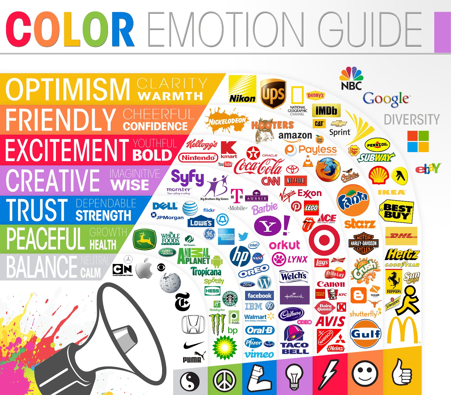
The color of your logo is important. It is also psychological. On the Color Wheel Pro site, you can study the various color meanings and decide which ones will fit your branding the best. When you use color in your logo in a certain way, you are communicating values of some sort, whether you know it or not.
It’s important that you understand what the various colors represent and choose your branding colors from that. Black is powerful and dignified. Blue symbolizes depth and stability. Yellow is cheery like the sun. Choose your colors carefully as it will reflect the meaning of your brand in a subtle and subliminal way that will affect the way customers view you.
Don’t overdo color but use it in such as way that helps shape your customers’ opinion of you in a unique way and connects with them. It doesn’t have to be your customers’ favorite colors, but it needs to be the color that speaks to them in some way.

What if my 6-year-old already designed it?
One of the problems that may be inherent in the logo color choices is that you may have already chosen your colors for your website or your brand, then you may find out that the colors you chose are not complementary to your brand. If this is the case, you can always change your colors. But you should do so in a manner that will not confuse your customers.
You also don’t want to overuse colors to the extreme. Instagram recently got a lot of flack from customers who loved their old logo of an old Polaroid type camera, and then they switched to a multi-colored rainbow logo instead. The new logo resembles one of Apple’s logos in the past that they used for their iTunes campaign. But Apple only used that logo once and for a particular aspect of the Apple store. They didn’t make it their “main logo.”
Don’t mess with what works
Instagram’s mistake was likely that they created such a great logo in the past that people connected too, then changed it without much warning into something completely different. You need to watch sudden changes when it comes to your logo because this could have the effect of a “6-year-old’s” work as well with your loyal customers!
You don’t need to change your logo just because you think you should. Consult with professionals first, do surveys and ask customers what they think of your logo before making any drastic changes. In the case of Instagram, the change did not add any perceived value to their brand. It did not seem to increase the way that people viewed the app or what Instagram can do. It was just more colorful. So it’s best to think carefully before creating a logo that customers will not like.
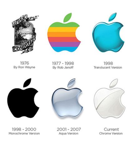
However, not all designs should stay the same forever. A perfect example of this can be seen with the evolution of Apple’s logo below.

Don’t let customers fall through the cracks
Another danger to changing your logo too drastically is that fact that you will lose some customers in the transition. Netflix recently changed their logo as well from the traditional “Netflix” where the entire word was spelled out to the lone “N.” They did this for some important reasons, not the least of which was to increase mobile-friendliness for their brand and make it more visible on the mobile market.
But they lost some customers and followers who didn’t know about the change and didn’t recognize that the “N” was for Netflix. Changing your logo from something that customers are used to carrying a bit of a risk and it should be handled well so that you will not lose people in the process.
Analyze the reason for the change
If your logo does look like your 6-year-old did it, then you definitely should make some changes! An amateur-looking logo is about the worst thing you can do for your brand. It represents your company to the whole world. You wouldn’t want a primitive-looking logo representing your brand any more than you’d want a 6-year-old doing the keynote address to a thousand of your customers.
But when you do change your logo, consider the factors for the change and ask yourself a few questions:
- Would a new logo better present the things your brand stands for?
- Does it need more (or less) color?
- Do you need to change the font or lettering to communicate your brand’s message?
- Could a professional designer capture your message better?
- Do you need new tools that would create a better look for your brand?
If you answered “yes” to any of these questions, you might want to look into getting help from a professional logo designer. Professional designers work on the logo and graphic design all of the time. It’s what they do.
In fact, it’s what we do. At logodesignteam.com, we understand how important it is that your logo puts your best face forward of your brand to the world. We know that the proper use of color, fonts, and designs help define the impact that you have to your customers and others that you want to attract to your brand.
We use the tools and resources that we have at our disposal to work with you every step of the way to create the best logo possible to represent your brand.
If you need to make changes to your logo, we can do that too. We will analyze what is working and what is not working for your brand and your company and work with you to determine the best course of action to improve the look of your brand so that you can attract the people that fit what your products and services offer.
The Essence of Sales
Matching customers with your products are what good sales are all about, and your logo is a big part of that! Whether you realize it or not, people will attach value to your brand and make a decision on whether you have something they are interested in with one look at your logo!
That’s how important your logo is to the success of your brand.
So, if your logo needs work or if it looks like a first-grader did it, call on us, the superheroes of the logo design world at logodesignteam.com. We can help you decide what to include in your logo, improve a lackluster logo, and help you create something professional and unique that will attract your target audience to your brand.


