Logos are all around. So much so, that sometimes we don’t even pay much attention to them; as if they are a part of our regular lives. However, then there are some that make us sit up and notice. These are the ones that mysteriously hide the entire business in just one or two elements! Talk about minimalism and only a few such designs will make you believe that creativity is not dead. Out of those few, let us narrow down to fewer and give you 10 such unforgettable clever logos that will stay etched in your mind for the longest time to come. The reason is pretty simple. These designs are extremely mind boggling and only go on to tell us the fact that nothing beats minimalism and simplicity.
Here are 10 clever logos that are hard to forget:
1. Amazon
If you have been wondering why there is an arrow that curves from ‘A’ to ‘Z’ in this one, then you have been trying too hard to figure that out. It simply means ‘from A to Z’ signifying the fact that Amazon is one such platform where you will get everything that you want! Clever clever!

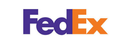
2. FedEx
If you haven’t read about it yet, you probably live under a rock. The FedEx logo has been the talk of the town ever since its inception or rather, ever since someone was smart enough to discover the hidden meaning in the logo that represents the brand’s entire foundation.
The space between the ‘E’ and the ‘X’ is an arrow which represents two vital characteristics that every shipping company should have; speed and precision.

3. Le Tour de France
The name of the annual biking competition might look like just a fancy font dented here and there to give it a stylish appeal. Well, attention to detail is what you need to spot the whole essence of the race in this logo.
Look at the yellow circle. It represents the sun. That is not all. Look at the ‘R’! It is a cyclist in the racing position! Well, cleverly designed seems to be an understatement for this one. Isn’t it?

4. Cisco
You probably think this one is a no-brainer because clearly, the vertical lined panel above the word ‘Cisco’ is the digital signal that represents the fact that Cisco is into manufacturing networking equipment.
Yes, of course, it means that but if you think beyond the obvious, you will know that those lines are also forming the Golden Gate Bridge in San Francisco! With just one element, Cisco managed to hit two birds with one stone. They not only tell what they do but also where they do it at!

5. Beats by Dre
Everyone loves this popular brand of headphones but has anybody ever looked closely at the logo? The logo looks like a simple white ‘b’ in a red circle. It is not just that. It is also the side view of a person wearing headphones!
Now that is some mind blowing creativity here! Isn’t it?

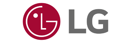
6. LG
You love this electronics company, but you think to yourself often as to why the company logo is just the two letters ‘L’ and ‘G. It is not just the two letters. If you take a good look at it, the L and G are forming a human face.
Life’s good for the logo designer here it seems!

7. Yoga Australia
This is one of the cleverest logos around. Look at it, and you will see only a woman’s silhouette doing a yoga pose. What is so innovative in that, right? Okay. Look at it once again. Do you see Australia’s outline yet?
The best use of negative space here!

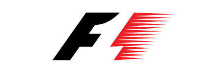
8. Formula 1
To all the lovers of racing and to all those who don’t care about the sport, the logo is fantabulous. Between the black F and the red lines is the hidden ‘1’! This is yet another example of a very clever use of negative space.

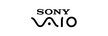
9. Sony Vaio
The whole name here is symbolism personified! Where the ‘V’ and the ‘A’ represent the analog waves in the digital form, the ‘I’ and the ‘O’ are symbolizing 1 and 0, the binary code.
Quite intelligently done. Period.

10. Sun Microsystems
The ambigram in this logo is so wonderfully done that no matter which side you look at, there is nothing else you will see other than the word ‘Sun’. The logo is very compact besides just being smart.
Definitely hard to forget!

The 10 examples here are just the tip of the iceberg but are undoubtedly the best 10 when it comes to cleverly designed logos. Every business must aim at creating a logo that represents the nature of the business without them having to say anything else!
You must take care and invest in getting a good logo designed for your business from an experienced logo designing company. If you wish to make it to this list, you need to be aware that not every logo designing professional can offer you the kind of expertise needed for this. Consult experts like LogoDesignTeam that have decades of experience and have worked with some of the biggest brands in the world and will do justice to your brand.
Well, who knows, one day your brand’s name might land up on one such blog post. That would make you extremely proud. Wouldn’t it?


