Do you have a logo or do you need one for your business? Either way, it’s a good idea to take stock of how your logo is working for you. If you are not getting the best of results from your logo, or if you don’t yet have a business logo, this post should help you.
We are going to first take a look at 7 of the biggest logo “fails” of all times so that you can avoid some of the problems that these business owners created. Then we’ll look at some great logos and talk about what truly makes a logo work.
7 Logo Fails You Should Learn From
The following logos started out as a fairly good idea that the business owner thought would create hype for their brand. Unfortunately, because they could not foresee the future or how their target audience would relate to it, it backfired on them greatly. Read and learn.

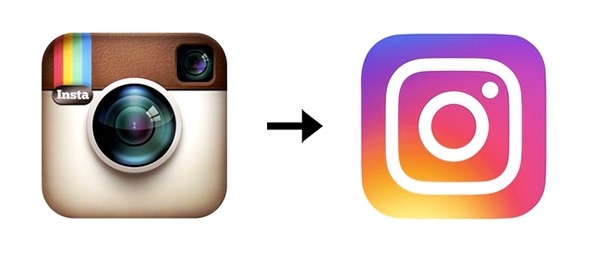
1. Instagram– Instagram tops our list of 7 of the biggest logo fails, mainly because of the negative reaction that it evoked from their target audience. The original logo (as you can see in the picture) featured a retro-style Instamatic camera that reminded everyone of the technologies of their youth.
The original logo and app icon was nicely detailed and designed and seemed to create an instant connection between taking photos that are treasured and uploading them to the popular social media platform to share with others. When they decided to recreate the famous logo a few years ago, fans reacted negatively. They said that they liked the original logo better because it was instantly recognizable as a camera icon and they associated it with taking photos of family and other events.
The problem seems to be traceable to Facebook’s purchase of the app in 2012 when they decided that it needed to reflect the changing culture of people using the app and how it has evolved into a modern symbol of professional media rather than just an app for friends and family. Still, the move seems to be a bad one when you consider that many customers were so unhappy with the change that they uninstalled the app. That’s how influential a logo can be!

2. Green Parrot– We thought it would be good to include at least one example of a small business that makes a terrible mistake in their logo. Though not as well-known, this company, Green Parrot, features a green parrot image that states, “Our beaks pretty long,” leaving out the apostrophe in the word, “beaks.” But that’s not the worst part. After reading how long their beak is (a metaphor, we think for efficiency or power), the beak is barely visible in the picture.
The problems with this logo are self-explanatory. We can only hope the company redid the logo to do what they say they are going to do and that they run it through a grammar check before making it a part of their brand.

3. BP (British Petroleum)– We can’t feature a post about the worst logo fails without mentioning this mother of all boo-boos. BP decided to go “earth-friendly” in this logo featuring a bright sun shining behind a green logo that resembled leaves on a tree. To their dismay, only a few month later, BP was responsible for the worst oil spill disaster in the history of the world in 2010.
Here is a picture of the original logo, the new logo, and another logo that disgruntled customers drew after the oil spill disaster. Oh, and did we mention that BP spent $211 million dollars on the new logo?
This was one of the worst examples of misspent funds on a business venture that we’ve ever heard of and one that BP is still trying to live down.
Don’t make the mistake of assuming that your logo will always complement your brand. Also be humble enough to know that you cannot tell the future. You should avoid any logo change that involves factors that could influence the way people view your company and your reputation. BP did not see the possibility of an oil spill in their future, but they should have.

4. Animal Planet– One of the most popular networks on TV is Animal Planet. A few years ago, they decided to change their logo from a globe with an elephant and the “Animal Planet” title to a letter-only version with a sideways “M.” It was hard to read and confused many viewers who probably ended up on the Discover channel or thought the “M” was an algebraic symbol. Remember that people are visual and including a graphic or a semblance of one in your logo is important to create meaning for your logo.

5. Verizon– Verizon had a great logo with a dynamic “Z” that looked like it was taking off into space, as well as a large check mark that sat on top of the “v” in Verizon. When they decided to change their logo to delete the red “Z” and make the checkmark much smaller, they probably didn’t realize what they had done.
Looking at both images and comparing them tells the story. The changed logo almost makes you think of a grocery list where you are checking off an item, or perhaps a teacher’s red ink mark indicating that your answer is correct! It’s not a powerful logo.
But that’s just our opinion. Apparently, Verizon thinks it was for the better. They still have this logo in 2017. You’d have to check with their CFO to see if this decision has affected their sales in any way.

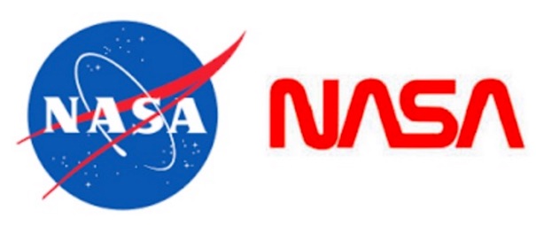
6. NASA– What was NASA thinking when they changed from the universe encircling NASA to a barely readable black “NASA” font? Astronauts are brilliant, and the people of NASA are true scientists. Perhaps that’s why they should have left the logo design to the right-brained designers! We did check on the logo today, and we were delighted to find that their main site has the original logo safely back “on earth!”

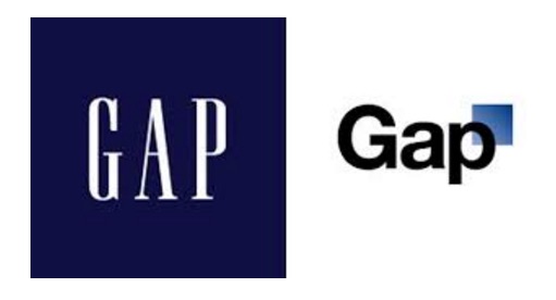
7. Gap– Okay, a brand is allowed to do what they want with their logo. But Gap truly shocked the world when they changed from the attractive, bold logo of three capital letters with a nice font on a blue background to a lower-case almost “shy” logo. Sometimes it’s best to leave well enough alone!
We went to their website and noticed, however, that as of this writing, they had reverted to the original image! I guess the CEO came back from vacation.
Summary: To Build a Logo
Well, that’s the wrap-up of failed logos. Understand that it’s only our opinion and you should feel free to do whatever you want with your business logo. Still, every little thing matters and you need to put in a great deal of thought before changing your logo to something that your customers may find repulsive, strange, or even unrecognizable.
Rather than make these mistakes, check out our online portfolio and see what you think. We are logo design experts, and we customize every logo to fit your needs as a brand.
Call on us for our previous design services at logodesignteam.com and avoid falling into these tragic patterns. Oh, and while we can’t tell what the future holds, we promise not to charge you $211 million for any of our logos.


