Look at any of the most successful brands and businesses in the world today, and what are you going to find? In most cases, a great looking logo design that not only represents their brand well but also one that is loved by their customers and audiences. This can definitely be said of brands like Apple, Nike, Google, and Target. Many of these brands don’t even need to include their names within their logos, as they are that well known.
So what does it take to create a successful company and brand? Do you need a great logo design or a great business model first? Well, each actually goes hand in hand. Of course, you need to have a great business or service and something of value, but you will also want to start branding yourself or your company at the same time.
With all of this in mind, we asked for the advice and opinion of many different marketing experts, entrepreneurs, bloggers and business owners in the world today. Not just about what their favorite brand logo design is, but also why it’s one that has grabbed their attention and earned their trust.
42 Marketing Experts Share their Favorite Brands and Associated Logo Designs

My favorite “brand” logo is the logo from my favorite rock’n’roll band: Metallica. I guess their music and my experience with Metallica impacts what I feel when I see the logo myself, but newbies to the logo and the band probably feel that the logo looks cool, that it’s aggressive, dark and mysterious. It’s cool to think that they’ve used that same logo for more than 30 years now and that it is still relevant and impactful. It’s got a real longevity as a brand logo, a longevity that only few companies (or bands) ever achieve. And the logo is so appreciated that it’s now spread to the more mainstream culture of Instagram celebrities and other people who wear it but have (probably) never listened to the music of the band that created the logo.
Marko Saric – HowToMakeMyBlog.com
_
For me, one of the most iconic, though underestimated, logos of all time is the Target logo. Though it may not be as globally recognized as Apple, Nike, or MasterCard, it definitely holds its own and is recognizable amongst a diverse group of people.
When I see the Target logo, a simple, bright red bullseye, my mind wanders to many different familiar places. As a discount store that prides itself on providing families of all types high-quality products for just about everything, the Target logo insights a sense of comfort within.
It’s cool, stylish, and trendy, while at the same time traditional, timeless, and friendly. It invites you to spend money wisely, on both required and coveted items, and doesn’t make me feel like I’m on the super discount side of the spectrum, nor on the ultra-fancy side of the spectrum.
For me, the Target logo gives off a sense of wholesome family pride that wants to include me, my spouse, my children, and even my friends into the mix. It’s recognizable, relevant, and yet has been around for ages. When a logo can withstand the test of time, remain trendy, and encompass such a large target audience, that’s when you know it’s a keeper.
Lindsay Liedke – WPKube.com
_

The Apple logo is a wonderful work. It’s so simple, and yet instantly recognizable and always modern.
Where many have changed with time, Apple has had just 6 logos throughout their history. Of those, all but the very original feature the iconic fruit-shaped outline. Only the stylization and color has changed with each iteration. The same basic outline remains. It’s as if they’re sticking to their original purpose, while adapting with to the current climate.
From the original rainbow logo from 1976, to the current all-black design adopted in 2010, each uses the same basic shape, while adapting the coloring to fit the times. It’s a wonderful way to maintain the iconic design while adjusting to the present day.
It’s an icon as powerful as the world’s most powerful band. Why mess too much with one of the most recognizable logos in the entire world? It sure seems to be paying off for Apple.
Ben Brausen – BenBrausen.com
_

I’ve always been a huge fan of logo designs and the way different companies brand themselves. Some of my favorite logos today are the ones of NBA basketball teams and how are they are so creative and unique in their approach to define the look and feel of each team. This can also be said of all professional sports. Not only do some of these logos represent the brand, they also can represent the fans and their support for the team as well. Just take a look at the Oakland Raiders and how their fans have dressed up (as Raiders) and used the team colors of black, silver, and grey to paint their faces and show their rage and support for the team. At the same time, the Chicago Bulls, have a fierce bull logo that represents their strength and dominance (which was clear back in the 90s with Michael Jordan). No matter what team is your favorite, there is a brand associated with it and one that millions of people loyalty follow in the process.
Zac Johnson of Blogging.org
—
I love the McDonald’s brand logo because it helps me feel happy. The coloring, symbols and overall feel of the brand reminds me of happiness, fun, and quick, tasty fare that I usually enjoy only when spending time in an airport during our world travels. I eat McDonald’s infrequently yet love the Golden Arches and what the logo represents. Fun. Happiness. Tasty, quick and easy fare which you can enjoy with family and friends.
Ryan Biddulph – BloggingFromParadise.com
_

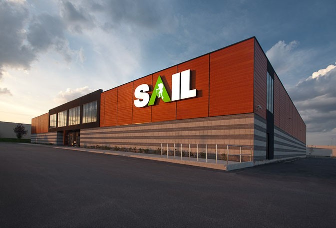
I really like the Sail logo. Not the dull one you’ll see on their website, but the one you see on the front of their stores. The website logo has been neutered. See the difference?

VS
David Leonhardt – THGMWriters.com
_

My current favourite brand logo is Fish Food. When I see it, I am filled with envy. I wish I designed that iconic skeleton of fish that is their very popular logo. It’s the work of a creative genius. I know my friends love it too. I can’t say it’s very simple like Google or FedEx logo. I think designer spent a lot of time researching it. It’s very memorable logo. At the same time, great logo should contain something about the brand. I think this logo contains two words perfectly “fish” and “food”.
Evgeniy Garkaviy – Violins.info
_

It has to be Apple. Their branding is so superb that it invokes all of these wonderful feelings the moment you notice their logo somewhere. Feelings of luxury. Class. History. Elegance. Even mysticism. The logo has such a great history along with the company, and to this day people aren’t sure exactly what it means. The fact that it’s been talked about so much attests to how iconic it is.
All of that, over a simple little shape.
James McAllister – Starlight-Baby.com
_

I really like the Nike brand logo. I feel motivated when I see it. As you know, it’s a simple logo that looks like a check mark. For someone who has suffered from depression (and still does, sometimes), seeing such a motivational logo is a good thing because of the positive impact it makes!
Lorraine Reguly – WordingWell.com
_

I’d say it’s the “Ford” logo.

A few reasons why it’s my favorite brand logo:
- Font text – its font resembles the elegance of automobiles one can buy from the company. It speaks power and authority over its competitors.
- One color – blue that stands for peace and calmness
Venchito Tampon – VenchitoTampon.com
_
I’ve always liked brand logos that combine both a logotype and a logomark. I eat at Snap Kitchen two or three times a month and love their logo. Its a great logo based on a modern sans serif typeface that’s easy to read. They incorporate both a fork and knife within the logo, it makes it fun and gives their brand a personality. We tried to the same concept with the HealthJoy logo by using both a logotype and a logomark of a stethoscope. You instantly understand that are work within the healthcare field within seconds.
Rick Ramos – HealthJoy.com
_

Naturally its going to be the Mailbird logo! We used 99Designs for it before we launched in 2012. When I see the logo, its not that I think it’s the best and most beautiful logo in the world, but more the history of it that means a lot to our processes at Mailbird and the journey we had and continue to go through in unlocking innovations to helping millions of people around the world manage their email and productivity through a unified experience with Mailbird. We’ve had some people say, oh it’s very similar to the twitter logo. This in part was intentional, as it had some familiarity. It is also more literal since Mailbird is an email tool….we have the bird incorporated into the @ sign which is associated with email. So it’s easy to remember since it’s tied to the name of the company itself. The color we chose was selected from a panelist of our target customers for Mailbird, and it seemed to be the most familiar color. If it were up to me alone, I’d choose something that really stood out from that classic blue you see so many places for online companies. But in the end, this is the one that won which is most important when connecting your brand and logo to your existing and potential customers.
Andrea Loubier – GetMailBird.com
_

My favorite logo design changes on a regular basis, however, what I find to be a successful logo design is BP’s flower logo design because it conveys an image of being environmentally conscious, with energy and power. Although this may not be true for an oil company, it’s the perfect example of how powerful a logo can be. A second runner up would be Milton Glaser’s I <3 NY logo.
Jacob Cass – JustCreative.com
_

I like brands that are fun and don’t take themselves too seriously. In my opinion, this helps make the brand more relatable and approachable which is a great foundation to have with your customers. This fun way of branding is what I strive to emulate in our brands.
I think that Apple pioneered this in many ways because how many other computer companies do we know that are named after a fruit? I’m sure we can all agree that their quirkiness approach has paid off. It makes the brand unforgettable and stand out. Sometimes when others in your industry are all going one way, pick a different path. Another favorite brand of mine is Target. Whenever I see their commercials on TV, it just makes me want to go their stores to see what’s new. Spot, their adorable dog mascot, takes their brand to a whole new level.
Syed Balkhi – WPBeginner.com
_

My favorite brand logo has to be the Nike swoosh. As someone who enjoys watching and playing sports, Nike is a brand that is close to home. The feeling that I get from seeing the Nike check mark is one of the sweetest emotions. By seeing that check mark, I feel unstoppable and I get a sense of motivation inside of me to increase my level of performance. The brand logo is so simple, but it can incite a great feeling inside people.
Jeet Banerjee – JeetBanerjee.com
_

My favorite logo has to be Amazon’s. It’s so simple and yet reassuring. I love the way they have ingeniously used the arrow from a to z, conveying that they cover everything from a to z.
Mohit Tater – MohitTater.com
_

I’m highly biased but Apple is my favorite logo. I think it’s because of the values the company stands for. They emphasize lifestyle choices and empowers people to create. It makes me feel that I can become anything I want to be if I dedicate myself and focus on one thing at a time. Their limited product line and premium positioning make it one of a kind. That’s what I value in my life as well. I believe in creating the best or nothing, leaving a legacy and empowering people.
The logo might not be as special if didn’t have mentioned emotions associated with the brand. I’ve been a long time customer and experienced their products and philosophy firsthand. That’s why Apple’s logo evokes such strong response every time I see it. It’s a reminder to focus on what matters, stay true to myself and accept the fact that I can’t please everyone.
Tomas Laurinavicius – TomasLau.com
_

Tesla. A lot of people compare Tesla to Apple, and rightly so. Steve Jobs wasn’t a man or a myth — he was a legend! Unlike Steve Jobs, however, Elon Musk doesn’t just bring vision and raw ambition, he also gives his followers an ideology. Something they, “the misfits” can believe in. Musk has made it trendy to be green.
When I see the Tesla logo, I don’t just see conspicuous consumption, and luxury for the sake of luxury, like the typical auto-maker. I see individuals wanting to send the messages of, “We care about air quality! We care about noise pollution!” in a very direct way. One less internal-combustion engine on the road makes our neighborhoods that much cleaner. The Tesla logo reminds me that change is a slow, persistent process.
Cody McLain – SupportNinja.com
_

I would say a brand logo like NIKE is something I like because when you see if you think “Just do it” with sport. They do not even need to add any wording with the logo just a simple Tick of approval for sporting people.
James Norquay – BackLinks.com.au
_

My favorite brand logo is of the world’s most famous tech company i.e. Google. Google redesigned their logo in September 2015. Google’s logo is based on their in-house font “Product Sans”. In my opinion, the logo is very simple yet powerful. From the beginning, Google has used the same logo colors for their brand.
Rajesh Namase – TechLila.com
_

My inspiration for the logo is LOTOS, an oil company’s logo. Why? Because every time I look at it, I remember the basic principles of logo construction, which are always in the rating criteria when the graphic designer asks me: “Do you like the logo I have just created for my client?”. I no longer remember whether I read about these principles somewhere or I created them in my mind, but in my opinion, it is important to remember about the target group, its usage and feelings the logo provokes in its viewers when they look at it.
The following are my principles:
- The logo does not have to be beautiful; it must be easy to remember.
- Colours in the logo are important.
- The logo must be recognisable, even in black and white, and therefore the shape of the logo must be characteristic.
- The logo must be scalable, both in large and small format, and it should be easy to read.
- The logo is a symbol, let it mean something, but first of all, let it be associated with your industry.
- Depending on its graphic use, the logo may have different variants, which, however, form a whole.
Paweł Kijko – TimeCamp.com
_

For me, the most iconic brand logo of all times is the ‘Lego.’ It brings back the fondest memories of my childhood and makes me nostalgic about the good old days. Moreover, the ‘Lego’ logo still makes a powerful visual impact, even after all these years and it is one that you can resonate with, no matter how old you get.
I was recently at a toy store with my kid and chanced upon a ‘Lego’ set and knew that I had to purchase it. Lego is the world’s most powerful brand and the logo, which has evolved over the years, can still inspire a sense of trust and has cleverly adapted with changing times.
Playful, straightforward, visually appealing and instant recognition, is what makes the ‘Lego’ logo the best that there is!
Nirav Dave – Capsicum Mediaworks
_

My favorite brand logo is the “Lego” logo.
I like it for three reasons:
- It’s clear and simple
- It’s memorable
- It’s evocative of memories
How many people reading this article played with Lego toys while they were growing up? A huge percentage of you.
Because of the strong emotional connection with Lego that we formed as kids (and I can’t imagine how strong that emotional connection is for kids growing up building Harry Potter and Star Wars Lego sets!), 2017 lead to Lego’s highest revenue in 85-years.
Lego is my favorite brand logo. And when I see it, I’m reminded of the feeling of a cool fall Saturday morning, dumping a bucket of Legos onto the living room floor, and seeing what I could build from the pieces.
Kai Davis – KaiDavis.com
_

Nike is so iconic and appropriate for the feeling the brand conveys. It just has so much versatility as well, as it can be used in many different ways and still retain it’s symbolism. The checkmark has movement and it never feels too old or played out. When I personally see it, I get a sense of confidence and purpose. I think many people get this feeling like – yeah I can do it – when they see the Nike logo. Not many logos have that. If you see the McDonald’s golden arches or the Apple umm…Apple, you don’t get a feeling that YOU can accomplish things. It’s very rare that a brand has that much personal value built into it. Most logos just have their own brand equity built into it.
Chris Kubbernus – ChrisKubbernus.com
_

As a mountain biker myself, the logo of Santa Cruz Bicycles is my favorite. The logo speaks the language of all mountain bikers: bold, speed, and risk-taking.
However, I think a good logo is not just about the design. It’s also about the story behind the brand. Just like any great logo — Apple, Nike, Amazon, Santa Cruz Bicycles has a great story behind the brand.
Of course the design plays an important on delivering the stories too. When I first started AppSumo and Sumo, I don’t think the logo is important. In fact, I don’t think the web design, the domain name, and the brand is critical to my business.
As Sumo grows bigger, I started to notice the importance of a good logo and overall brand to the business. I even spent $1.5 million on a domain name.
A good logo evokes emotions. And an excellent branding leaves a lasting impression in your customers’ mind.
Noah Kagan – Sumo.com
_

My favorite brand logo has always been the Nike symbol. One of the most amazing aspects of this design lies in its history. It was crafted in 1971 by a graphic design student and costed Nike a mere $35! Fast forward a few decades and it’s one of the most recognizable logos on the planet!
When I look at the logo, it immediately makes me feel a strong jolt of motivation. Even though the design is incredibly simple, it represents so much. Due to everything the brand has contributed to the world, their logo encompasses meaningful characteristics of hard work, determination, and pushing oneself beyond the limits of their comfort zone.
To the uninformed eye, it’s just a checkmark with rounded edges. To everyone else, it is a symbol of the pursuit of greatness. The logo has become so much more than just the face of a brand. It is now the face of an entire mindset that urges people to step up and be the best human being they can be.
Manish Dudharejia – E2MSolutions.com
_

My favorite brand logo is Nivea. I love the clean design with minimum colors and the edgy font.
To me, it projects competence and quality. It’s as if a company is saying “We don’t need a fancy logo. We have nothing to prove here. We know we are good.”
I think a logo for a company is like clothes you wear.
You choose a certain dress to communicate your personality and to make other people like you (or at least to not run away in fear). A company chooses a logo to communicate their values and appeal to their target audience.
But of course, a brand is much more than a logo. It’s an image of a company shaped by the media coverage and their advertisement, and, most importantly, the quality of their product.
If you had a bad experience with a company or their products, even the most beautiful logo would evoke negative emotions.
Gill Andrews – GillAndrews.com
_

My favourite brand logo out of all of my businesses would have to be Influence Express. The simplicity, yet the meaning behind the logo is powerful and depicts what the company is all about. When I see the logo, I think of a system that will take your site from point A to point B. Our Train in our logo displays the forward movement that we want to take our clients sites and put them on track to have a successful business.
Kelley Jones – InfluenceExpress.com
_
My favorite brand logo is the Snapchat logo. Every time I get a new snapchat and the logo pops up it just gives me a happy feeling and puts me in a good mood.
Madeleine Taylor – ContentRefined.com
_

As a company, our favorite logo is Nike’s logo.
Why? Simplicity is key if you want to position yourself as a large enough company to handle your customers’ needs. It is easy to say, but difficult to achieve.
The Nike swoosh has many stories behind it, but they legitimately paid $35 for their logo back in 1971. The mark meant something to them, so it means something to us!
Their slogan “Just Do It” also has many stories behind how it began, but it is why the logo is so important to our choice as our top logo. The slogan and logo are inseparable – the logo makes you think of the slogan, since they marketed them both so heavily together.
Nike’s slogan was first spoken by a criminal that demanded the death penalty for his crimes! Believe it or not, a famous ad executive took the criminal’s “Let’s do it” statement and tweaked it to “Just do it.”
The two were inseparable, and the “Nike Swoosh” was positioned in our minds. The swoosh is a simple mark that connotates an extremely strong message to their target market even today – athletes around the world resonate with the message. Break through barriers, push through pain. Just do it.
It’s not easy, but to infuse a slogan into your logo is quite a feat, and that is why they’ve earned the title of our favorite logo!
Andrew Lowen – NextLevelWeb.com
_

Personally, I like the Apple logo. It is simple in its design, but it represents so many things as well. It symbolises creativity, ingenuity, simplicity and the beginning of something new. It’s also instantly recognisable in different colour formats, which isn’t something that all logo designs can do.
I also like its minimalistic approach. I do think the major brands have mastered the art of creating a simple symbol that can represent and convey so much meaning.
David James – BusinessGrowthDigitalMarketing.com
_

So I’m a big gamer geek. One of my favorite brand logos has to be the Sony PlayStation logo – it’s not the most clever logo, it’s not the flashiest, or most balanced – but it’s always been there, and it’s always felt “cool”. I grew up on video games and when the PlayStation was released in 1994 I just knew it was going to change the world – it introduced new games and new characters that no one really cared about, but charmed us and still show their faces to this day in games.
When I see the PlayStation logo, it reminds me of all of the things that I used to love, and still love. It reminds me of long relaxing lazy days at home as a kid – days that I still daydream about recreating again. It gives me hope, that you can build something long lasting and meaningful from a simple design element – The logo isn’t everything, but it represents everything – and with it brings the good memories, or bad – it’s up to the brand to manage that aspect, but a good logo does its job, and it doesn’t have to change like the wind.
Andy Sowards – AndySowards.com
_

I’m a big fan of minimal logos such as those by Stripe, Uber, PayPal, eBay, etc… However, I would probably have to say that my favorite brand logo is Google. It might seem a little cliche, but let me explain why.
I utilize Google for everything productive I do in life. I have a Google Pixel phone which keeps me productive on the road. I use Gmail for both work and personal emails. Most of my job description and even my hobby (blogging) entails doing SEO and writing, for Google none the less. So Google is my favorite brand logo, not only because I see it pretty much every day all day, but because I associate my daily work life with it.
Logos aren’t always about the design, but what they mean to the person when they see it, which can be different for everyone. I see the Google logo and I immediately see “possibility.”
Brian Jackson – Kinsta.com
_

Nike. It’s simple, recognizable, ubiquitous, works with any color scheme and matches perfectly with their slogan. When I see it, my mind immediately jumps to “just do it.” The slogan gives my mind an energetic jolt. Even though it’s branding a company, the slogan and logo both work well in isolation, so repeating the slogan does not feel like a corporate sell out. It’s not annoying to repeat like a blatantly brand/sales slogan like “I’m lovin’ it” and the McDonald’s Arch.
As a business owner, it’s also encouraging to see such a simple logo become so powerful. It’s a reminder that great does not have to be complicated. There are mountains of marketing ink spilled on design – but it’s cool to think that a small business can create and build on something simple. The logo itself was designed by a student – not a high dollar design firm. It’s lasted a long time – and doesn’t even need the company name to appear with it. Just do it.
Nathan Shivar – ShivarWeb.com
_

I love Apple’s logo. It is elegant, clean and stunning. Here’s how Mr. Janoff (the creator of Apple logo) described the importance of it. He said he included the bite “for scale, so people get that it was an apple not a cherry”. Also, it was kind of iconic about taking a bite out of an apple.
Anil Agarwal – BloggersPassion.com
_
My favourite brand logo is SpaceX’s logo. I can’t think of many logos that are more futuristic looking than this one. When I look at it, it makes me feel like this is a company that is truly forward looking. It screams innovative and high-tech. The stylized X reminds me of the path of a rocket ship escaping Earth’s atmosphere and the colour palette also, to me, encapsulates what the company stands for (blue representing the Earth and silver representing the metal of a spaceship). I also like the way the font has been stylized with missing lines on the X and the E. It makes me think of innovation and creativity.
I know that when Elon Musk founded SpaceX, his goal was to change the world by making human beings an interplanetary species (a lofty goal!). The company is all about ambition, invention, technological improvement and advancement, and in my mind the logo captures all of those values.
Brett Langlois – PureSEO.co.nz
_
The Airbnb logo is one of my favorite logo. Feels like perfect logo combination. Logo symbol itself is a combination of four simple symbols: a head to represent people, a location icon to represent place, a heart for love and then an A for Airbnb.
Logos should best represent what your company stands for and what you wish to convey about the service or the product you are offering. Logo concepts are developed on this. If I were to tell which logo I was impressed, well there are couple of them to be listed.
One logo which I always carry in my mind for being one of favourite is that of Airbnb. The company provides home-stay, hotel rooms, hostels and rental rooms in different location around the world for a homely feeling accommodation.
Now this was very simply put across to the public with an attractive yet simply designed logo. Their logo Belo, as they call it is a combination of four symbols; each of them which strongly represents what the company serves. It has in it the letter ‘A’, a heart, people or man and the location symbol.
The location symbol is because it wide-spread across many places- cities and states; the people symbol that says it’s for the people or tourist as it targets that; the heart, that connects to emotion of care and love that you get at home – a sense of belonging; and the letter ‘A’ stands for the name – Airbnb.
These entire complex concepts are very brilliantly conveyed through a simple design that anybody can connect as it’s also very catchy in red colour – the colour of warmth and love. Moreover, on a graphical point of view, the logo can be scaled to any size and can be applied to any surface without any worries..! This very simple yet exquisite logo is one that has truly impressed me.
Vipin Nayar – Acodez
_

It’s hard to pick a favorite, but there are a few that stand out to me. The Coca Cola brand logo is the first one that comes to mind. The logo may have changed over the years, but there are a few design elements that remain consistent despite all those changes. And seeing the logo instills a feeling of nostalgia for me. It was a huge part of almost everyone’s childhood, so the logo stirs up those childhood memories immediately.
There’s also the Target logo, which is distinctive and relevant to the brand name. This too has remained almost unchanged over the years, always including a bull’s eye. When I see the logo, it immediately attracts me because of the bold color and makes me think of THE store to go to for great deals.
And of course, there’s the classic Nike swoosh. Despite a few changes in how they write their brand name, they’ve consistently used the swoosh for decades. So when I see it, it makes me think of dependability – a classic brand that I can trust to produce high-quality sportswear.
Shane Barker – ShaneBarker.com
_

Favorite brand logo is Coca Cola. I am really amazed by their logo creativity, logo speaks a lot about your brand. Having a good logo is extremely important to your business and to the branding of your company’s name, but it is also important to help attract new customers. When people see an eye-catching logo on advertisements or promotional products, it will stand out.
Coca-Cola has maintained its brands for a long time and they keep making their brand stand out because of their logo. With careful marketing, a Logo can become the main reason for the sale of a company’s product. So I had my product logo and I paid to a designer lot of money so that my product Schemaninja logo should stand out from other product.
I have learned this that brands pay lots of money for their logo because people feel attached to the brand if their logo makes them feel best.
Jitendra Vaswani – BloggersIdeas.com
_
Being in the web design space, I see a lot of logos. An entire brand is often based on the logo. It’s important the brand logo communicates the correct emotion for the industry that it’s in. For example, a fitness brand might make you feel energized, while a humanitarian brand should evoke peace. I feel the logo is the first step to connecting to the visitors’ emotions. A logo also needs to be memorable.
Choosing a favorite logo is difficult, but one immediately comes to mind. The Amazon logo has an amazing design. I love how the line goes from “a” to “z”, signifying they have basically everything. I also like how it creates a smile with its design. This logo even has a custom wordmark. This brand logo is extremely well thought out, and the feeling I get is a sense of great customer service, while knowing I’ll most likely find almost anything I can think of.
Dario Zadro – ZadroWeb.com
_

My favorite brand logo is Puma. It shows movement in the leaping puma while being a static logo. It’s clean, simple, and evokes action. It makes me want to get up and start jogging or riding my bike, which is what it is intended to do. This proves that the logo gets its message across about being a sportswear company and having the skills of a Puma without using words. Of course, I’m pretty partial to the Due logo as well. Our team produced something that tells you what we do in a very visual way with the dollar sign “D.” Our customers and prospects immediately know we are there to help them make money.

John Rampton – Calendar.co
_

The Nike logo is possibly the most famous and rememberable brand logo. Nike gets its name from the winged Greek goddess of victory. The logo is officially called the Swoosh. In 1971 the creator, Carolyn Davidson, was given 500 shares of stock for the design. The stock was never sold and is worth over $1 million today. The logo captures the essence of the speed and motion, which was the motivation behind the logo. For me its simplicity is its brilliance. When asked the question, it was the first logo that came to mind.

Allan Pollett – AllanPollett.com
_
How to Create a Brand Logo Your Audience Will Love
Now that you’ve had an opportunity to read through some of the most respected and well-known brands in the world today, have you given thought to what your favorite logo design and brand is? It really does mean something when you think about how an audience will pay more money for a product or service, simply because of the logo or brand that is associated with it. With this in mind, you should also be thinking about how you can make your existing personal brand or business logo even better.
If you don’t currently have a logo design for your website, blog, or business we would definitely love to work with you to create something amazing. Even if you simply need to create a digitalized version of your logo or would like to freshen it up with a new look and feel, we have the design team and resources to accomplish whatever it is you might be looking for. To get started, click here to contact us for a free consultation and you will soon have a logo that brands your business for the better and gives it the look and feel it deserves.

