The evolution of a logo has taken us from simple wall paintings and posters on tree trunks to the graphic world of animation and 3D. This journey reflects the positive changes in technology and the understanding of marketing strategy. With the emergence of new types of businesses, it has been imperative that a logo covers the novel requirements of the 21st-century organization. Marketing professionals have experimented with graphic and text logo to study their impact on consumer retention.
One thing that has remained constant, however, in this fluctuating environment is the need for a logo to relate to its audience. No matter how graphic we get, if the logo fails to communicate with its audience, it can be safely dismissed as a failure. This is the reason why the use of text has not yet been outdated in a logo design.
Text enables the consumer to make sense of the product or service offering and decipher the nature of the business it is representing. Just by the kind of language used, we can gauge what category the company belongs to and what its target audience might be. Hence, it is crucial while designing a logo to look into its text element. We highlight the must-have elements for your text logo that you simply cannot afford to ignore:
1. Geometric Experiments
Graphic designers are now equipped with various tools to experiment with the shape and size of their text. This is not limited to a discussion on the basic squares and circles, but text elements that go beyond two-dimensional figures. We see more and more instances of cubes and other multi-layered designs being incorporated in logos. Texts that give a graphic illusion of being hollow or 3D etc. are widely in use now thanks to advanced software.
With increased freedom in the hands of designers, abstract figures have also taken the forefront. Texts artistically shaped in a warped manner that immediately attracts the attention of the onlooker. There are also instances of texts rolled over or outlined to other texts in case the brand name contains two or more words.
2. Readable Fonts
We ask students to improve their handwriting so their exam papers are more presentable. Being presentable in our logos also gains some additional points. No matter how much the text resonates with the consumers but if it is stylised in a shabby manner, it will irk them.
Designers can collaborate with Calligraphy experts and artists to make their text logo pleasing in appearance. This also helps get brownie points in the eyes of those who value stylised text and neatness in design as they make the logo visually appealing.
The manner in which IBM, with its signature strokes (similar to Adidas), is designed makes it strongly engraved in our memory- which is what a logo is aiming to achieve.
 3. Color Combinations
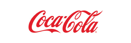
A recent study analyzed around 50 logos for brands including Coca-Cola and Walt Disney to study their color combinations and arrived at a list of preferred hues. This extensive research revealed that red and blue were the most popular colors for logo choice amongst successful companies. Additionally, it stated that 43 of the top companies use no more than two colors in their logo designs.
This gives us valuable insights into the world of logos and why we encounter similar color streaks among top companies. Research from Logo Factory further quantifies it. Their results show that 33% of the top brand’s logos use the color blue and 29% use the color red.
Therefore, incorporate these to enhance the possibility of our logo getting noticed and seen as one of the premium logos in the world.
 4. Character Extensions
There is no denying that characters in a logo enhance its appeal and increase its chances of getting noticed. So why not combine characters and text in your logo and give it a more dynamic look?
Sprite, for example, has a lemon on top of its text and that gives the consumer an idea of its citrusy flavor. They have thus communicated their product info without the consumer having to fear wasting money on trial and error.
For a character uniquely used in a text logo, we may take a look at Amazon. They have a small arrow that joins the “a” to the “z” below the text. This gives the message that they cater to all your shopping needs from “A to Z” with a single click.
Such innovative ways in logo design have always yielded results. Nestle also uses their graphic of “birds and nest” to complement their text.
 5. Accompanying Texts
Just like a character, a text accompanying your logo can be used to accentuate the original text (brand name) or even to add some valuable information to it.
For example, many luxury watch makers add “established since (year)” within their text logo to emphasize their aristocratic value. This makes the customer drive home the point that they are buying something that is a part of a tradition. They have now joined in the legacy.
Accompanying texts can be tricky and should be used sparingly. Only the most important info should be added and in a concise manner. Anything more than a few words- it becomes a slogan or a tagline and should be reserved for that. However, used correctly, it can stamp the brand name and logo in the minds of the consumer.
Choosing a text logo means being selective in your vision. It immediately restricts the use of other techniques and focuses on the text aspect of the logo. This has proved to be sound business strategy over the years since most of the industry stalwarts have their logos in pure text format.
Google, Facebook, Philips, Honda, Prada, Gucci- you name it, most of them are on the list. These companies have realized that being specific in their design and narrowing down their focus on one aspect of their logo made it more recognizable.
And here’s our most vital tip!… Trust only the experts in logo design to use the above elements and incorporate them into your logo design to give your brand a distinct identity, and therefore, give you an edge in the market. After all, a logo can be your claim to fame!

