Typography is the art of designing, modifying and arranging textual aspects to produce attractive graphic designing elements and brand identities. The typographic prints are fashionable & appealing. If the recent trends are to be followed, the designers are creating creative works of art, including typography logo design frequently.
So, what is the reason behind their popularity? There are these three ethos:
- ‘Live off the land.’
- ‘Back to Basics’
- ‘Make do & mend.’
Typography has moved forward to the point where an artist can select from a variety of typography font for creative purposes, like producing typography logo design. Typography can be seen everywhere; like on artistic layouts for publications, functional computer programs, merchandises and what not?
So, here are the 10 Typography logo design trends for you so that you must know by heart!
1. Digital conversion is the need of the hour
Software today can turn typography into outlines because the internet recognizes fonts that are digitally modified. Digitally converting any artwork like typography logo design is essential. Today’s technology does not identify unknown fonts that are hand-made. Therefore, without a digital modification, it is impossible to establish the real value of the typography creatives.
2. Textual typography logo design is popular
Textual typography creates layouts and shapes which can be arranged for making it the focal point of the logo design. Whenever it becomes the focal point, it surpasses the boundary of being a mere graphically designed element and starts to communicate visually, which is the primary purpose of the logo for a logo. A written word is most natural to comprehend and therefore, amazing typography logo design that is formed in a straight-forward pattern, appeal the most!
3. Typography with Style
Only a perfectly harmonized & stylized font can give a stronger message of communication to the reader. It adds a stronger punch to the entire articulation method of the typography logo design. The stylized typography font has the power of conveying the meaning of the word. So, choosing the right fonts and the layouts is essential. And there is indeed no doubt about it!
4. What type of information do you want to share?
Here, possibilities are many. The logo designer must gather all the information that he or she wants to deliver by selecting the best elements of typography inspiration for the creation. A logo communicates with the general public, and therefore, it should be made simple, clear and lucid. A creative typography based logo is placed across numerous platforms and mediums like banners, billboards, visiting cards, merchandises, websites and what not? So creating it medium-friendly shall be the 1st of the many considerations.
5. Who is your target audience?
Typography designers have to know about the taste, sex, range, age and choices of the audience. Even the social influences like cultural and political preferences too play a significant role. Keeping these things in the mind, the designers have to select a typeface that intrigues the interest of the onlookers towards it.
6. Legibility is also an important factor of consideration
Here the reference is towards the ease of using the typeface that can be recognized from a distance. Effective communication is the primary function of any logo, and in the case of the typographic logo, the job becomes extra challenging! Why? Because text logo design might seem to be an easy alley for communication, but, it takes extra effort and attention to create a typographic logo that will reflect the purpose it is built for. Ask yourself, will the audience be able to understand the logo you have designed? If your selected font and elements bear the answer yes, then you are good to go!
7. Readability pools in the interest of the people
Readability strikes the right chord of interest when the audience can combine the letters used in the logo into meaningful words and then decipher the message. It concerns how the onlooker grips on to the message coded by the logo designer. The perfect unity of the combination of the individual letters creates communicable symbols in creative typography.

8. Is your logo appropriate?
Without proper appropriateness of the elements, creating a typographic logo is not all going to serve the purpose of reaching the targeted audience.
9. Know whom you are working for
Who are they? It is the right question that you must ask. Also, you can refer to their old designs (if any) when you are going to create a logo for them. You may feel that immersing yourself in the business entirely is not a great idea, but knowing the brand carefully will give you the idea to understand its competition and then follow its trends and ways in which it captures the attention. This is how the logo design trends are set, isn’t it?
10. Employing the professionals rather than DIY
Professional logo design agencies and skilled logo designing experts can only understand what a logo requires to stand amidst the rest. Face it; not everyone can be an expert when it comes to being arty! Leaving the crucial job of designing the textual logo with the experts is a great idea. It not only saves time, but you will also save a lot of resources while receiving the best typography logo design for expressing your brand identity.
The visual basics of typography trends 2018
The ideal typography font for typographic logos is Serif (Respectable, comforting, reliable, traditional), Sans Serif (Clean, modern, objective), Script (elegant, affectionate and creative) & Decorative (unique and expressive).
- As for the colors you can choose from Gray (calm & balanced), green (healthy & peaceful), blue (trustful & firm), purple (wise & creative), red (bold, youthful & exciting), Orange (confident, cheerful and friendly) & Yellow (warm, bright and optimistic).
- To make your logos versatile, design them in vector applications like the Illustrator of Adobe. Photoshop must ideally be avoided so that the logo does not lose its scalability.
- The designer must be able to reproduce the logo in a single color and even after that, recognize it!
- Specify the logotype colors with Pantone references and CMYK to ensure the colors will be reproduced correctly when the logo is printed.
- Avoid mistakes like using a lot of font colors, fonts that short-living and trendy & plagiarism!
Get started with the following areas of consideration below:
- The goal of your typography creation has to be clear before getting started.
- Know what the readers are attracted to through a thorough market research.
- Emphasize on the elements in your typographic logo creation which you have found in your research.
- Try a lot of styles, sizes; colors underlines, patterns, etc. which will perfectly convey your mood and purpose to grab people’s attention.
- To portray your artistic skills, the designer must avoid overdoing things. The text should be eligible, even if small fonts are used.
- The characters must have the ability to be identified correctly for a smoother or seamless reading and understanding of the typography logo design.
- Use simple fonts, avoid capitals, consider the line space, line length, letter space, use contrast and vibrancy!
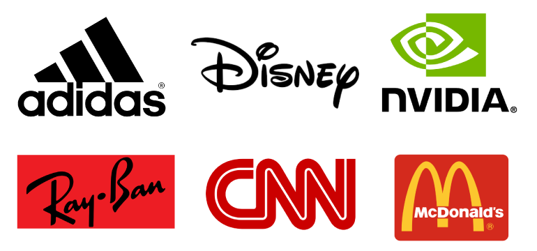
Here are some popular company logos with typographic examples
- Lettered and word logos: CNN, Disney, RayBan
- Combined (icon+text) logos: Adidas, McDonald’s, nVIDIA
To wrap up
When you are creating a text logo design, you have to aim at creating long-lasting relationships with the audience. Once you have understood the brand identity, its basic messages and positioning, it will be easier for you, the designer to choose the right elements to create a fantabulous work of art. You have to strike the perfect balance of following the ethos mentioned above and carrying off the shelf ides for creating logos.
Logo design team has been in the business of creating awe-inspiring logos for iconic brands for the past 10+ years. We have successfully designed more than 1 million logos for over 200 brands over the years. Trust our experts to design a logo that touches many hearts even as it helps you establish a brand that lasts!

