An elegant and appealing letterhead design makes a letter (an essential business stationery) a material to cherish. Letters are a material of great importance for any company. In the world of business, letters are necessary stationery items used for professional correspondence. Hence, a letter paper needs to have an appealing format to evoke the interest of the receiver so that he/she attempts to know more about its senders. Thus, exclusive letterhead design ideas are fundamental to heighten the importance of this marketing collateral. Its timeless design would enhance the importance of your communication level with your target audience and make them more interested in building a long-lasting relationship with you.
What is a letterhead?
It’s the heading inscribed at the top of the sheet of a paper(letter) used for written correspondence by a business organization. A ‘letterhead’ is a combination of the company name, address, a logo or brand design.
Tip#1: Simplicity is the Key – Letterheads Should Have Uncomplicated Designs
Letterhead design should be simple yet attractive. It’s imperative to keep the composition distinguishable because as letters bridge the gap between the sender and receiver, the visual elements must strike the right chord of the spectator. An uncomplicated design principle would allow the readers to decipher the content other than getting confused with the optical illusion. As written contents in the letter are the main matter of importance, every letterhead designer must plan graphical representations in such a way that showcases the contents suitably.
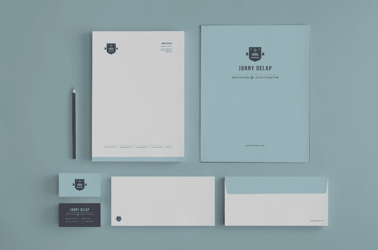
Image Source: Striking letterhead design: 20 case studies to inspire you
Tip#2: Embellish With Beautiful Borders – Consider Using Colorful Borders
In the past years, there has been a phenomenal progression in the printing technology. Hence, a designer can use this state-of-the-art technology and create visually stunning business letterhead templates. There can be stand-out creative elements like elegant borders to catch the reader’s attention. But all should be done keeping the content in focus – the most important ingredient on the page.
Borders enhance the look of the letter paper giving a beautiful finishing touch to the layout. Well-designed borders are creative ways to frame the content and also these can make the text more attractive. Expert designers always suggest of adding modern graphics instead of block colors in the layout. It’s always a treat to the eyes for the audience when borders are placed on the margin edge instead of the trim.
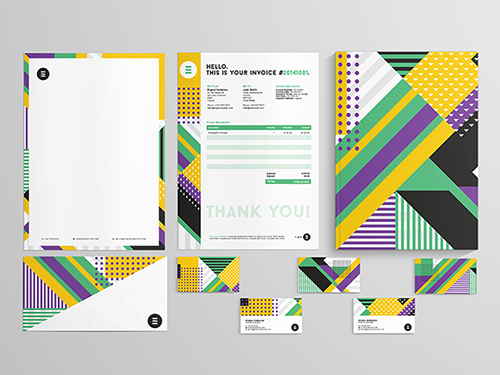
Image Source: 25 Examples of Excellent Letterhead Design
Tip#3: Watermarks are Indispensable – Don’t Forget To Include Them
Watermarks are essential ingredients of any published official documents that prevent texts and images from getting copied. These marks are said to be a fundamental element of a letterhead design because these are a subtle way of grabbing customer attention to your brand without using up too much of the valuable space of the document.
A letterhead can have a logo or words superimposed on an image as watermarks. However, using watermarks on letterheads is not a recent trick, designers from past days have been including watermarks in every stationery as an art form. A designer can intelligently create colorful watermark and graphics without affecting the message. Experts suggest that a designer can judiciously position a watermark in the center of the page and there’s no chance written elements get disturbed. To have a more visual impact, it’s recommended to set the watermark transparency tint to a paler hue.
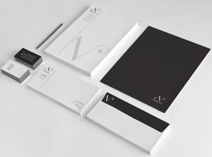
Image Source: Striking letterhead design: 20 case studies to inspire you
Tip#4: Typography – Focus on Creating Engaging Type Features
Fonts and typography are one of the vital elements of any designing. Focus more on creating brand-specific typos and fonts. You might experiment with bold or shadowed sans serif features or add a classic look. Turn necessary information of the letterhead into an artistic piece. Designers can also try using fonts like Century Gothic, Futura, Helvetica and many other mainstream fonts for letterhead.
Tip#5: Logo Positioning – Place Logo Near The Top of Your Letterhead
Brand logos are the most vital component of any marketing stationery. Hence, it’s necessary to clearly position the logos at the top left-hand corner of the letterhead because that’s the most important area that grabs the audience’s attention. Additionally, to create more appeal the surrounding white space of the logo should be highlighted elegantly.
Using logos suitably in your letterhead design is a fruitful way to engage your customers. Logos and symbols not only will add variation in your company letterhead format, but they also influence the mood of your clients, brighten up the content and give a new dimension to your letterhead.
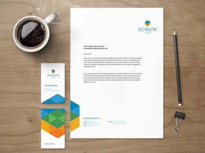
Image Source: Striking letterhead design: 20 case studies to inspire you
Tip#6: Enhance Letterhead Design with Special Effects
Creativity knows no bounds; a designer can apply anything interesting and eye-catching as letterhead design. Consider using special effects to make letterhead design take on an extra splendor. Experts describe several ways of producing the most appealing letterheads. One of the proven ways is to add more solid colors on the reverse of the letterhead. In addition to that, you can also overprint a spot-UV design in a way to reflect light differently to the non-UV-printed areas. This creates a visually impressive effect. There are also examples of using a specialist printer for letterpress effects such as embossing, debossing, foil blocking and die-cutting.
Tip#7: Make Good Use of Space with Meaningful Brand Representation
Your letterhead will look perfect if you make use of positive and negative space. Play with your creativity to include imagery that represents your brand. Several designers depict high-contrast like tones of red and white color scheme that enrich the look and feel of the creative. You can use your own imagination and present an eye-catching example.
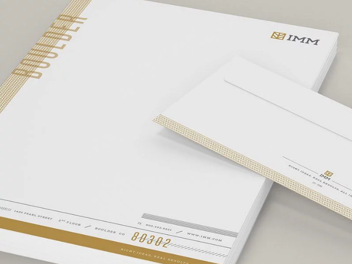
Image Source: Striking letterhead design: 20 case studies to inspire you
Wrapping Up
Letterheads are a traditional form of marketing and communication tool to attract the attention of the target audience. Their design plays a significant role in creating a lasting impression on the people a business communicates with. Therefore a thoughtful design of the letterhead can boost the brand value and make yours the most sought after company in your niche industry. Letterheads should be as creative as possible. They should possess all the branding elements – brand icons, logos and brand-specific color schemes. All these features would create a coordinated look that often spans across multiple print pieces like business cards and envelopes.
Do you strive to create the best letterhead and build an established with your clients? Just visit the Logo Design Team portfolio and treat your eyes as the most brilliant creatives. The artistic minds here are continually delivering world-class ideas to help you climb the corporate ladder.


