The brochure design tips would enable every designer to create an impressive brochure and grab the attention of the target audience.
In this age of digitization, a designer must be abreast about the continuous evolving designing trends to create an impressive printing material.
Designing a brochure is not only a process or a technique, but it’s an amalgamation of creativity and functionality.
The creative brochure design tips that we talk about here would help you plan the most stunning marketing collaterals of all times that are sure to sell.
Brochures have always been one of the most valuable marketing tools to add to a company’s proverbial marketing tool loop, and that’s the reason why you need to spend lucrative hours to weave gorgeous and compelling designing features to impress your target audience.
Our brochure design best practices will enable you to conceive fascinating design ideas. Use these brochure design tips and your consumers would have the extreme urge to pick it up and read it instantly at first glance.
Before you start planning for the next modern brochure design, take a look at the different types of brochures and the useful brochure examples. Think how these communicative items are used as marketing collaterals in any company. This categorization is necessary because it would enable you to understand the variation required in designing each specific category.
Continue reading and get a detailed idea on the different brochure styles:
Owing to market demands and changed perception of the viewers, interestingly brochure designing trends change continuously. Therefore it’s essential to be aware of the recent designing updates and plan accordingly.
Types of brochures and the designing elements:
- Gatefold Brochure – It’s a kind of handout used mainly for high-end marketing purpose and hence they demand grand yet corporate brochure design. If appropriately composed with all the designing elements (a perfect balance of color, typography and grid) this kind of brochure would work wonders in grabbing the attention of the target clients. Made of premium quality paper, this type of brochure is exceptionally durable. It features an 8-panel structure and is a compact material. While designing such a brochure consider providing a minimal look yet bring on that dramatic effect. In a gatefold brochure, the “gates” in the design are arranged side-by-side to create a compelling impact.
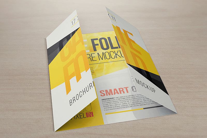
Image Source: Design Bundles
- Tri-fold Brochure – This type of brochure has 3 folds with 6 panels. It’s a common type of brochure used by almost all companies irrespective of size and annual turnover. A tri-fold brochure is one of the best marketing material for producing presentations and other necessary institutional information etc. While designing such a brochure the graphic artist needs to understand its exact structure and tri-fold brochure design ideas will enable him to know where to emphasize more and which area needs minimal composition.
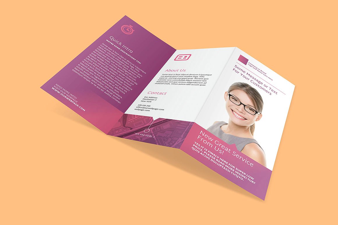
Image Source: Creative Market
- Bi-fold Brochure – Organizations mostly use this type of brochures. This kind of brochure has 2 folds that form 4 panels. A bi-fold brochure features a front cover, back cover and two internal panels where a marketer can present all the information about the company and its products and services. A bi-fold brochure can also be converted to a booklet with more detailed artistry.
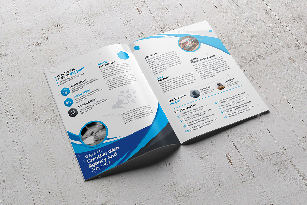
Image Source: Graphic River
- Z’ fold brochure – This brochure features an exciting look just like its name. Designers enjoy composing its features because, amongst all, this type is known for its extravagant appeal. Its accordion (musical instrument) like get up inspires the creators to create a visual hierarchy in its 3 panels. With product brochure design, there is ample space to incorporate about your company and product offerings.
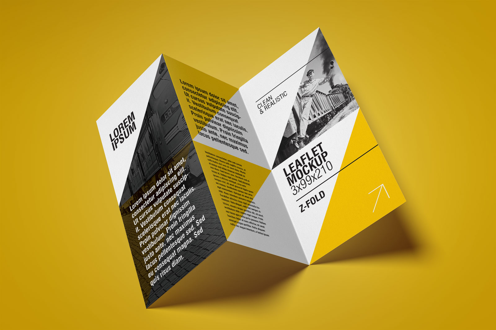
Image Source: Good Mockups
Brochure Design Tips 101: Create a Stunning Brochure That Sells
A brochure tells a story of the company and its products and services. To make it more appealing and memorable here is brochure design inspiration for the designers. Incorporate these essential elements of a good brochure design and create a work of art:
1. Insert Fascinating Photos and Graphics
Intriguing visual elements are a must for any marketing communique. You need to incorporate compelling illustrations and marketing brochure content to convey the company story. When you add such high-quality ingredients in a brochure it’s sure to resonate with the target audience and they would feel the urge to pick it up and read every single word. For precision and quality, it’s essential to take the support of brochure design software and tools like Adobe Photoshop or Lucidpress for masking, image alignment and changing the saturation as well as contrast.
2. Plan Strategically with White Space
As you know that any brochure design process requires proper utilization of every single white space. White space plays a significant role in emphasizing essential images and texts. Hence, you need to plan strategically using the white space element in a brochure. These white spaces should not look clumsy. White space is an essential area for any marketing material because it’s used to draw attention to other essential images and information.
3. Emphasize the Brochure Cover
Brochure covers play a vital role in attracting the potential customers. So, designers should explore their creativity and produce an attention-grabbing cover with excellent brochure graphic design. But, you should take care of not creating a cluttered design and focus on specific images so that they stand out among others, e.g., the company logo should get the maximum focus. A cover must consist of substantial and compelling fonts placed at the top.
4. Add Appropriate Colors to Set Perfect Tone
It’s imperative to choose colors that convey the perfect message to the target audience. Choose a color theme that complements your business type. Whether you provide light and recreational services or you offer severe corporate products set the tone of your brochure accordingly.
However, expert designers alert us not to use too many colors to distract the audience. The ideal color selection for a brochure is recommended as neutral hue because such shades are better suited for conveying a more severe business message.
5. Impress with the Element of Visual Proximity
Brochures can become more visually impressive when designers plan and place similar images and graphics in close proximity. Grouping such visual items together in one place creates a compelling visual effect. Thus, take care while setting photos, pictures and graphics, instead of scattering them all throughout, arrange them together to draw attention and impress your target audience. Expert designers confirm that clarity and proximity provide more weight to all the images and graphics.
An excellent brochure is informative, memorable and tells a story. With such marketing brochure ideas design a brochure and please your customers.
6. Repetition – A Vital Ingredient for Brand Recognition
In designing, repetition of graphics can lend a sense of stability to the brochures. For example, while placing the company logo, it’s advisable to repeat a specific logo or graphic throughout the brochure. Additionally, designers can plan to incorporate useful icons that are different in approach, yet similar in design. This designing technique is sure to draw the attention of your potential clients. Interestingly, such repetition of images and logos maintain a level of consistency for overall unity. A look at the brochure design inspiration 2018 will give you opportunity to create the brochures to build a trustworthy brand.
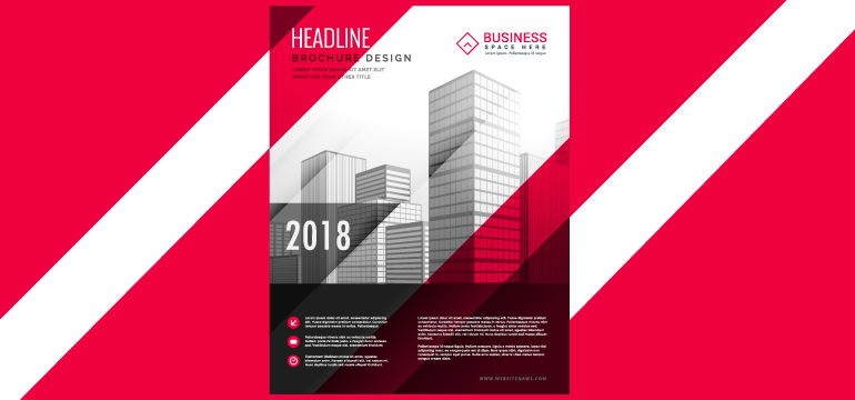
7. Visual Contrasts Create a Flow
Contrast is not only limited to color contrast, but it can also mean any variation including spacing and size. You could change the hue or shading of a logo to enrich the character of a particular element, or you could superimpose a small image over a large painting for visual effect.
8. Use Full Bleed Technique for More Effectiveness
In this age of digitization, brochures are still a printed marketing communication material preferred by the marketers as well as the clientele. That is the reason why you need to focus on its overall component while reproducing. Designers are of the view that while printing a brochure if you utilize the full bleed printing technique, you can achieve a design that extends all the way to the edge. This is a technique which allows the designers to trim a printed document for a desired visual layout without any noticeable white space.
9. Complete with A Compelling Call-To-Action
Similar to the cover the concluding portion of a brochure also holds extreme importance. So, it’s necessary to plan accordingly and create a compelling call to action area. The closing paragraphs of the brochure content must be interestingly done to create a lasting impression on the audience. Remember, it’s your last and final chance to influence your potential clients. So, insert a fantastic call-to-action graphics or text font to request the audience to take further action indirectly.
To conclude
A marketer design brochure with an ultimate goal to increase sales. The printed marketing materials like brochures, flyers, etc. have been used for a long time, and interestingly these documents have not lost their importance even when the world is getting digital. Therefore, to make these items more prominent and keep impressing the client base, we need to think of excellent design ideas. If you follow the tips mentioned above while designing a brochure and use visual elements judiciously and intelligently, you will surely create printed assets for your portfolio as well as the company.
Logo Design Team is a pro brochure designing agency that has years of experience in producing stunning design ideas for its client base. The moment you decide to design and print a brochure consider hiring professional creators who can provide you with the high quality graphic designs.

