In the present era, the hospitality industry is one of the most flourishing sectors of all. With the growing importance of the industry it has become vital for us to plan something unique to attract our customers and satisfy their needs. A well-planned hospitality logo design echoes the warmth delivered to the clients. The bottom line is after you establish the hospitality assets you need to decide how you want your story to be told with appealing logos. As logos are the face of any company, you need to evoke the feeling of belonging for your customers through the right use of the essential elements like texts, symbols, colors, etc.
To create an effective hospitality industry logo design, you must understand that your customers demand comfort and convenience. Knowing what your clients expect from your service would make matters easier to create a relevant logo. Whether you are designing hotel brand logos or are involved into travel logo design, you need to keep in mind that hospitality logo design should be simple yet versatile to create the first impression on your audience.
Does your hospitality icon need exclusivity? Then it’s time to find out about the indispensable components of the hospitality industry logo design. Here are the details of 7 of the most essential elements of hospitality logo design that set a welcoming tone.
1. Logo With a Distinct Personality
As the hospitality industry is widespread throughout the world ranging from lodging (including accommodations and restaurants & bars), transportation, cruise line, traveling, etc. and all have varied and intriguing branding techniques to attract people, you must design a logo that has a distinct personality and sets you apart from competitors. The amenities and services you offer should find a place in your logo design. The goal should be to send a clear message to your guests about what you provide to make them feel at home when they are away from home.
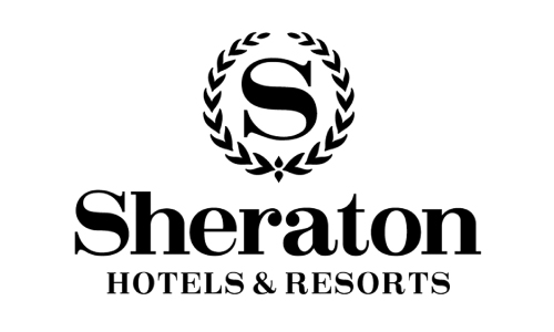
Sheraton Hotels & Resorts is the premier global hotel brand in the world. It has a logo design that reflects its personality distinctly. The brand logo is refined and it expresses its sophistication and grandeur.
2. Expressive Fonts May Do Wonders
It’s known that typeface plays a significant role in any kind of logo design. Hence to create a lasting impression on your audience and stand out amidst your peers create typefaces that are expressive. If you take a look around you, you would see that a strong brand logo is not dependent only on any particular symbol. Many use only letters to make the mark and capture the attention of the target audience. However, whether you use a fancy script or a serious font, it must reflect the tone of your business.
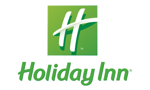
For example, the Holiday Inn brand designed by InterContinental Hotels Group (IHG) emphasizes on the letter “H”. This logo has a great appeal because of its color and orientation.
3. Induce the Elements of Storytelling
Induce an element of storytelling in your logo. Although it sounds clichéd yet, we can’t deny the importance of narrating what our company offers. Since the inception of designing logos for promoting brands, the approach of letting the core customers know about a venture through thoughtful creativity was significantly obvious. Hence, today also you must utilize the prowess of storytelling. Needless to say, it’s the best way to make easy for your target customers to understand whether you are a family-friendly or do you tend to serve high-end facilities to your customers.
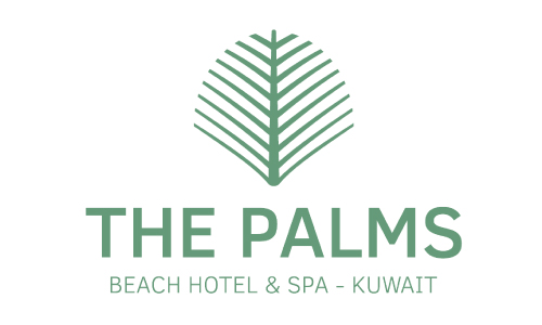
The Palms Beach Hotel and Spa, Kuwait has a logo that cleverly induces the element of storytelling. It’s one of the unique five-star resort hotels in the world that promises to pamper you the moment you be their guest.
4. Balancing Designing Features is a Must
Balance is one of the essential elements of hospitality logo design. You must know how to harmonize all the different design components and create a unique and unforgettable brand identity. Experimenting with different elements is a good idea, but you must keep in mind that without balancing each of these features you can’t produce the best logo ever. A logo that has too many shapes, symbols or texts confuses the clients and therefore diminishes the emphasis of your brand. So, every designer needs to understand the basics of symmetrical balance and asymmetrical balance to present their target audience something quite welcoming.
The logo of the Hilton Hotel and resorts is the epitome of sophistication and elegance. The design is an expression of thoughtfulness and creativity which aptly balances all designing elements to give an engaging feel.
5. Themes Have a Stronger Appeal
Themes are yet another defining aspect while creating a logo for the hospitality industry. Although the industry defines itself on its own terms and doesn’t require any kind of motif to get identified yet nowadays to appeal to its audience themes, have been playing a crucial role. It’s to remember that using themes would set your business apart from your competitors and enable your target audience to determine your company’s credibility. Market research shows that hospitality companies that design logos with specific themes are likely to be more appreciated compared to general hospitality businesses.
The Taj group logo is the best example of using themes in design. The combination of ‘Sun and Dome’ displays the rich heritage of the hotel group. The logo has a special significance in the designing industry because it reflects a blend of hospitality traditions with opulence.
6. Managing White Space For a More Warm Feel
White space is the place between design elements and also the space within individual design components, including the space between typography glyphs or most commonly known as readable characters. Negative space plays a significant role in designing; it enhances the image of the object of the design and brings the image into focus. According to design principles, negative spaces are of two types: micro and macro. Micro negative space is the one that is seen between the smaller elements of the design — for example- the space between paragraphs, individual lines of type or the space between letters and words. On the other hand macro, negative space is the space between the larger core elements of the design which include the header and the footer. In any logo design, you must give importance to the white space.
7. Simplicity Treat To The Eyes Of The Audience
Any significant design grabs the attention of the customers when it’s simple. Simplicity has always been a treat to the eyes of the audience. Complex designs put off the interest of the target audience. It’s quite apparent that people can’t decipher the real meaning behind the intention. So, it’s necessary to set a logo for the hospitality industry in a pure tone.
Sage Hospitality has a simple yet elegant logo. Designers can draw inspiration from this kind of representation. The logo is undoubtedly a treat to the eye of the audience.
Your Turn
Like every organization, logos play an integral role in the hospitality industry also. To promote food and services, you need to create branding stories that are sure to impress the consumers and encourage using your services time and again. Above all, a logo design developed following all the elements would help you stay prominent in the competitive market. Now it’s your turn to design a logo that’s original as well as eye-catching. Hope the collection of our hospitality logo elements has given you enough idea. Now portray your own logo and create a mark in the industry.
Are you still confused about incorporating all the elements into your hospitality logo? The Logo Design team does it for you. Come and unleash your artistry with the creative creatures.

