A great logo design, consisting of the best logotypes, although a small part of the branding package is an organization’s visual identity. Needless to say, logos represent subliminal meaning and people respond to it while selecting it as its brand. People prefer to define a brand before buying the product or service from a company.
Industry experts identified that customers have really an intimate sort of relationship not only with the brands but also with the symbols that represent the brands. Hence, in this new economic era, every brand tries to focus on its logotypes.
What is a logotype?
Logo design consists of letters and symbols – the letters are called logotype design and the symbol or icon is termed as logomark. Logotype actually displays the name of a business designed in a unique way. On the other hand, a logomark is a describing mark or symbol that doesn’t contain the business name.
Do you know which are the most expensive logos ever designed?
In 2008, BP paid an impressive $211,000,000 to roll out a beautiful new company logo.
Other major companies have paid much less for their logo designs. Back in 1971, Nike paid a graphic design student $35 for the swoosh logo and it still uses today.
Whether they paid a few dollars or millions, some companies have hit the jackpot when it comes to memorable logotypes.
From the ultra-luxurious to everyday brands, here are 7 logotypes we all know and love.
1. Coca-Cola
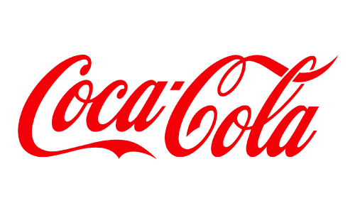
Coca-Cola standardized its red and white logo in 1923, using the Spencerian script. Although its packaging has changed over the years, the logotype itself remains virtually untouched.
The result? It’s now one of the most recognized logotypes in the world. In fact, 1.9 billion Cokes are consumed every day in more than 200 countries around the globe.
2. Subway
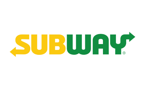
Subway’s iconic yellow and green logo has evolved only slightly since the 1960s.
The arrows pointing out of the first and last letter immediately evoke the image of a subway map. The colors, on the other hand, remind diners of the fresh and healthy vegetables they’ll enjoy on their sub.
3. FedEx
As one of the most recognizable brands in the world, FedEx has changed its logotypes over the years. In 1991, though, it hit one out of the ballpark by incorporating a hidden symbol in its logotype.
The negative space between the “E” and the “x” forms the shape of an arrow. This clever design reinforces the company’s dedication to speed and efficiency.
4. eBay
Perhaps one of the most colorful and unusual logotypes out here, eBay’s original logo remained unchanged for 17 years.
In 2012, they revamped their logo for a cleaner and more streamlined appearance. Designers chose to keep the same four colors and the letters touching to represent the community’s connections and diversity.
5. Samsung
Another company that’s successfully used creative logotype design is Samsung. What started as a tiny storefront in South Korea in 1938 has grown into one of the world’s biggest electronics companies.
From 1969 onward, designers incorporated the company’s name into the logo instead of the three stars it previously used. Its trademark blue ellipse, marking it at the center of the tech universe, remained unchanged for over 30 years.
6. Disney
From kids to adults, who doesn’t love the whimsical Disney logo? Symbolizing fantasy, entertainment, and everything fun, one look at the swirled letters brings you right back to your childhood.
Some versions of the logo also incorporate a fairy tale castle, which marks the entrance to nearly every Disney theme park.
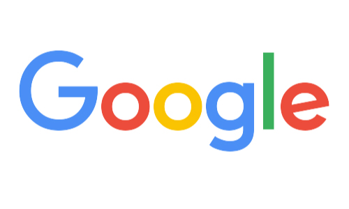
7. Google
No discussion of the world’s most famous logotypes would be complete without mentioning Google.
Its colorful logo has evolved over the years, but it’s always recognizable in an instant. This could explain why Google is worth a staggering $762 billion.
What do we learn from the top logotypes?
A logotype is associated with ‘picture superiority effect.’ According to logo psychology, human beings respond and recall visual stimuli compared to anything else. Hence, if you want your brand to be as the most recognized one, you must enhance your logo’s visual appeal. Several researches reveal that font psychology impacts your audience. Industry experts have always identified the inherent influence of different fonts and have a significant emotional appeal. Logotypes induce a higher level of trust in the audience’s mind. To put simply, when a person thinks about logo design, they are directly thinking about logotypes.
In a logo, all elements such as colors, shapes as well as the fonts play a significant role and they display the unique values of the company. You need to understand that even if the brand name, colors and the iconography around your logo are perfectly right, yet a wrong font could destroy the credibility of your brand.
Therefore the solution is simple, get solid logo design ideas for business and pick the correct typography. Look through the recent logo design trends, identify which one is your inspirational typography and create your own identity to impress your audience.
Final Thoughts on Logotypes
Is all this talk of logotypes and logotype design getting your creative juices flowing?
There’s no reason why you can’t create a memorable (and profitable) logotype for your own business. All you need is the right team to design the perfect logo for your company.
Today when almost all our communication is on a non-verbal level, we need to find out reliable ways to deliver the right message. And there’s no denying the fact that a company’s visual assets play a deciding role. We have seen success stories that say people first notice the typeface of a brand and then judge its credibility. Whether to form a long association with the brand or not all depends on how appealing is the typeface.
Ready to get started? Logo Design Team is your agency that can help you create the finest of logos. You will surely enthrall your audience with the creatives. Check out our pricing plans to find the option that best suits your needs.
We look forward to working with you!

