A good first impression on potential customers is the best way to boost sales. Your website is the most crucial part of your company’s online stature. Therefore, it is important to design it in a way that holds the website visitors’ attention.
Your site is a place you cultivate your bottom-of-the-funnel prospects in order to convert them. As a result, you cannot risk any website failures that may force your potential clients to leave your website.
Before making a purchasing choice, most buyers conduct extensive web research on goods and services. According to a study conducted by the eCommerce Foundation, 88% of shoppers will seek product details before purchasing it online.
This type of purchasing behavior emphasizes the importance of an evidenced, expertly built website for a brand. Furthermore, people spend more time on good-looking websites than on ordinary and simple ones.
However, if your website isn’t up to par, you risk making a terrible first impact on your viewers, as 94% of all first impressions are based on the layout of the website.
The design of your website not only makes the first impression but also has the power to impact whether or not someone becomes a customer.
There are several unique and intriguing websites whose designs are not just great for their business, but also make for a good inspiration for others. In this article, we will talk about four such web designs that you may take inspiration from in 2022.
Before that, let us look into the benefits of a good website design.
Benefits of a Good Website Design
1. Sets your brand image
People tend to make a judgment within a few seconds. If your website design is unappealing and out of context, you will lose out on several business prospects.
The way your customer sees your business is influenced by web design. The first impact you have on them will decide whether they browse more on your page and read about your company or exit and go to a rival company. This is why businesses opt to invest in the services of a web design agency.
2. It helps your website’s SEO
Several web design features and practices have an impact on how you publish material on your website. This has an impact on how search engine spiders index and scan it.
You can’t risk making a mistake here. You’ll be waging an uphill war for exposure from the outset if the basics of the SEO on your page are not good enough.
Apart from how your site’s material is produced, some web design features may directly impact the website’s SEO. If you’re not familiar with how website layout functions, it can be hard to understand but to put it plainly, your code must be SEO-friendly.
3. Boosts trust
As previously said, the style of your website influences how most people view your company’s honesty. Website designs that are professional and trendy are more likely to gain trust.
On the other hand, outdated and amateurish web designs make consumers doubt your authenticity. Another prominent way that a good site design increases trust is through proper labeling.
Make sure that your site’s layout, colors, and fonts follow the same pattern across all pages. Your website will look unsightly and unprofessional if every page has a separate pattern. Building brand awareness will also be difficult because your target audience will struggle to recognize items that reflect your company.
4 of The Best Web Designs to Inspire From in 2022
1. Foyr
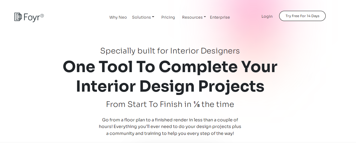
Although most people today still think that the color pink is synonymous with femininity, changing times tell a different tale. The website design of Foyr is a depiction of exactly that.
The website is proof that even a limited color palette can give way to a masterpiece. Using different shades of pink, blue and black, Foyr’s simple yet elegant home page is a precise depiction of their design software. It gives you an idea of the simplicity of their user interface and ease of use of the software.
Its homepage has small video animations of the design software which are insights into what to expect when using it.
The video depictions, especially of the kitchen design app, make users want to get started instantly. It seems more like a fun experience than monotonous design work.
2. Jagenberg
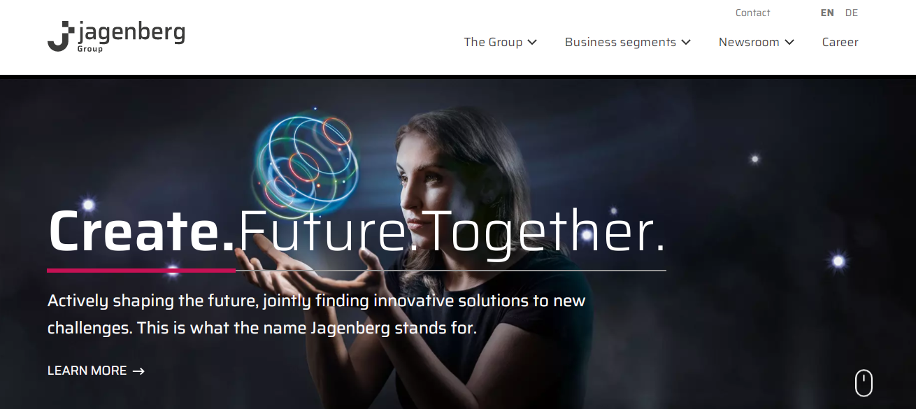
The Jagenberg website design has a very lively, sharp, and distinctive style that distinguishes it from its trade contemporaries. Aside from the monochromatic menu panel (with a very small rainbow strip on top as part of the company’s branding), the imagery above the folds is vibrantly colored.
The principal ‘criminals’ in this case are sophisticated, professionally edited images of people holding colorful neon lights. This is in addition to the company’s catchphrase, ‘Create. Future. Together,’ as well as each of its solutions.
Below the folds, white and black blocks and grids are paired with the company’s distinctive bright red, as well as blue, emerald, and tangerine, generating a very unconventional arrangement that adds a pleasant surprise element.
Jagenberg is a provider of corporate and industrial services such as equipment and factories, automation and motors, and online services. The New Atlantic, a digital marketing agency based in Cologne, Germany, designed their website.
3. Klokhuis Interior
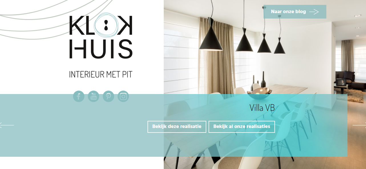
So much social activity takes place indoors, in workplaces and lounges, in houses and garages, in stores and restaurants. Beauty is fundamental to modern living, and no one effectively combines the necessity of indoor environments with the value of aesthetics than Klokhuis Interior.
This Dutch interior design firm creates imaginative indoor areas that cater to every social interaction and draw out the best in rooms of all dimensions.
The website draws the 3D richness of its artistic offerings to reality in exciting ways by using a UI rich in dynamic features and subtle theme qualities. Users are welcomed by a light homepage with dynamic scroll elements that display work specimens. A lot of white highlights dominate the page, evoking the welcoming vibe of the wide spaces designed by the firm.
Simple elements, such as the company logo’s curves and teardrop forms, are used creatively across the main page. This underscores the significance of detailing in any interior area; a subtle wave in an above ceiling light or a one-of-a-kind window pruning in a sunroom all contribute to the overall mood.
This organization is as concerned with the intricacies as it is with the overall result, whether in a little or large place.
To generate an active impact, Klokhuis Interior’s website employs text that travels in a somewhat distinct plane than the background imagery. Color contrasts alternate between portions of web pages where blank space prevails, and white writing covers dark imagery on their main page’s ‘About’ segment.
As users navigate, a little company logo appears and remains on each page. These design components keep users interested from top to base of the website, resulting in a lively engagement.
4. Forty Ninth Living
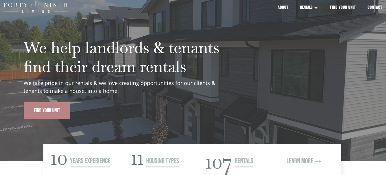
Forty Ninth Living is a rental real estate company in Chilliwack, BC, and the firm’s website was created by Khula Agency, a Canadian branding design studio.
Kristie Derkson, the founder of Forty Ninth Living, initially created multiple websites and branding for each house in her portfolio. This was excessively time-consuming and expensive due to the various domain and hosting fees.
The web design firm was tasked with creating a consistent presence online for all of the company’s assets. The organization needed to create a professional brand image that was both appealing to Forty Ninth Living’s target demographic and appropriately portrayed the company.
Following the website strategy and audience discovery study, the studio built an on-brand visual identity as well as a single-platform website that can give real-time updates.
The site’s sophisticated new Information Management System can now handle interactive content across the website while also enabling the smooth addition of new real estate listings.
The redesigned Forty Ninth Living website has not only enhanced the customer experience but has also transformed the company’s operations and everyday activities.
Wrapping Up
Hopefully, the designs mentioned in this article will inspire your next web designs. Remember, a good website design enhances the user experience and makes it smoother for your website visitors to visit and surf your website.
So, if you are searching for website designers, make sure you vet them comprehensively and make sure they are experienced at creating user-friendly and searchable websites.
Conducting a site audit and optimizing it to create a better user experience and enhance accessibility is always a good start. Especially if you already have a website.
Your website design can bridge the gap between the uprise and downfall of your company. It has an impact on how people perceive your company or brand.
As a result, making sure your website design is aesthetically pleasing, user and mobile friendly can help you increase your rate of conversion. This will lead to higher profits and a more thriving business. Don’t forget to look for ways to connect with international media and broaden your target market.

