The aviation industry is one of the most valuable and prestigious industries in the world. Needless to say, the industry standards of an airlines logo give us the perception of glamour, efficiency and professionalism. Each logo of an airline is the most excellent example of corporate visual branding. Hence, trying a hand out at designing an airlines brand logo will give any graphic designer a creative edge and also act as a useful inspiration resource for him/her.
We know that the purpose of any logo design is for immediate brand recognition. Consumers identify an organization by its company symbol which is the only aspect of a company’s brand strategy. Essentially a logo is a component that differentiates a company from its competitors. But, one should aim to create meaningful logos because a great logo can only reveal the true worth of a brand to its users.
When we talk about airlines logo of the world, we see that logo designs of the airlines’ industry are a reflection of smart advertising and careful branding techniques. As airlines are vehicles of national importance, their branding essentially reveals the heritage of a country. Most of the airlines logos feature colors of their national flags adorning the tail of many air crafts.
Interestingly, since the inception of the airlines industry its logo design style has remained the same. Till today travelers connect with each particular airline brand depending on the specific patterns which have become the core elements of the airlines industry. As airlines are associated with exploration and possibilities, marketers conceptualize the logos related to its nature of the business.
However, as competition is paramount in every industry, each airline company now needs unique marketing and branding ideas to stand out amidst fierce competition. Needless to say, all airline companies strive to craft new and refreshing creatives. A graphic designer must always try to design a logo with the contrasting color palette and melding unique pairs of images with excellent composition. In addition to that experiment with typefaces for impressive and appealing presentations is also required for unique and memorable airlines logo font.
As a graphic designer of recent times and to keep up with the changing requirements, focus on designing airlines logo and unleash your creativity.
Take a look at the 9 finest ingredients for creating airlines logo design to let your skills fly high:
1. Color Scheme
There’s no denying the fact that colors play a significant role in any logo design. As the aviation industry is the name of sophistication- it’s logo should also reflect the industry’s true essence. It’s seen that bright and warm colors resonate more with airlines’ clients. The colors blue, red and orange are commonly used to communicate reliability and convey the message to the travelers that the vehicle is all set to take them towards their dream destination. Whether designing passenger or cargo airlines logos, stick to the specific color scheme and color palate that attract the clients.
2. Typography Format
One of the most vital features of an airlines logo is its typography. As these logos are created to capture the attention of the clients instantly, they must mostly feature bold and sans-serif typography. The striking feature of such logos – having lowercase typefaces that mainly convey trust and friendliness.
3. Symbolism
Logos become prominent and eye catchy when you use meaningful symbols on them. Symbols make any emblem useful and engaging. While designing an airline logo consider using symbols that merge well with other design elements. Through symbolism, you can represent a hidden meaning of the company. A metaphor or symbolism is an ideal airlines logo concept, it’s an element that provokes emotion as well.
Emirates Airline
The Emirates logo designed by Negus & Negus Associates in the year 1985 is a simple representation of the red-on-white logo. It’s an intricate design form that has Arabic lettering along with the company’s name written in English below it. The color red in it symbolizes leadership, prosperity, passion and self-confidence and the white color stands for elegance, purity and nobility.
4. Pattern Design
Patterns have engulfed the world of designing. Nowadays patterns have been playing a significant role in logo design. These are among those finest designing ingredients that are used to build and strengthen any brand identity and style. Patterns make an airline logo all the more appealing and establish its brand identity in a more meaningful way. In logo design, patterns serve as a great tool. Using this design element, a designer can create a perfect connection between the brand and the consumers presenting them with a coherent image.
Thai Airways
The Thai Airways logo is a beautiful representation of colorful ornamentation- the pink part of the logo represents a magnolia blossom. Complementing the company slogan “Smooth as Silk,” this logo is one of the most excellent examples of pattern design which is, in turn, a vital feature of a brand denominator.
5. Surrealism
Surrealism has greater significance in painting and today surrealism plays a pivotal role in graphic designing too. However, you should keep in mind that in one logo form, you cannot use all the surrealistic ideas, yet you may use many factors that can heighten a brand’s significance amongst competitors. Surrealism is that form of art that uses common but unrelated things in juxtapositions to make some powerful concept. Designing experts are of the view that surrealism introduced in logo art enhances the power of branding.
It’s general psychology of people to associate a plane with a large winged bird that expertly flies cutting through the labyrinth of clouds. With surrealism concept, you can form an airlines logo that expresses these images.
Lufthansa Airways
Lufthansa logo features a flying crane in a circle. It was designed in the year 1918 by designer Otto Firle and officially adopted in 1954. The logo color consists of a dark blue hue on a yellow background and this is an excellent example of an absolute graphical contrast. This logo can also be an inspiration for the graphic designers because it also uses a custom typeface.
6. Modernism Effect
Modernism is the practical approach to the artistry that has brought about a revolutionary change in the logo designing concept as well. According to this art, form logos take in ornamental as well as functional designs. Jens Müller proposes three defining rules for creating the modernist logos:
- These logos mostly incorporate black and white hues
- They are simple and can be drawn by hand only
- Modernist design feature geometric forms and letters
Modernist aesthetics are an essential element and one of the finest ingredients of airlines logo design. With substantial technological advancements, modern artistic features have radically improved to impress the viewers. Modernism, when related inseparably with logos contemporaneity, enhances the corporate identity of an organization. With changing trends in graphic designing, Logo Modernism has been a fascinating designing concept as it has social, cultural, and organizational importance. Additionally, these design form is considered to have persuasive power.
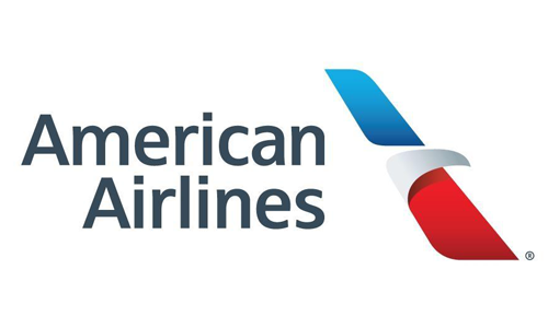
American Airlines
The new logo of American Airlines is a beautiful example of the modernist art form. As modernism uses abstract images, this airline logo has an element of ‘flying eagle’ which is present with traditional American colors – red, blue and white. This logo was further labeled as the “Flight Symbol”. Many designers say that this design also incorporates certain components of the previous versions: an eagle, a star and the letter “A.”
7. Dominance & Emphasis
Dominance and emphasis are two primary ingredients of contemporary airlines logo design form. As a designer, you must understand what the present day viewers prefer and relate to, what kind of designs mainly resonate with your audience. According to the design principles, dominance and emphasis is the process of visually reinforcing a design which eventually attracts maximum attention of your target audience.
Further, when dominance and emphasis are coupled with focal point techniques – unique logo conceptualization comes in. Focal points are those regions of a design that directs a viewer’s attention towards the essential symbol of the logo. Designing experts suggest that ‘the strongest focal point that has prominent visual weight creates the dominant element of a work.’
However, you cannot always apply the principle of dominance and emphasis in all logo design forms. Hence, you need to create graphical representations where some of the designing elements are highlighted whereas some others are faded out to maintain the artistic balance.
While developing a airlines logo composition you need to exert dominance in some elements, emphasize specific significant brand components which will, in turn, let the viewers know why one particular airline brand is more dependable than their peers.
8. Minimalism Approach
A gaudy or clumsy design does not appeal to the audience much. Hence, you need to incorporate a minimalist modality into your logo design. It’s a sophisticated approach and when an airline brand logo uses minimalism in its design, the idea justifies the grandeur of the aviation industry. Further minimalism design process strengthens the company’s position within the industry as a contemporary brand. In minimalism design method designers use the existing elements but maximize simplicity. When you utilize the minimalist approach while designing a logo for an airline company you focus on making the brand symbol distinctive and appropriate while conveying the intended message to the target audience.
9. Expressionism
An expressionist is a form of art that conveys emotion and meaning compared to reality. It’s one of the finest ingredients of logo designing. Using this form of art, each deigning artist “expresses” their emotions in their art and further expresses the brand’s identity in exaggeration. In this concept of designing some time colors are quite vivid. This is the essence of the expression form of art and it is the extremely purposeful style of logo designing. There’s no denying the fact that any kind of logo design is essential art. Hence, incorporating the useful elements of art movements can highlight the actual nature of the brand.
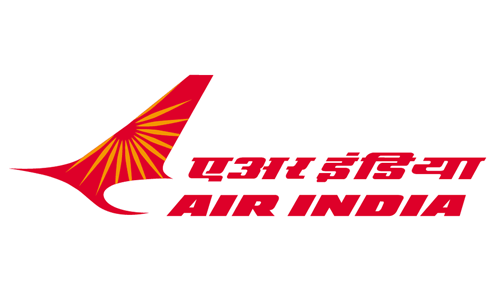
Air India
One of the best airlines logo design is the example of the Air India logo. The logo design portrays a red flying swan that has the wheel of Konark sun temple. The wheel is painted in orange on the swan’s spread-out wing. This design represents vigor and progress. The Konark wheel symbolized the carrier as the chariot of the sun god. Designed by DMA Branding, The logo is an example of expressionism art form.
Summing up
A quick glance at the ingredients mentioned above must have given you a rough idea what features make a logo of an airline company memorable. Additionally, the vast array of design examples must have opened up your thoughts. Explore the different creative elements of an airline logo designs ranging from the choice of colors, fonts and use of different kinds of artistic ingredients to present the best brand symbol which in turn resonates with the customers in this industry. Take the plunge and design an airline logo that genuinely helps the airline industry. Focus on creating something unique and let the organization stand out among its competitors while honing your ability and sharpening your skills as a designing professional.
Graphic designing trends change continuously and to keep up with the recent updates as a designer you need to explore and understand the market happenings. The creative heads at Logo Design Team.com strive and experiment with all modernity and present to their clients’ world class designs.
Are you looking for airlines logo inspiration? Then you are in the right place.
Designers, Fly High!

