Creating out of the box logos has always been the primary intent of the artists. With so many styles, genres and varieties prevailing in the graphic design world, people can never run out of ideas. One of such unique techniques is the ambigram logos. These are based on the genre of typographic design that has the capability of being read as one or more word from different angles; mirrored, turned or shown from different directions. The ambigram logos are visually stunning fruits of the optical illusion. When rightly-done, it is not difficult to get it etched into the minds of the audience or an everlasting appeal, making it a preferred logo style for various brands.
Types of Ambigram Logos
There are many kinds of it like mirror ambigram, rotational, and chain styles. The mostly used ambigram design is the rotational style. The rotational ambigram art images are designed in such a way that they can be read even when they are inverted. Rotational ambigrams are not based on any stringent rule, but they depend on how an ambigram artist shapes the characters of the logo and make it readable in any direction.
Take a closer look
- A graphical figure based on the ambigram style can spell one and more words, presented in any direction.
- Ambigram images can be represented in art forms or symbolically.
- The meaning of the word may change when seen from a different angle.
- Styles of certain characters create the similar word from backward angle.
- There are many experts who are of the opinion that ambigram art is the calligraphic design that comprises of two different readings into selfsame set curves.
- Ambigram typography creates the same words that differ in their formation and also style but have the same meaning.
Pictorial examples of ambigram art based images:
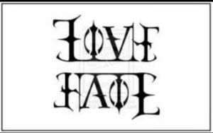
- Oscillation Ambigram
One word, carrying to presentation with the same character, but different when the angle is inverted. For example, this image below shows the ambigram image love which also reads out as hate when inverted.
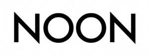
- Natural Ambigram
Forward or backward, natural ambigrams are amazingly convenient to read from any direction, just as showcased in the image below.
- Chain Ambigram
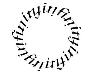
In the chain ambigram logos, the letters are interlinked in such a way that they form a continuous chain. When the care arranged more than once in a circle shaped pattern, they form the chain styles ambigram.
- Inverted Ambigram
Look at the image below. The letters are all inverted. Now, turn the same image and you will be able to read the word Ambulance. This is the magic of inverted ambigram where the words become visible and readable when they are inverted.
- Rotational Ambigram
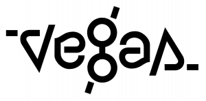
Rotational ambigram images have ambigram letters that are written and designed in such a way that when the picture is rotated, they look the same. People obviously mix it up with inverted ambigram, but the difference lies in the point that even when inverted, the rotational ambigram graphics do not experience any elemental change.
Brands That Have Ambigram Logos: A Close Look
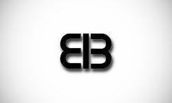
1. EIB Logo (Excellence in Broadcasting Network)
The EIB logo has 3 distinctive letters that are arranged in such a way that it can be read identically from any direction. Many experts are also of the view that the logo also represents a hidden butterfly with ‘e’ and ‘b’ as the wings and I for the torso. The chrysalis elements of the logo reflect the brand’s belief in the media freedom. It is needless to say that the logo is versatile and hence used in a variety of context making it the face of a brand.
2. The New X-Men Logo
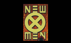
Who does not love X-men? But have you realized that the new X-Men Logo is an ambigram creation? Look closely in the picture above. The X in the Circle and the words ‘new’ and ‘men’ can be read exactly, even when the picture is inverted. The central X within the circle acts as the cohesive agent of the entire logo.
3. Tyrian Logo Design
The video game Tyrian has an attractive logo design. In the relevance to the theme off the game, this ambigram inspired design is created in a fanciful font. The eye catchingly appealing shade of metallic gold complements the creation in the best way. The best part? Invert it and read and you will be able to read the name in the similar way. It is needless to say, the artistic details of the brand are very much visible in the game graphics as well, making it a global favorite.
4. The NASA GOES Logo
GOES – Geostationary Operational Environmental Satellite, is a NASA agency. It is obvious that its logo as well has to have the creative touch where it represents its stance as a government agency. 1st of all, its oval shape is the reminiscent of its inclusive shape that is associated with orbits and satellites. The central image of the logo is visually attractive as the letters are arranged in a way that the logo reads the same when inverted. The logo successfully gives the positive impression that this agency is exclusive than NASA’s other corollaries.
5. Nine Inch Nails Logo
So, what is common between the logo of NIN logo and others in this list? Yup, that’s the ambigram art. The N’s are identical with one being inverted. Let’s face it, inverted letters have always been a matter of visual interest for everyone. Here as well, when the logo is inverted, it remains the same. The color black as well goes perfectly with the genre of music that is dark.
6. New Man Logo
The popular French clothing company is said to get the world’s first ambigram logo designed for commercial usage. The letters ‘a’ and ‘e’ are given similar design treatments whereas; ‘n’, ‘w’ and ‘m’ have mirror reflection. Getting everything in favor, New Man has successfully got an amazing ambigram logo designed for its brand.
7. Delorean Motor (DMC) Company Logo
DMC’s ambigram logo design is much simpler than others in the list; but does not make the image less powerful. DMC’s curved edges although give a softer feeling, considering the fact that it is a vehicle company. Mirror it and see the magic as the letters upside down too give the same feeling. This image is easy to remember and also versatile to be used in multiple contexts.
8. Mosuki Logo
The magic of Mosuki lies in its ambigram logo which when inverted reflects the same name. The juxtaposed ‘o’ and ‘u’ makes it interesting because of the fact that when the logo is inverted these letters interchange their alphabetic positions. The color blue is also very calming in this logo appeals on the modern lines as well.
How to make an ambigram logo? Try the professionals…
Creating ambigram graphics is definitely something not easy. People may take the help of ambigram logo generator or ambigram logo maker available online, but the results they will get may not have the exclusivity that is needed to thrive in the long run. At this juncture, it is obvious to choose the creative services offered by a designing agency. Employing a talented pool of designers who work day and night to deliver excellence, you can definitely expect the best results for your project. Not only ambigram, but any logo creation requires the work of dedication and excellence and that can only be offered by experienced hands of the artists.
Images: Source

