The gaming landscape is incredibly competitive these days. The first interaction with your potential gaming audience is your logo. In other words, do you want to hook mobile players right away? If so, you need the best logo! But how to make a top-notch logo?
To begin with, look at what logos for the ten most popular mobile games have already been made before you. This way you can figure out where to move when developing your best mobile game design for a new video game.

10 Popular Games Logos of All Times
So, let’s analyze the most famous mobile games regarding their gaming styles specifics.
Tetris
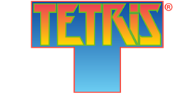
Today it is impossible to find a person who would not know this old, but still popular mobile game. A true legend, Tetris, was released in 1984. The gaming product has an incredibly memorable logo. It was created by developers only in 1997, and since then the T-shape symbolizing the union of Tetris and Domino has been known all over the world.
Many years later, in 2019, the game’s logo was changed to a darker blue shade, and the letters became smoother and less sharp. Keeping the basic design idea, the Tetris symbol is one of the most recognizable mobile game design for now.
Geometry Dash

That mobile fun is demanded between users who prefer the best games logo design. As its name suggests, the main characters here are geometric items. As the player progresses through the levels, he will discover new shapes.
Your goal in the Geometry Dash is to help the square overcome obstacles with geometric forms. The main character of the game’s logo is also a square. A yellow figure with a grimace of three blue rectangles is placed diagonally on a blue background. Under the square icon you can see a small black triangle, and in the upper left corner there is a small icon with the logo — RobTop Games.
Minecraft

Another game, without a doubt, known all over the world – is Minecraft. Players compete via consoles, PCs, tablets, and mobile devices.
A feature of this game is the original logo. Its appearance fully corresponds to the theme of the game-building process in the open world.
The Minecraft logo is an impressive image that has changed several times during the existence of the game. Today, the word Minecraft, which is the logo of the game, has the appearance of construction of cobblestones of mixed stony rocks.
And so, the Minecraft logo can be called an ideal mobile game designing solution as it combines simplicity, clarity of idea, and expressiveness.
Call of Duty Mobile

Call of Duty Mobile is the 7th game with the largest average daily income. Like it’s desktop version, the designing phone games is distinguished by well-designed illustrations of characters and settings.
Speaking of the logo, everything is simple and minimalistic here. But it was this style that brought the mobile game designer of the Call of Duty logo recognition and fame all over the world. Today, this logo is among the top five game designs of all time. The letters are black in a straight shape, on a yellow background – what could look simpler? But it was this combination that made the Call of Duty logo special and memorable.
PUBG mobile
Playerunknown’s Battlegrounds (PUBG mobile) is a popular multiplayer game in which users will have to participate in epic battles and a team death match. Moreover, it has zombie modes that make the game even more exciting. The game is also available in the mobile version.
The PUBG logo is simple but catches the eye. Here we see a simple execution, which, however, is imprinted into consciousness after the first sight. White letters are framed against the background of the playing field. Military 2D game art styles, as is inherent in shooter games.
State of Survival: Zombie War
That is an action-strategy game for desktops and mobiles. Here, a player tries his luck at the atmosphere of the post-apocalypse. The main point of State of Survival: Zombie War is to build a city and keep it from zombies.
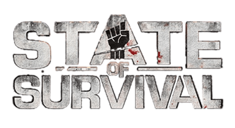
The State of Survival has an impressive logo that is worth being on our top list. Its game design theory consists of a yellow road sign with the plague icon on the triangular part and the title on the rectangular one, which is installed at the bottom. You will see this sign against the background of a ruined urban landscape, made in a brown color. The idea of logo conveys the sense of the State of Survival: Zombie War, and at the same time, there is nothing superfluous in this image.
Bingo Blitz — Bingo Games
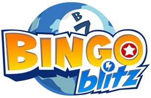
Try out this popular mobile fun, especially if you like Bingo games. The rules of Bingo Blitz are known to everyone, so there is nothing new and surprising here, but its impressive colorful design and a large pick of game rooms are what distinguishes Bingo Blitz from other titles of this genre.
The Bingo Blitz logo deserves special attention here. How to design a mobile game, like that? It’s incredibly bright and juicy, like the whole gameplay. A smiling and winking cat, painted in blue, waves its hand because of the yellow-blue inscription with the title. As soon as you see this sign, start to enjoy the gameplay in full. Bingo Blitz is the best game for entertainment on the go.
Hay Day
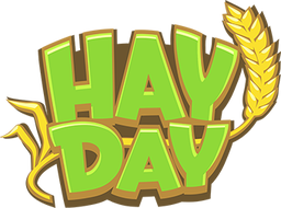
One more top-rated mobile game allows online users to break up their virtual land, take care of crops, and trade collected goods with other users. The gaming characters are bright, as well as the color palette of the logo. It comes with light and colorful shades.
The Hay Day logo is one of those that seems to be made easily, but in fact, the designing mobile games efforts of real professionals have been involved in this creation.
Angry Birds

This exciting game appeared ten years ago. Although, despite a decade of existence in the game industry, it keeps to be a demanded online fun with bright colors and cartoon graphics that make the game even more exciting. Its game art styles as well as the logo is unique, and each of you undoubtedly remembers it.
Mobile Legends: Bang-Bang!

That is one more top-notch game that features a 5v5 showdown against users. Mobile Legends: Bang-Bang comes with fast matchmaking and 10-minute fights. The logo of this virtual game has a color palette and the game art style that incite energy and excitement among its players. The letter M comes in the center of the updated logo, so it looks more remarkable. Besides, all the letters are combined with the river symbol on the `game map. These icons are also a symbol of the heartbeat to emphasize spirit and strength.

