Apple Inc. is synonymous with high standards of quality, innovative technologies, and for setting the curve on progress in the technology world. The brainchild of Steve Jobs and Steve Wozniak, Apple has continued to set the norms on excellence with several new high-tech gadgets that, to many, are the only kind of technology they would ever need. And the Apple logo history is another aspect that makes the brand so enigmatic.

Start with a visionary
Much of this standard of quality came from the individual philosophies of Steve Jobs, who believed that technology should allow people to create and discover the great things of life, to explore, and invent and create. He didn’t want computers just to be something someone used from a consumer end.
Add a unique logo
Jobes also valued branding and used the unique logo to promote his brand. After brainstorming different names and logos for his company, he and Wozniak decided on Apple due to its allusions to the “forbidden fruit” in “The Garden of Eden,” and the idea of it being a required element of all that is good and wholesome.
But what role did the logo itself play in the success of Apple?
Looking at the history of the logo may shed some light on this question.

History of the Apple Logo
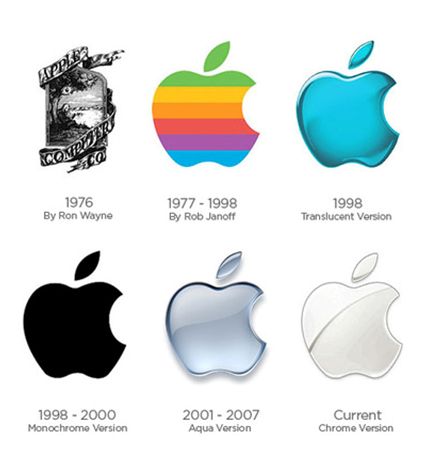
Let’s raise the curtain on the Apple logo evolution phenomenon, that has ever since fascinated people all over the world. So, the initial logo was drawn by hand by Ronald Wayne and showed Sir Isaac Newton underneath an apple tree, as in the famous painting. Following this, in 1977, a designer named Rob Janoff created a logo with a rainbow scheme that was used until 1999.
Problems with the Rainbow
Like any logo, there were a few hiccups along the way. For example, the rainbow logo seemed to work fine on the original beige Apple computer (old-fashioned) version. But, once the new streamlined computer was created more recently, they removed the rainbow logo because it didn’t seem to fit with the more modern look.
The Current Apple logo
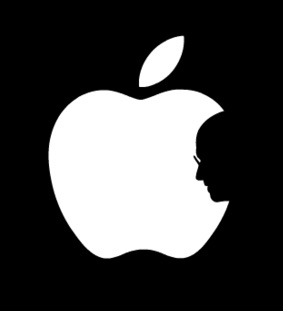
Delving deep into the Apple logo history, as mentioned, the current apple logo was born from the minds of Rob Janoff, famous for creating corporate identities and logos. The company changed to a silver logo design with a bite out of it later. Then, after the passing of CEO and founder, Steve Jobs, Hong Kong design student, Jonathan Mak Long created a unique logo tribute to Jobs.
In the logo, he placed the silhouette of his face in the eaten part of the apple, to indicate the loss of a visionary that Apple (and all who appreciated Jobs’ tribute to the world) would have forever.
The unique logo even got the attention of Coca-Cola, who recruited Long to design a logo for their company following the unveiling of the logo of Apple.

Why is it Half-Bitten?
There are numerous speculations as to why Apple logo is half bitten. Is it a ‘bite’ of Wisdom? Does it have any Biblical undertone? Is this the same ‘Apple’ that is mentioned in the Book of Genesis?
Well, not really!
Contrary to these romantic beliefs, Apple’s logo was made out of a simple thought. Janoff, the Apple logo designer, stated that the bite had been added so that people don’t confuse the fruit imagery with a cherry. Moreover, the word bite symbolizes byte as per computer technology.
And the apple itself was a tribute to Alan Turing, the famous mathematician, cryptanalyst, who played a huge role in winning World War II. By inventing a codebreaking machine called the Bombe, he made it possible to decipher up to 4000 messages a day.
But alas, he was wronged and charged for his sexual orientation and was arrested. This arrest broke his spirit down and left him disheartened. There’s still a doubt surrounding his untimely death and cyanide poisoning. His bedside found a half-eaten (read bitten) apple. And thus the world lost a prolific man of sheer genius!
Janoff’s logo for Apple Inc. was a tribute to him. He improvised the first logo designed by Ronal Wayne that depicted Sir Issac Newton sitting under the apple tree. Janoff made the logo way more simple with just the fruit. And the half bite is a commemoration to the death of Turing. So an apple that created a milestone in human civilization, the ‘Gravity’, that same apple was the cause of the end of a versatile genius.
What made it successful?
Considering the Apple history timeline, it’s crucial to think about what made it successful. It may be impossible to know exactly what factor was the most influential in helping the company find success. But there are some common factors we can analyze regarding the company’s logo.
1. Consistency
Consistency is the key to creating a logo that lasts. This is a part of the branding of a company, and it’s essential that the logo becomes an integral part of the brand itself. Steve Jobs was able to do this by showing the logo often through all of the rollouts of products he advertised and the degree of “hype” that he put out on every product before its launch.
Who can forget the day Jobs unveiled the iPod in 2003? He didn’t just come out on that stage in Silicon Valley and say to his people that they were revealing a music player. He said it was a “tool for the heart.” Additionally, he said that people should imagine “a thousand songs in your pocket.”
With such visual imagery, Jobs was able to gain such credibility and trust in the products he created that people decided they just “had to have one.” To this day, Apple’s stores are packed to the brim with lines all of the way to the highway when a new product is released, and all with the prevalent Apple logo on every one of them.
2. Uniqueness
The prime aspect of the logo of Apple Inc. is its uniqueness. Who else has a logo that is one of the most basic fruits, a universal symbol of goodness and something to be desired in that of a fresh apple? The bite out of the apple is also important because it indicates the idea that people cannot help but take a bite out of it.
The apple itself may be ordinary, but the way that Apple has included it in their branding is the key to their success. The Apple logo history facts are truly unique in their own way and have been explained by many, true or untrue!
3. Intrigue
There is a bit of mystery and intrigue with the apple, as well. When someone sees it initially, they are immediately drawn to the bitten out section. They may wonder who took the bite out of the apple, why they felt compelled to do so, and how the bite of the apple symbolizes the brand. The quest to find the meaning of Apple logo, has made it so baffling.
Once someone uses Apple products, they make the connection. They start to understand why the logo of that particular brand is so useful. The apple itself symbolizes something that you want to bite into, and the bite indicates the indulgence of the greatness that you get when you consume the brand.
4. Connection to founder
The logo design also has a strong connection to the founder, Steve Jobs. As explained before, Jobs and Wozniak, his business partner, created the logo based on a story Jobs referred to as “his childhood story,” as someone who came up from nothing and created an empire, as well as the idea of the “forbidden fruit.” Since Jobs related to his company identity and logo, he reinforced it and made the connection stronger.
The presence of the entrepreneur and leader of a company should be present as much as possible with their logo as they build their brand. Jobs did a great job of immersing himself in his brand, and to this day, though Jobs died in 2011, people automatically see the face of Steve Jobs in every product Apple sells.
5. Status
Apple is also a status symbol. Just look on Facebook on any given day, and you’ll see someone bragging about getting the next big thing from Apple. They line up for miles both online and in the real world at the Apple Store in California to be the first to reel in the latest greatest gadget created by Apple.
6. Branding
Branding is the key to logo success. This is the key to everything when it comes to creating and maintaining a business. Regarding your logo, you should focus on how to use your logo for everything you do to include both offline or online and incorporate it into everything you do.
You also want to try to maintain a degree of consistency, even if you do make some changes now and then in the color, texture, or other aspects of your logo. Don’t change your logo just to change it. Have a reason, like Apple did, such as the fact that they needed to change the look to fit the modern technology or to blend more into their branding that was in the process of evolving. Not has just the brand evolved, but along with it, also evolved the Apple logo history theories and conceptions.
When to Change Your Logo
So how do you know when you should change your logo? One way is to think about the success of your company and how people are responding to your branding. Check your analytics and metrics in Google Analytics and other tools to see how your logo is doing.
Another way is to send out surveys to your best customers and ask them what they think of your logo. By considering the ideas of your clients and customers, you may gain some insight that you would not have otherwise.
Once you gain this information and consider your options, think about how you want your logo to look. Don’t go for radical changes. Make some subtle changes first so that people will not be shocked by the change and work on improving your logo to fit the needs and goals of your brand better.
If we can help, contact us at logodesignteam.com.
Logos are what we do.


