How do you trust a bank? How do you believe a financial organization who will keep your hard-earned money safe and secured? It is not only the popularity but also the way the organization’s branding reflects its ethics & values to get the trust of the people. It is all about how the bank logo designs and their branding strategies that make them worthy of trust gaining the confidence of people.
One can easily differentiate between the international bank logos and the nationalized bank logo designs, and the reasons being their appeal and presentability overall. Private banks have more liberal approach whereas for public sector there are certain norms to be followed, yes; even in being creative with logos.
In this blog, you will know about 2 things; one is how to create finance and banking logos with the correct element and the other is some fantastic examples of bank logos images. So, are you ready for the amazing journey?
A. Colors are significant
A majority of banks, both public sector and private sector primarily choose the color blue. Even the non-banking financial institutions stick with the psychology because the color represents serenity and reliability in people. Blue is serious and conservative and people find it reliable therefore making people believe the trustworthiness of it.
B. Typography
Typography manipulates the significance of communicative ways. It straightens the context of the content and can do wonders. Selecting the right kind of typeface communicates the strength of the brand and also increases its memorability.
C. Shapes and elements
The most challenging part of creating any logo design is to understand what the user thinks with the used elements and chosen shapes in the logo.
Financial and banking sector today is extremely competitive in today’s scenario and therefore, a strong branding is definitely essential to make customers look at you. As mentioned earlier, it is all about how a person looks at the brand and perceives the company.
Companies belonging to the sector have to feature the accents of stability, reliability & strength through the logos that will speak of their professionalism. Elements like pencils, graphs, charts signify what they exactly do. Since the usage of these elements is so frequent, they have become extremely clichéd and conventional. Originality is always the key to portray the same service but in a different way. It is always better to have a standard and sophisticated design when it comes to bank logo design.
Giving the emblem plenty of colors is nothing ideal & as mentioned before, shades of blue, grey, white, silver and other darker colors are much preferred. Although, some modern companies are breaking the clichés. Colors and shades of red, yellow and others are now being used to get the maximum attention.
Bold typeface, thick fonts, and attractive colors are what makes a logo stand apart from the rest in the crowd. So here we present the top 7 bank logo designs of today so that you get a clear picture of how it should be:
1. Citi Bank
Tell your clients about your strength straightforwardly. The logo design of Citi Bank is based on the concept of typography. The results of typography logos are always satisfying as they are clean and strong statement makers. The brand names based on the typography tend to create an everlasting memory in the minds of the onlookers; which, goes without saying, is beneficial for the organization’s branding. A bold or flat font reflects the tradition, the ethics of a company. A font that is soft shows the dedication to the customer service. This is the magic of typography which through minimal usage can result in excellent effects.
2. Blue Crane Capital
Blue Crane Capital logo is the example where the organizations instill the use of animal imageries. The most common such elements are lions, bulls, bear, stag and similar ones that signify the strength and courage of the company. These imageries make them a reliable name with the customers. From the creative point of view, it is amazingly easy to work with animal imageries as they can render any memorable logo. Couple them with contrasting colors and interesting typeface and you will have the most amazing emblem for your institution.

3. Chase Bank
Geometry has always been the beauty that captures the eye of the onlookers. Clean, sharp and wonderful shapes talk of the modernity and tech-friendliness. Geometric bank logo ideas are versatile as they can represent not only the value of the organization but can also incorporate the name to compliment it. The logo of Chase Bank appeals to the seniors as well as millennials who have the knack for technology-based services. The logo reflects the bank’s pioneering spirit and hence is an amazing example of a geometrically designed logo.
4. Standard Chartered Bank
The logo of Standard Chartered Bank has used the shades of green and blue quite impressively with that intertwined strand signifying steady growth and stability. This is a perfect example of a ligature style of logo that symbolizes coherence and connection. The green color is the symbol of vitality and wealth whereas blue signifies trust-worthiness. Standard Chartered is a financial brand of many years which has a significant base of global clients and customers. The logo is stable and along with its sequence of shades, it speaks of the organization’s prolonged dedication to disciplined and orderly wealth management.
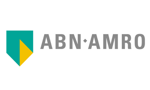
5. ABN-AMRO Bank
ABN-AMRO Bank, the name is entirely based on the amalgamation of 2 founding banks- Algemene Bank Nederland and Amsterdam-Rotterdam Bank in 1991.The logo consists of the colors green, subtle grey and mustard yellow shaped in a shield. The minimalistic logo symbolizes security, protection, tradition, & reliability which make it stand apart in the crowd of its competitors. The logo is clear, distinguished and at the same time modern in its appeal.
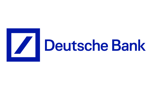
6. Deutsche Bank
A perfect example of abstract design, the logo of Deutsche Bank creates a long-lasting impression in the mind of the onlooker from its 1st glance. Formed mainly in the color blue with a slash in the box the entire presentation reflects stability, consistency and growth. The motif speaks of simplicity yet sophistication that appeals to the global audience through its straightforward flow.
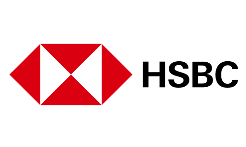
7. HSBC Bank
A fine example of combination style, the logo of HSBC Bank in white, red and black is actually the modified version of the bank’s original house flag, based on the Cross of St.Andrew. The hourglass-shaped whitespace within the red hexagon reflects security and strength that the organization’s services are aimed at. “It becomes a lens through which to look at the world, showing how the influence of the bank can help individuals, businesses and communities to grow and flourish.”- Source
Choose a logo that speaks and reflects of your organization’s true spirit…
With these amazing examples of bank logo designs, it is clear that organizations of any industry need a powerful logo that will be the visual speaker of them in the market. Since it is always ideal for learning from the pros, we hope these examples would help you understand the myriad styles, features and elements that cumulatively craft the desired logo. You can also refer to the blog by Logo Design Team, the pioneer in designing professional emblems worldwide. A logo is not only a part of the story; the best ones make successful stories that carry the legacy of trust forward.

