Coming up with the perfect logo design for your business or brand simply isn’t a matter of just choosing the right name, tagline or even how it looks — it’s actually much more! For example, have you ever looked at some of the most famous brands and logo designs in the world today and thought about why they used the colors they used? Using the right colors for your logo design can mean the difference between having a successful brand, or one that simply makes people want to turn away.
It’s a good question and one that most individuals might not think about. However, from a branding and business perspective, it’s definitely something all brands should consider. Colors aren’t just what people see and how to bring logos to life, they are actually one of the most effective ways to engage with your audience while also triggering emotions when they see or think about your design.
In this article we are going to take a look at many different colors, the emotions they emit and also some of the top brands in the world today and how they are using colors to get their message across to audiences around the world.
How to Use Color and Emotion in Logo Design
To select the best colors to be used within your logo design, you must first understand what each color represents. While common knowledge is that red means stop and green means go, there are many other colors and emotions associated than you might think.
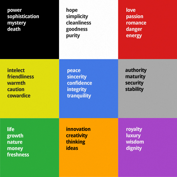
Through the color chart below, we can quickly see 4-5 different emotions associated with each of the colors they represent. (image source) How many of these emotions are triggered when you see each of the colors below?

- BLACK is commonly used to show power, mystery and death
- WHITE is the opposite with hope, goodness and purity in mind
- RED is most commonly used when showing romance, danger or energy
- YELLOW is a great color for grabbing attention and showing caution
- BLUE is one of the most common used colors, and shows confidence and integrity
- GRAY brings a feeling of stability, security and authority
- GREEN is often associated with life, growth, money and freshness
- ORANGE emits feelings of innovation, creativity and thinking
- PURPLE brings a feeling of royalty, luxury and wisdom to the table
Now is a good time to think about the brand and business your logo is going to represent. How many of these colors and their emotions would you associate with your business or brand, and how would they look within your logo design as well?
How Color Usage can Influence Buyer Decisions
Colors aren’t just for emotional value, they’re also a huge contributor to influencing customer buying decisions as well. While in the color chart above “red” might be known for romance, danger, and energy… when used in business or marketing it is often associated with creating a sense of urgency or used in promotional tactics to bring awareness of clearance and sale items.
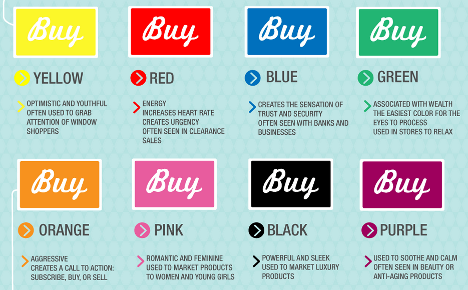
The color guide below breaks down many of the most commonly used colors in the world today, while also showing how they are used to influence consumer habits. (image source)

- YELLOW is a youthful color that is often used for grabbing attention
- RED brings a sense of urgency to anything it is associated with; especially promotional sales
- BLUE is often used to makes consumer feel trust and security with brands, banks or businesses
- GREEN is a very wealth-associated color, which is also used for relaxation and easy on the eyes
- ORANGE is an aggressive color often used to stress the importance of a call-to-action
- BLACK represents luxury and is commonly used as a way to represent power and sleek design
- PURPLE is a soothing and calming color often associated with beauty and anti-aging
Again, now with your business model and marketing efforts in mind, did you still pick the right colors for your logo and design? If not, that’s fine. The important thing to remember here is that the color chart above and the emotions associated with them are used for marketing purposes. This means you logo can be one color while your marketing creative can be another.
Color Emotion Guide: Top Brands in the World Today
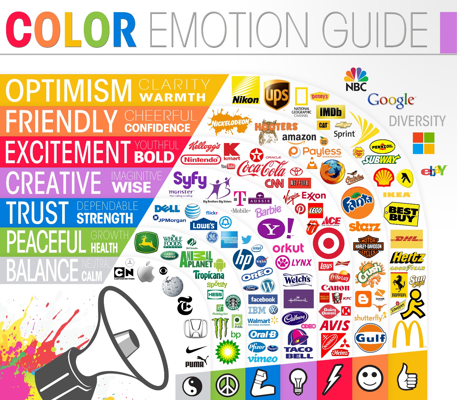
Now that we’ve covered the many different colors and emotions they represent, it’s time to take a look at some of the most popular brand logos in the world today. The image chart below does a great job at showing off the most common colors used today, along with showing a collection of the top logos and how they are represented. (image source)

Using what we know from both color charts above, let’s pull out some of the famous logo designs above and analyze their color usage and how it best represents their brand.
- FIREFOX (Blue and Orange) – FireFox is one of the most popular web-based browsers in the world today. With so much focus on security and privacy online, it’s important for FireFox to establish themselves as a trusted source to their users. By using blue and orange in their logo design, this is a perfect color combination — which shows “trust” and being “friendly”.
- WHOLE FOODS (Green) – When you think about food and the concept of eating, most people would want to look at this in a healthy light. Whole Foods is a well-known brand and food shopping center found throughout the world. No matter where their stores are located or where their logo is being seen, the solid green design associated with it will also bring a “healthy” and “fresh”solution for their customers.
- WIKIPEDIA (Gray) – The Wikipedia globe logo is one that is seen millions of times per day as users throughout the world access their site. With a simple design and using gray/white colors, it brings a sense of balance and neutrality to the site — which is what Wikipedia is, a source for information that anyone can contribute content to while also striving to stay accurate and neutral at all times.
- BESTBUY (Yellow) – BestBuy is a well-known shopping center for buying everything related to electronics and technology. When shopping for such products, most consumers want to save as much money as possible. Using the combination of black and yellow was a perfect choice for their branding, as yellow will grab the attention of their audience and makes you think of discount pricing while also bringing a sense of luxury to the products they sell.
Be sure to look through the rest of the logos in the chart above and see if the listed color and emotions make you feel the same way when seeing or thinking about their brand.
Using Diversity in your logo design.
Something you will also notice in the color emotion guide above is that many brands will stick with one or two colors for their logo. Not only does this help with print and branding, it also keeps their logo design quite clean.

However, every so often you will come across a world-famous logo that has taken a different approach and used a wide variation of colors in their design. The can be seen through the NBC, Google, Microsoft, Apple and eBay logos above. Also important to note, each of these logos represent individuals and business of all sizes, while also being commonly seen and marketed throughout the world. By using colorful designs that include red, green, blue and yellow, they are able to adapt their message and branding to different audiences around the world, while also getting their message across as a trusted and valued brand.
Creating a Logo with the Best Colors in Mind
Now that you’ve seen how important choosing the right color can be for your logo and brand, it’s time to re-consider the direction for your existing or new logo design. LogoDesignTeam.com has designed thousands of custom logos for individuals, businesses, and brands around the world, while also providing guidance on color usage and brand messaging in the process. No matter how simple, complex and crazy you might think your logo design might be, we will do our best to bring your logo to life!
To get started, click here to complete our logo design customization form. Here you will be able to customize the look and feel for your logo, while also making sure the project meets your needs and falls within your design budget.
You’ve spent endless hours on the creation and marketing of your business and brand — make sure your logo represents it in the right way.


