Logo designs are one of the best ways to message the success of a business or brand. Some of the most successful brands in the world today don’t even have a name attached to their logo, yet everyone knows exactly who they are and what they sell. Target, Apple, and McDonalds are all great examples of this.
However, even spending millions of dollars on logo design and branding isn’t enough to guarantee success when trying to win the love of your customers and their brand loyalty. To help get a better idea on what type of logo designs and brands are making the biggest impressions on people today, we asked 17 brand marketing experts what their favorite logo is, and why.
What is your favorite company or brand logo, and why?
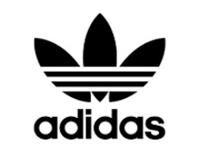
 I think I would have to say there’s two Brands I massively respect, for different reasons. Firstly, Adidas. Their Branding has remained consistent for as long as I can remember, with the recognizable ‘three stripes’ now iconic in terms of visual design.
Certainly, their Marketing and overall identity is aesthetically pleasing, but it’s their visual look that I’ve come to love.
Secondly, Amazon. The arrow/smile element to the logo mark is highly effective at adding a human personality to the brand, something hugely important to such a large organization.

From a Brand perspective, this touch has allowed them to become one of the largest companies in the world, ultimately taking over the online shopping market for the most part.
Stuart L Crawford – InkBotDesign.com
 I absolutely love the logo from my husband’s blog – it is created by danish Thomas Bang from pr3.dk and it captures the essence of my husbands work and it is beautiful.

It shows the name of the brand my husband made and the tools he works with. When you look at it, you know that this is about a garage project and brand. For me, that is the essence of good design. It tells something about the brand in a beautiful and meaning full way.
Maj Wismann – MajWismann.com
 While there are plenty of great company and brand logos in the world today, if I had to pick one of my favorites, it would have to be the Wendy’s logo. The reason why I chose this logo, is because it tells the story of the brand and where it all started. Dave Thomas was the founder of Wendy’s, and he named the company after his daughter… Wendy!
With the Wendy’s name and brand now successfully scattered throughout the world, it was really a great way for Dave Thomas to leave a lasting impression on just how much he loved his daughter. At the same time, there is also a hidden message within the Wendy’s logo. If you look at the neck area in the revamped Wendy’s logo, you will see the word “MOM” designed into the logo.
Tim Bourquin – AfterOffers.com
 The shopify logo is probably my favorite brand logo because of its simplicity.

The green bag with letter “S” already signifies what the company is all about – stores, though it’s not stately tells you if it is an online store or offline. But basically, you can tell exactly what the company is offering to you.
Venchito Tampon – SharpRocket.com
 A favorite logo of mine is one that is little known. This logo was designed by Pentagram for the Fashion Law Institute which is a center at the Fordham Law School in New York that trains and advises designers, lawyers and design students in areas of the law affecting the fashion industry.

I like it because it cleverly combines the two facets of the institute – fashion & law – into one very literal & memorable logomark. It’s subtle too, which rewards the viewer once they discover it.
Jason Cass – JustCreative.com
 My favorite company logo is probably the iconic Nike swoosh. I like the logo for its simplicity, the fact it is instantly recognizable and the design which symbolizes the Nike ethos of winning.
It also has a great story surrounding it, such as the Nike co-founder Philip Knight who remarked at its design “I don’t love it, but it will grow on me.” And, the fact the designer Carolyn Davidson received only $35 for her work back in 1971.
The design and story surrounding the logo work together to make the Swoosh a truly iconic symbol.
James Reynolds – SEOSherpa.com
 As a blogger and internet marketer, I like logos that look great at the top of a website and convey an idea of who is behind the brand.
This usually translates into a simple logo that is well designed and has enough color to catch the eye.
I also prefer logos that are designed around the name of the blogger. After all, if you are a blogger, then your name is your brand.
Two of my favorites are John Chow and Zac Johnson.


Neither of these guys need an introduction as they have both built incredible brands around their names.
I think both of their logos are simple, yet awesome and I used John Chow’s logo as inspiration when I created my logo for jvanderlaan.com.
John VanDerLaan – JVanderlaan.com
 Target – I think Target has done an outstanding job with their brand and logo. The iconic Bullseye was created in the 60’s and simplified to its current design in the 80’s. It still feels fresh, modern and relevant with todays design sensibility.
They recently opened a Target close to my house and I couldn’t tell you how excited my wife was when she first saw the bullseye appear on the side of the building. Target really focusing on Customer Experience (CX), the store layout, lighting, merchandising, in-store signage, are all extremely well done. The different from walking into a Walmart vs Target is so significant, its all based on thousands of small decisions that affect the CX.
Rick Ramos – HealthJoy.com
 My favorite brand is LinkedIn. The reason why I vouch for LinkedIn it’s because it’s a powerful tool for individuals and companies looking to make new connections, generate leads, and build their brand.
It’s a platform that can be a true game changer for B2B (business to business) companies.
If you’re looking for the best brand that can help you build your business brand today, then you’ll love LinkedIn.
Bill Achola – Billacholla.com
 I love the McDonald’s logo. The brand image makes me feel happy. Gold and red catch my attention and the McD’s experience follows up on the eye-catching, one of a kind logo.
The product or service behind the logo adds juice to the logo. Some brands create the most eye-popping, visually-appealing design but follow up with a substandard business model.
After visiting McDonalds’ around the world – we’re not obsessed fans just travelers – I’ve seen the experience never changes at a McD’s, whether in Colombo, Sri Lanka, Kuala Lumpur, Malaysia, San Jose, Costa Rica, Jimbaran, Bali or Chiang Mai, Thailand.
My favorite brand logo became my favorite brand logo partly because of the design and partly because of the experience of stepping insight a McDonald’s store; even before I sit down to eat.
Ryan Biddulph – BloggingFromParadise.com
 I’ve always loved the concepts of logos and the hidden meanings built within many of them. While most people will name familiar logos like Nike, Walmart, Target and Starbucks… I’ll choose a different logo, simply because of it’s uniqueness and branding.
This is the logo for the Lebron James brand.

In the first version of his logo you will see the variations of a “L” and “J” being used to represent his name, along with a “23” in the design to represent his jersey number. A crown is also shown in the bottom area, simply because he is referred to as “The King”.
In thie more recent version of his logo design, you will see a crown icon, with the “L” and “J” on both sides… again, representing his name.
Zac Johnson – ZacJohnson.com
 As someone living in Switzerland, I thought I would select a brand from here. One of my favorites brands here (for obvious reasons) is. They produce some of the best quality Swiss chocolate around! They are known to produce premium products but at reasonable prices. That is maybe why I eat too much of the stuff.
Their logo symbolizes their offering perfectly:
– The gold color obviously indicates their premium level of product.
– The flowing script of their name eludes to flowing chocolate (so they say) which is difficult to resist
– And their logo is complemented by their coat of arms (premium again)
– Underneath they also state how long they have been around (since 1845) which gives us a sense of top quality and experience
All in all, they have done a great job of summing up what they offer all in a logo. Perfect!
Ashley Faulkes – MadlLemmings.com
 I guess I am not breaking any molds here but I am a big fan of Google. From the simplicity of the logo to the overall mission statement which is “to organize the world’s information and make it universally accessible and useful. Our company has packed a lot into a relatively young life. Since Google was founded in 1998, we’ve grown to serve millions of people around the world.”
Google gives us so much. Sure, they show a lot of ads and a lot more recently but I would much rather live in a world with a search engine and the other free tools Google provides and accept the ads than just not have the search engine at all.
Great brand. Simple, recognizable logo, truly wonderful mission.
Marcus Miller – BowlerHat.co.uk
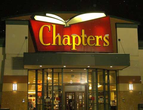
 As for the logo, I like Chapters. The logo is bright yellow and red, so it stands out (probably designed by the same folks as designed the McDonald’s logo?) and the shape is like a book. No question what you buy at Chapters.
A logo I really don’t like is Starbucks. Guess why? A green-on-white mermaid. Dull colors that don’t stand out. And do they really sell mermaids there?
David Leonhardt – SEO-Writer.ca
 I like Mcdonald’s. The reason I like it is because I find it to be very memorable. There are a lot of big brands out there, but there are only a few logos I could draw from memory, like Mcdonalds, or Nike. Disney, for example, I would recognize, but I can’t draw it from scratch. I think the branding team did a great job when they made McDonald’s logo.

I also think it is cool that it has become a part of the storefront, so as you’re driving by you can see it on signs, etc, and know exactly what it is. It’s probably the most well-known logo in the world.
Dave Schneider – NinjaOutreach.com
 One of my favorite logos would have to be Apple.
To truly appreciate their logo, you would have to see how it’s evolved over the years — as it wasn’t always the simple little icon we know today.
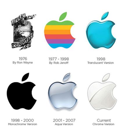
If you were able to jump back in time to 1976, you would see an Apple logo that looks completely different from their logo of today, It was a black and white renaissance-like logo, with an Apple tree and the name “Apple Computer Co”. In 1997, the brand went with their basic Apple icon, but in a much more colorful form. Over the years, Apple would continue to play with their colors (usually based on their computers or current focus). No matter what color you see it in, the Apple logo is recognized by all.
Brandon Johnston – BlogReign.com
 I define a brand as the relationship between a company/product and the users they serve.
The logo, color, and design are important as a touch point to trigger memories of the experiences that make up that relationship.
Choosing a mark to win awards or be stylish unto itself is missing the point of why we have marks and logos. Winning an award from peers or popularity contests is nice. Designers need peer review and industry attention to further their careers, but I’m more focused on where it can aid its owners’
We have a tendency to want to redesign and update brands and logos. We should be careful to do this when it helps our customers and/or indicates progress. Most of all, we need to pick what our customers will come to know as a symbol of the excellence they have experienced in their relationship with the brand”
Warren Whitlock – SocialMediaTeamManagement.com
How to Create a Memorable Logo from Day One
If you want to create a brand that is loved by millions around the world, it’s not going to happen with just a great logo. At the end of the day it’s all about the service provided, the quality of products and of course the user experience.
At the same time, a professional logo does mean all of the difference when it comes to creating a professional and memorable brand experience. How many times have you seen an extremely successful business with an absolutely horrible logo design? It doesn’t happen often.

If you are trying to build the brand of your dreams, it all starts to come together with a great logo design.
Thinking ahead in terms of trends and time. We aim to create designs which will remain unique and iconic, in other words – timeless designs. You want it, we’ll give it to you. Give us a buzz here!

