Logo designs are everywhere. However, not all logo designs are created equal. Some are amazing, some are horrible and some of the most recognized logos in the world today don’t even have a text name attached to them. Brands like Target, Nike, Apple, and Starbucks are so focused on their service, products, quality and branding, that people around the world recognize their logo, even if it’s just a small icon. At the same time, these are some of the most loved logos and brands in the world today.
To help everyone better understand why some logos and brands are loved more than others, we reached out to over 50 different branding and marketing experts to get their thoughts.
47 Experts Answer the Question “How are you actively growing your brand authority and online following?”

This is not an easy question for as I am a marketer by trade. So, I tend to look at everything through my marketing spectacles. I am also a parent so I see how marketing and branding effects my children. So, it’s hard not to be impressed by McDonalds when the kids scream “daaadddd, it’s the golden arches… can we go to maccas!”. Likewise, I really like the Google logo – so simple yet the colours are now iconic. The winner though has to be Nike. The tick. The “just do it” slogan. It all just comes together. In a world where there are so many platforms and such digital exposure for brands it is key to have something simple and recognisable so you can really keep all branding consistent across the web. So Nike. The tick and the slogan. They just nail it.
Marcus Miller – Bowlerhat.co.uk
–

My favorite logo is the one Google uses. I like it because it’s very simple, without anything fancy or shining. It’s so easy to recognize it, and they can easily make any derivative logo using too much effort. The color combination will make you think at Google, no matter what the text actually says.
Felix Tarcomnicu – Cross.Promo
—

I think Airbnb did a great job with their latest logo. People criticized it when they launched the logo, but over time people started praising it. It is one of my favorites lately because it’s very simple yet memorable. It would be hard to come across it and don’t notice it or remember the Airbnb brand.
Daniel Scocco – Dailyblogtips.com
—
 I’ve always loved great company logo designs and branding. As a kid, my favorites were NBA teams. Some teams would have great logo designs, while others were just “ok”. Of all the different NBA logo designs out there, my favorites were the ones that got creative with their designs and even had some hidden messages within them. However, of the 30 different NBA teams out there, I would say my favorite was the Chicago Bulls logo — not because they were a top team (nor even my favorite team), but the bull represented such a fierce team and it was such a bold and attention commanding logo. A lot of NBA logo designs are great, but there’s is one of the most well-known designs in the world today, and they don’t even need to have any words associated with it for people to know what it is.
Zac Johnson of Blogging.org
—

A great logo instantly communicates something about the brand. It might be something about the product or something about how the product makes you feel. Two favorites of mine are:
Hockey Canada:

Skate Canada:

If you’ve ever seen the red maple leaf, you’ll know right away that both logos are about Canada. Plus they both say Canada on them to make it easier for you. If you’ve ever seen a hockey player, you’ll know immediately that Hockey Canada’s logo is a hockey logo. Skate Canada makes it even easier by writing “Skate Canada” on the logo.
Hockey is much like soccer and basketball. The team members on the ice/field/floor try to score on the opposing team’s net, and try to block the opposing team’s players from scoring on theirs. Basketball is faster than soccer, because the small floor makes sprinting easy. But hockey is faster still, because gliding on ice is even easier.
The Hockey Canada logo captures this sense of motion and speed. The Skate Canada logo captures it even better. That makes the logos exciting, communicating more than just what the organizations do, but also how it feels to participate.
Contrast these logos with the Canadian Soccer Association logo: 
Just as clearly about Canada. Just as clearly about soccer (or about truck tires, perhaps?) But lacking the sense of movement, the sense of grace and the sense of speed. I suppose that’s truth in advertising.
David Leonhardt – THGMwriters.com
—

Nike, for a few reasons.
1. “Just do it,” their slogan is concise and therefore easy to remember.
2. Their symbol is memorable. I think it’s the winged symbol from a mythological god. In other words, you’ll go fast in Nike shoes and sportswear.
Janice Wald – Mostlyblogging.com
—

The Adidas trefoil. It’s very unique and recognizable. There’s also an entire culture built around it.
Arman Assadi – ArmanAssadi.com
—

I’ve always been a huge fan of Nike, because it is so simple and clean.
When I first had the Simple Programmer logo designed I made the mistakes of making it far too complex, and detailed.
I didn’t realized I might want to use it in many different formats and print it in gray-scale or 1 or 2 color prints.
When I redesigned the logo, I tried to make it as simple and clean as possible.
Nike has a huge advantage with such a simple, single color logo because they can put it anywhere at any size and it’s still clearly recognizable.
John Sonmez – Simpleprogrammer.com
—

My favorite logo is that of one of my favorite companies of all time, Patagonia. The main reason I like it is because there really isn’t any one official version of it, but rather many different kinds all with visual cues that tie it all together. The most common are the “Patagonia” text or the classic Fitz-Roy mountain silhouette, but there are tons of variations. Fitz-Roy in a buffalo, in a tarpon fish, in a bass or trout, even just in an oval or circle gives it away. Going one step further, they also use tri-color combinations to communicate their brand. In this regard, their product is their logo but only with the product design itself, not creating walking billboards like other companies do. I think their fluid logo presentation really represents their company culture too, changing with the environment/conditions, what materials are available, and responding to customers.
Harris Schachter – OptimizePri.me
—
A few years back I asked a designer friend what makes a logo “iconic”, instead of just being a… logo. My go to example of an iconic logo was the new design for the Royal Bank of Canada. Without knowing exactly what makes it great, this logo conveys quality, integrity, legacy and dozens of other positive connotations. The designer said he mostly credits “how often you see it”, but I think if you were to look at other bank logos you would find similar traits, even if you’ve never seen those logos before.
Michael Alexis – Michaelalexis.com
—

I think it has to be the Nike tick. It’s just so simple yet so powerful. Tick = yes/right/win. It has translated so well into modern technologies like social media and so easy to incorporate into any form of collateral.
Stuart Davidson – StuartJDavidson.com
—

My favorite one is Amazon’s logo because it is simple yet meaningful! 🙂
Atish Ranjan – Techtricksworld.com
—

McDonald’s; it just tastes good! Seriously, I rarely eat at Micky D’s but when I do, the flavor of the food is addictive. Which shows how incredibly branded the Golden Arches are. When I see the Yellow I instantly taste McD’s fries, or McNuggets. This is brilliant branding: the logo and customer experience are not only memorable, they are 1 in the same.
Ryan Biddulph – Bloggingfromparadise.com
—

I’ve been lucky enough to provide a lot of marketing training to the fashion industry in the UK and I’ve seen just about every type of logo you can think of.
The one that has always stood out for me is the Panache logo.
Panache is a long established lingerie & swimwear brand that offers products for ‘normal’ people and not super-models! Their logo to me is clean, simple and very easy to recognize.
Jon Tromans – Jtid.co.uk
—

Without thinking, I love MailChimp’s logo, partly because I love the name of their brand as well. The logo does a few things.
1. Says what they do: “mail”
2. Keeps it light: “chimp”
3. Makes it a logo + mascot in one
It is also a brand name and logo that you just can’t forget, I mean it is a chimp after all!
Patrick Coombe – Elite-strategies.com
—

I really like the app store logo.

The fact that it only uses a simple gradient with a white sign on top makes it extremely simple to read yet elegant but most importantly, the mix of the pen and brush really enforces everything Apple computers are about: creation.
This probably gives us an insight into who their most profitable users are, content creators, and that logo subtly winks at them without really excluding anyone because everyone likes to think of themselves as potential creators and the logo represents that hope / opportunity.
All in all, I think this is one of the most clever logo designs because of it’s simplicity yet depth of meaning.
Gael Breton – Authorityhacker.com
—

I’ve always been a fan of cleverly designed logos with hidden symbolism in them. One of my favorite is the Tostitos logo which uses the T’s in the middle to depict people dipping a chip into a bowl of salsa sitting on the i in between. I had been buying Tostitos for years without spotting it before someone pointed it out to me. So simple and subtle but so very much on target!
Bill Burniece – HighPayingAffiliatePrograms.com
—

This might seem funny, but my favorite logo is the one for French Connection UK. The acronym logo of FCUK was brilliant because it was simple, edgy and controversial. From a marketing perspective it was genius. In 1992, the company was struggling with annual losses in the millions and the introduction of the logo turned the business around. The launch of logo led to complaints from British MPs and the Church of England. It was big news in the UK and when it came to North America the logo had the same effect. It tapped into spelling controversy to not only get media attention, but to generate sales. One of the French Connection’s all time best sellers was a simple T-shirt that just had the logo in small letters. A strong logo can make or break a business. So remember to make your business’s logo FCUK-ing good.
Allan Pollett – Allanpollett.com
—

This is an extremely difficult question, but I think that if I had to pick just the one, it would be Nike’s. It’s so simple, so basic, and yet, so effective. It’s instantly recognisable all over the world, whether you ever even wore something Nike. And even though it’s small, it somehow always stands out; not to mention, you never need to see the “Nike” wording above the swish to know what logo it is.
Lilach Bullock – Lilachbullock.com
—

I love a logo that makes you think, perhaps with a hidden or double meaning. It shows that the brand behind it isn’t just concerned with visual aesthetics, but also has ascribed a deeper meaning to their branding efforts. I don’t think I have a favorite per se (there are simply too many amazing options to choose from!), but one that immediately comes to mind is FedEx’s logo. Many marketers and branding experts are well aware of the “hidden” white arrow in the negative space between the “E” and “x.” The arrow communicates movement and speed – both important with regards to package delivery!
Maddy Osman – The-blogsmith.com
—
![]()
My favorite is Coca-Cola. The reason being is that it has never changed since it’s inception. It’s the same throughout the world that even those who don’t speak English can recognize the logo for Coca-Cola. I try to avoid the drink but it’s so iconic that it’s impossible to ignore.
Rhys Wynne – Winwar Media
—

The London Symphony Orchestra
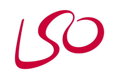
It’s a secret double meaning. Or maybe it’s obvious. Yes, the letters form the shape of a conductor. But it’s the energy that makes it great. He looks happy. Excited. He wants us to be a part of something. I love this little guy.
Andy Crestodina – Orbit Media
—

I don’t believe in logos. My mentor, Jon Morrow, didn’t have one for 7 years (nor did he have a tagline). Spending time deciding on a logo is just time wasted that you could be spending on growing your audience!
Sue Dunlevie – Successfulblogging.com
—

No political comment here, but I was really impressed by Hillary Clinton’s campaign logo. At first, I thought the arrow going through the “H” was pretty weak. When I saw the way the logo could be transposed onto geographic backgrounds or rendered in different colors (the LGBT rainbow flag, for example), however, I got what the campaign was going for. All together, they created an immediately recognizable, iconic logo that gave them the flexibility to support multiple causes and create flexible avatars.
Aaron Agius – Louder.online
—

My favorite logos tend to be from car manufacturers. I love that for the most part, many of them have changed very little in almost 100 years. The Audi logo is perhaps my favorite. Simple, clean and timeless. (And Audi started out as Auto Union in 1932, but the logo stayed the same even after the company’s name changed.) Designing a logo that will still look relevant and contemporary in 100 years is quite an accomplishment. I can only hope that my company’s logo will look fresh a decade from now! Being consistent is critical to any brand, whether it’s a logo, an advertisement or marketing initiatives like the kinds of promotions we see our most successful users run month after month
Jim Belosic – ShortStack.com
—

I know it’s a common choice, but I’m going to have to say Apple. Apple has everything you could ever want in a logo.
It’s simple, which makes it memorable. I’m willing to bet you could draw it out pretty easily from memory alone. When you see it, you instantly know what the company is and what they sell.
It conveys a premium feeling, a feeling of class, of luxury, of elegance. This fits right into Apple’s marketing strategy. There’s also a degree of mysticism to it. To this day, you’ll hear 5 different stories about what it means.
Apple shows us that the right logo can send a message and get people thinking about your brand more than they otherwise would have. In my eyes, that’s really powerful.
James McAllister – Helpstartmysite.com
—

My favorite famous brand logo has to be the Nike logo. The checkmark and the slogan “Just do it!” complement one another and are extremely motivating!
I also like some of the less famous logos, such as those of my fellow blogging buddies, Ahfaz Ahmed and Enstine Muki, because of how their names relate to their logo branding.
Each has been inspired by the initials of their name to create their logos!


Lorraine Reguly – Wordingwell.com
—

My most favorite brand logo is the I <3 NY (I Love New York) logo by Milton Glaser (even before I was even a professional designer) simply because it works and is so easy to understand.
Jacob Cass – Justcreative.com
—

I love the new Airbnb logo. For me, it has everything that I feel about Airbnb in one logo. It’s a heart, meaning love. It’s shelter, meaning home. It has a flow to it, meaning travel. As the design studio explains,”everyone coming into contact with the brand has an emotional sense of purpose and affection for it”. I feel that they’ve nailed that with their new logo.
Ben Matthews – Montfort.io
—

Years ago I loved MTV and now I love Google — for the SAME reason. Both of these brands play hard and fast with their logos without losing out on the message or connection with their audience. They dress up their logos, they adapt the logos to the event or the way they are being used and this is what keeps them current.
Ivana Taylor – Diymarketers.com
—

There are many brand logos that I like but, off the top of my head, I would choose Ford Mustang’s logo. It gathers everything that I enjoy finding in a logo: it’s simple yet beautiful and meaningful at the same time. With just a few colors (with different tonalities) they’ve designed a memorable logo. It represents the strength, the rebellion and the wild nature of an untamed animal that fought a hard battle to be accepted as a true horse breed in its own right. That’s what Ford kind of borrows from the Mustang logo. That is what consumers will eventually feel when they see it. Mission accomplished.
Louie Luc – Buzznitrous.com
—

My favorite brand logo has to be Apple’s logo. Most logos are too complex and try to scream the brand name everywhere.
Apple doesn’t have to with their minimal with the simple mono logo that tells. I think simplicity and readability is key. Apple logo does that and it’s recognizable everywhere in the world without having the need to mention brand name.
Aaron Lee – Askaaronlee.com
—

I’ve always loved the MailChimp logo. Their whole brand is just amazing and the logo, while simple, feels perfect when you see it in context. There are several versions of their logo but the one that features a chimp head right next to their name is the best. It’s simple, fun, and bold. This is completely inline with everything they do as a brand, and it’s not something you see with most companies their size.
Ruben Gamez – Bidsketch.com
—

The Nike swoosh is my most favorite brand logo because it is simple and easily recognizable from a distance. This logo represents more than sports… it represents an active lifestyle. I associate the Nike swoosh with excellent due to the caliber of athletes that represent the brand. As a child I remember feeling like the king of the world while wearing the Nike swoosh on my Michael Jordan warm-ups.
Ben Wynkoop – Benwynkoop.com
—

I love the hidden arrow in the FedEx logo because I never see it when I am not thinking about it. Then when I come across a post that mentions it, once I find it then I can’t not see it. It reminds me of that photo illusion of the old woman and the young girl.
According to CNBC, “the design has won over 40 awards and was ranked as one of the eight best logos in the last 35 years by Rolling Stone magazine.”
In an interview with FastCoDesign.com, the logo’s designer, Lindon Leader, said, “The arrow could connote forward direction, speed and precision, and if it remained hidden, there might be an element of surprise, that aha moment.”
It also has the five elements a great logo should have as I explained in
How Much is a Memorable Logo Design Worth.
- It’s describable
- It’s memorable
- It’s effective without color
- It’s scalable i.e. works when just an inch in size
- It’s appropriate
Gail Gardner – GrowMap.com
—

The logo of Nike is my favorite one because of its simplicity. Also, it’s powerful message is the main reason why I like it most. How simply it says it is the right one for all. The most important thing is it could be adjusted in any kind of visual quite easily.
Mi Muba – Beamoneyblogger.com
—

I really like Instagram’s camera logo along with their lettering of the brand name. The camera icon — I’m referring to the most classical one (at least to my eyes), that light-brown photography camera — is super cute and well-thought. It really says what their website is all about, right off the bat. Visitors don’t really need to read anything else to learn what that social network is there for. If that’s not what a brand logo wants to achieve, what else can it be? Their designers really nailed it.
Clara Jeronimos – TravelRedux.com
—

My favorite famous brand logo is Monster Energy drink logo. It, being combined, brought together the recipe required for a successful logo; simplicity, creativity, and playfulness. The Monster Energy logo is just a simple three claw marks, you can project whatever you like on to it. The logo has become so popular that people are even printing it on their own clothes. This shows how inspiring and creative the logo is.
Evgeniy Garkaviy – HopeSpring.org.uk
—
 I definitely have to pick Amazon.com for this one, and not because I’m a big author on their site. If you’ve been on the internet long enough to remember the Amazon of the 90s, you will remember a place where only books, movies and music were sold. If you are really old school, you will remember their first logo, which was a big “A” with the Amazon river flowing through it. Now Amazon is all about their smile logo and the “A” to “Z” arrow, since they sell everything. What I also love about Amazon is how they’ve been able to brand themselves over the years by having their name and brand on all of the boxes they ship out. They are definitely one of the most powerful and impactful companies in the world today.
Montgomery Peterson – OriginalColoringPages.com
—

Sports brands are my thing. The Adidas logo is really great; those three white stripes are recognizable anywhere in the world. The 1971 version of the logo is still awesome and it’s the one that’s more memorable to me. Actually, it is now being used on their vintage product line (known as “Adidas Originals” in the States). My thinking is simple: this particular version of the Adidas logo is so brilliant that is still out there outliving newer versions; can’t really get better than that, right?!
Mike Martyns – SoccerGearHQ.com
—

I love Slack. I think what they’ve done in terms of branding is great. This includes the animated Slack logo while loading, to the colors in the app and also the way they “speak” to the users. All combined it is great branding that sets them and their product apart from competitors.
Marko Saric – HowToMakeMyBlog.com
—

While I do not think that flat design should be generally used in any case, there are a few examples where I think flat design turned out to be a great improvement over the previous logo design, such as in the case of Microsoft’s XBOX and Google’s YouTube. The biggest improvement that we saw with a flat design logo is Netflix, however. Their logo has always been simple and the new flat logo is even simpler – but still as recognizable as ever. I am convinced that this new logo makes marketing and sales a lot easier for Netflix.
Björn Assmann – Maxsearchusa.com
—

I think my favorite logo would be the FedEx logo. I love that they hid an arrow within the logo that subliminally shows movement and direction. Once you notice the arrow, you won’t be able to ever miss it again. Including one of your missions within a logo is incredibly hard. At HealthJoy we’ve included a doctor’s stethoscope within our logo to make it easy for someone to understand what business category we are in. We’ve also named our chat bot avatar “JOY” to tie in the brand, logo and our mascot into one complete brand story.
Rick Ramos – HealthJoy.com/
—

I’ve always been a fan of the Microsoft logo Not only has it’s changed and transitioned over time, it’s also one that is quite simple, yet known throughout the world at the same time. The Microsoft logo is also cool because of how it’s changed over history. If you ever take a look at their original black and white logo, it was extremely simple and very 70s-80s. Their logo today represents color, openness and isn’t limited to just software and Windows, like the original theme for the business eas in previous years. Keep an eye on Microsoft’s logo in the coming years, as they are always changing it up, but also keeping it very similar to the company goals at the same time.
Tim Bourquin – Afteroffers.com
—

As a gadget person, I’m more inclined to look at tech companies and their logos. I can think of the Android logo, which is that groovy green robot that sort of takes you on a trip to the future. Then there’s also Microsoft Windows’ logo that has evolved over the years and is becoming more interesting and nicer to the eye. Along with Windows 10 came the logo’s latest version which is the most beautiful of them all.
Tim Blaustein – ToolFever.com
—

Apple’s logo. That half-bitten silver apple is probably one of the most iconic brand logos of all time. It’s simple, smart, beautiful and cool. It transmits the brand’s spirit and what they want their message to be: “We are different. Be different. Think different. Break your boundaries. Free yourself. Live free”. Apple customers know that when they buy Apple products they aren’t getting just another product, they are getting a work of art, something that raises their status quo. They’ll even show off their Apple product and the brand’s logo with pride. All just with that single apple element on it. Kinda makes you think…
Katy Manniche – TattooOy.com
—

It is difficult to choose only one. For me, there are a number of features that a logo should bring together:
1- Easy identification. It must be distinctive enough for our target audience to associate it with our brand
2- Associated with our corporate values. It must convey a psychological connection with the main values of our company
3- Capacity of attraction. In a world, both online and offline, where the users encounter thousands of visual impacts, our logo must have the ability to excel and capture the attention of our customers.
4- Versatility. The logo of a brand is going to be used in multiple media, so it must have the ability to integrate correctly.
Taking into account all the above points, I would choose the Nike logo.
Albert Mora – Seolution.com
—

Well, tooting my own horn, but Mailbird’s brand logo. The reason is because it has some relativity to the popular brand logos out there like Twitter and follows the styling with modern Windows OS apps. It incorporates what the product is, which is an awesome email client and a bird. So its an @ sign that looks like a bird…therefore Mailbird. Simple and easy to remember.
Andrea Loubier – Getmailbird.com
—
 I love logo designs that don’t need any words attached to them for them to be known. A few good examples of these would be Microsoft, Apple, Target, and Nike. Of the ones mentioned, Nike has to be one of my favorite. Not so much for the actual design, but instead on how they’ve been able to grow the company and brand over the past several decades. For example, imagine if Nike didn’t grab Michael Jordan when he first came out — and how they did the same with LeBron James. Would they be the same success story they are today without the endorsements and sponsorships of the names they’ve been able to secure over the years? Some interesting food for thought!
Brandon Johnston – BlogReign.com
—

That´s easy.
Nike.
Why?
The logo is so simple but elegant.
And the slogan is awesome.
Just do it.
Sometimes you can´t overthink stuff, you just need to apply massive action and…
…just do it.
This is what I did when I was able to use business coaching to grow my business with 20x last year.
Many people are afraid to make mistakes.
But you learn more from your mistakes than your victories.
And that is what leads to experience, which again will help you to crush it!
Tor Refsland – Timemanagementchef.com
How to Create an Amazing Logo Design that Leaves an Impression
It’s easy to look at some of the most popular logos in the world today and think they are popular just because of the brands they represent, however, it’s actually much more. A lot of work goes into the actual look, feel and design of a great logo.
To learn more about logo designs and how to create an amazing one for your brand, be sure to contact LogoDesignTeam today!

