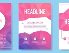
A brochure is just as important as your most basic marketing tool – your business card. Your business card introduces you as an individual and your company brochure introduces whatever it is that you want to sell. The look and feel of the brochure is every bit as important as the content. The design should reflect the visual feel of who you are and communicate with or reach out to a prospective customer who knows nothing about your company. It must be easy to read with a clear focus on what it has to communicate through the use of images and copy.
It is your opportunity to create a lasting impression. Make sure that it is a good one.
How and when to use your brochure to gain the maximum impact:
An introductory mailer – This will need a powerful sales letter to accompany it so that the prospect has a reason to take the time to read it.
A ‘leave behind’ following your initial sales call – Even if you have mailed out a copy in advance of your meeting, it is always a good idea to leave another copy as a reminder.
A response mechanism – Fulfilling requests from potential clients for literature, either in response to an ad or a phone enquiry.
The four key points on building brochures that sell.
• Attention
Get the attention of your prospective customer by using color and creative graphics. Do not make the front of your brochure wordy. In fact, keep it to one or two main headlines. The headline should be brief and effective such as, ‘Do you have too much money at the end of the month?’ This headline is simple and will strike home with someone who has a hard time budgeting their finances. Remember, at this point you are just trying to get their attention. If you overwhelm them right away with lots of text, they will not want to bother picking up your brochure much less reading it.
• Interest
To keep a prospect’s attention and interest you need to quickly show that you understand the reader’s problem. Once the reader can say, ‘Hey, they are talking about me,’ you have peaked their interest in your product or service. Then show them ways that your company can better their situation. Keep your text light and easy to read. Too much text can clutter your piece. Always remember this thumb rule, if your brochure is too hard to read it won’t be read.
• Demand
An appetizer is a small taste of something to make you crave in the main meal. Your brochure should be treated the same way. Give the prospect just enough information so they crave more. Leave some things unanswered so they have to call and find out more information. Graze past the main topics, do not let the brochure tell everything. A mistake people often make is designing their brochure to be a sales representative. A brochure is not a sales representative. A brochure should simply get people excited enough to want to inquire for more information. It should whet a prospect’s appetite, not fill them completely.
• Action
If your brochure has done its part up to this point, you should have legitimate prospects wanting to learn more about your company. You must now tell them clearly how they can go about taking that next step. Also, do your best to provide a variety of options they can take advantage of. For example, provide a phone number and a Web site address. Alternatively, print a form for them to fill out and send in for more information. Bottom line, make it as easy as possible for them to take that next step such as a toll free number, a prepaid business reply form, or directions to a form they can fill out on your Web site. All of these can help expedite turning prospects into customers. Lastly, you only need to print your company’s contact information once. Why? Because it is more professional and prospects don’t need to be blasted by your phone number all over the piece or printed in a large font. After all, a brochure is just one piece of paper, not a billboard that people are passing at 60 m.p.h. If they are interested, they will find your number.
Order a Custom Logo or Graphic Design or Brochure Design to Enhance Your Brand
No matter what type of personal brand, business or organization you are running, having a great first impression means everything. One of the best ways to deliver a lasting impression is through the use of a high-quality logo and professional images and designs throughout all of your products and branding.
Do not have brochures? Get your facts straight.YES, your company needs it. And We deliver it. Contact us here.


