Your logo is a very important part of your branding. Whether you are a Fortune 500 company or a small business trying to make it online for the first time, you must have a great logo to attract the kind of customers that will be interested in your products and services. You also want to present a professional demeanor to your customers in a way that helps define your brand.
Your logo often goes hand-in-hand with your motto as well. Your motto dives deeper into what it is your company stands for and what values you embrace.
But how should you start in creating your logo?
There is no exact way to start working on your logo, but it helps to see what some of the top companies did to create their logo.

Let’s start with Coca-Cola.
Coca-Cola is one of the biggest world companies that has ever existed. They have manufacturing plants all over the world, and they have a brand that is synonymous with American tradition. They started in 1886 when John S. Pemberton developed it as an original soft drink and decided that he should put the two “C’s” together in his logo.
The original logo was a black scripted “Coca-Cola” font that resembles the read “Cola-Cola” logo they have today. In the early 1890s, they inserted the small “c” for copyright in the tail of the first “C.” It took a bit different approach in the years that followed, and the drastic appearance of the curlier “C” did not have the same impact as the earlier scripted version, so they decided to go back to the scripted cursive writing following that.
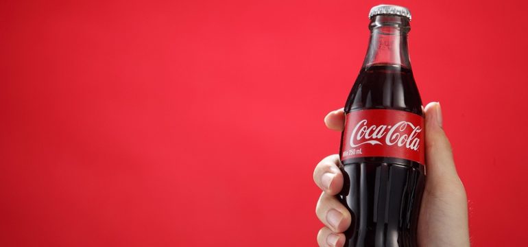
They brought in the red background in the early 1960s which gave it a “fishtail” look at both ends. From 1969 to 2007, they stuck to similar logo looks that always embodied a red background with white scripted lettering in the foreground. The only diversion Coca-Cola took from this red background, and white lettering was in the year 2011 when they celebrated the company’s 125th birthday with a slender red bottle of Coke that spewed out the top in celebration of the event.
In 2013-14, Coca-Cola also ran a special campaign where they put individual customer’s names on a Coke in a plastic bottle which helped their PR with customers but didn’t do much for their logo. But, when you are Coca-Cola, your brand is so popular that you hardly have to do anything to promote it!
See the history of Coca-Cola’s history here:
http://www.coca-cola.co.uk/stories/the-logo-story

Apple: The First Fruit of Invention
The history of the Apple logo is an interesting one. When Steve Jobs and Steve Wozniak were playing with ideas for the name of their company, Steve Jobs came up with the name, “Apple,” much to Wozniak’s dismay. He was afraid that people would get the branding mixed up with Apple Records. But Jobs was quick to point out that it was a very good idea because it symbolized the first fruit that was forbidden in the Biblical Garden of Eden.
He wanted the name also because it started with an “A” which, during the time of phone books and physical directories, would put the company high on the searches when people looked for computer or technology companies.
Rob Janoff, the designer of the original Apple logo, decided to create the Apple logo with a bit out of it, symbolizing the bite that Eve took out of the Apple, symbolizing the fall of man. Janoff explained later that he did not mean for this meaning to be conveyed in a negative way, but he wanted to make sure people knew it was an apple, and not a cherry.
But Jobs saw the irony in it and decided to keep the logo, which, to him, represented a company that, in his mind, would have everything that people wanted but thought they couldn’t have. See more about the history of the Apple logo here.
It seemed to work for the Apple company, and they are still enjoying this fame to the tune of $495 billion (as of May 2016). Yes, I’d say that’s a big bite out of an apple!
The Common Denominator of Logo Success
When we look at these two examples of great logos from well-known, successful businesses like Coca-Cola and Apple, we begin to see some common factors. Both companies knew how to capture what they were about in ways that went beyond their product. Coca-Cola was about simplicity but consistency, not just soda or soft drinks. It was about stability; something America needed in the early to mid-1900’s.
They played on this theme with their simple but beautifully-scripted lettering on the solid red-colored background. Apple, likewise, found it’s branding with a bit of simplicity as well as allusions to the Biblical beginnings of the world. But it did it in a way that enticed people to want what it had to offer and created a sense of desire in the customer to have the products it was putting out.
Apple chose a universal theme (the fall of man) for forbidden fruit and the knowledge of good and evil to Coca-Cola’s sense of American tradition and consistency, yet they also have some things in common in the way that they found a connection between their logo and their customers.
This connection can be evocative and emotional, or it can be intellectual. But most of all your logo must be something that connects you to the client and makes them want to be a part of what you have to offer.
What’s in a name?
Not everyone will like your product, but they should still like your brand. Remember that you can always change your products. If you are marketing to a certain audience and they don’t have what you want, you can always market other products to them later.
So work on your branding and figure out ways that you can lure them with your logo even if they are not crazy about your products.
Relationships, not Products
Branding is about developing a sense of trust and understanding among your targeted audience. You need to develop relationships with them so that you can present different products to them at different times. You want to develop connections that help you build trust over time. That is what will win you loyal customers that not only buy something one time but they will shout your brand to the world.
Creating brand ambassadors is what we are talking about. You can do this too by using your logo and other branding assets to connect to your customers truly. So look to Coca-Cola and Apple as your inspiration, then call on us to help.
At logodesignteam.com, we are in the business of creating memorable logos that appeal to both your target audience and your hard-to-reach customers. Your logo is a huge part of your brand. Let us design a winning logo that will bridge past the barriers and present your brand to the world in a way that will truly create loyal customers for life.
We don’t have the tree of the knowledge of good and evil but we can make your customers think you do.


