Brochures are one of those traditional ways of advertising that still work in our current times. That’s because advertisers and small businesses have realized that they can advertise their online sites and blogs on traditional print ads. You can also put your website URL and email on the brochures and do some cross-advertising between digital and print ads.
Therefore, there is still an inherent value in creating compelling brochures that people will want to read.
But how do you make your brochures more effective?
The key in any advertising campaign is to capture and keep the attention of a skeptical recipient. When they get your flyer or brochure in hand, you have to get their attention to make them want to tune in to hear what you have to say. Then you need to keep their attention long enough to follow up with the message.
Unlike video where you can entertain them with audio and video clips and animations, the brochure is just a two-dimensional piece of paper.
How can you make it stand out?
Here are a few pointers that will help you do that.
Know your purpose.
One of the most important keys to keep in mind in any ad campaign is to know your purpose before you start. It might help to make a set of main points that you wish to address in the brochure and make sure you cover those.
Are you primarily doing it to introduce your services or do you want to use it to sell?
Steve Jobs had a saying he liked to say often, despite his love of digital technology: “Plan in analog.” So take an old-fashioned legal pad and write down the important points you want to cover in your brochure.
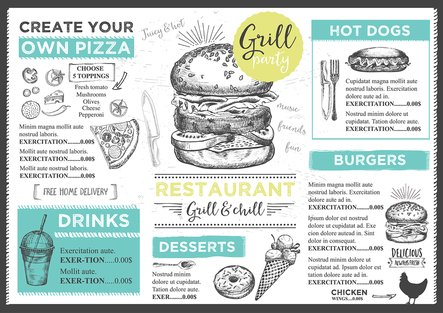
A great example of this can be seen through the example menu below. For a diner or restaurant, you can’t come up with a better example of a brochure than an actual menu. Look at how amazing the design is in the example below versus a typical text-based menu you might see in any average dining location.

Make your fonts speak for your brand.
Fonts are a great asset to your brochure, but you don’t want to overdo it. Using too bold of a font in the wrong place can make you seem overly aggressive. If you use fonts that are too small, it can make you appear timid. Fonts say a lot about your brand but choose them carefully, especially if you integrate them into your official logo.
Plan from the reader’s perspective.
When designing a company brochure, make sure to design it with the reader in mind, not yourself. The more you keep the reader in mind, the more you will get the message across that you intend to with the right people. If it’s about a new product, you will want to make that the focus in the middle of the brochure. Include lots of photos and create a desire to purchase within the ads.
Brochures may seem traditional when compared with our modern digital ways to get information out there, but it still holds the same power of glossy magazine pages that could lure and attract customers by creating a desire to have something. If you can create this sort of need within your readers, you’ll have it made.
Photography Should Shine
Since you are dealing with a print medium, your photography should shine through and leave readers in awe. Closeups and detailed photos highlighting the best parts of an item or pictures of satisfied customers go nicely in the middle of a company brochure.
You need to create a sense of happiness for your brand by placing the proverbial apple from the Garden of Eden within their grasp.
You want to instill in your readers of your brochure that they just have to have whatever it is you are selling and make them want that forbidden fruit.
Need a perfect example of this? If the picture below doesn’t make you want to wish you were on a tropical island or vacation… it’s not correctly doing it’s marketing!

Create Unique Shapes
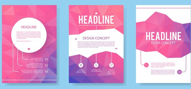
Who says the company brochure has to stick to the old traditional rectangular shape? Some folders have been created in a multitude of various shapes and designs that all appeal to the senses.
Check out this video of creative brochure ideas to get your creative juices flowing:
You don’t have to go wild focusing on the shape or colors, but it’s great to break out of the mold When creating your logo design for your company brochure, you should consider several aspects:
Use Power Words
Use some power words that trigger a sense of urgency or immediacy within your intended audience. Some examples of power words are:
- The Secrets to…
- Time Sensitive Opportunity…
- Discover Proven Methods…
- The Key to Success…
- Last Chance to…
All of these headlines have a way of grabbing the attention of potential customers and get them to act within the first few minutes of reading your flyer. If you win them over at the beginning, you will likely secure a sale.
Make your points obvious and don’t overdo with too much text. One mistake often made by business owners trying to create a flyer is that they try to cram too much into the space that is available on your flyer or brochure. Save some space to achieve a clean look.
Sometimes “less is more.”
Logos Matter
One of the most important and memorable things about your company brochure is your logo. The logo of your brand is what readers of your ads will remember long after they have forgotten about everything else.
How does your logo show off your brand? What does it say about your company ideals, goals, and achievements?
People don’t care about your company. But they do care about what your company can do for them. How does your logo communicate what you can do for people on a real level?
When designing your logo for your company brochure, you should consider several aspects:
- Color
- Design
- Artistic quality
- Fonts
- Graphics
The color and design are all going to affect the mood of your brand when people view your brochure. What does your logo tell people about your company?
There are universal meanings for colors. Here are a few to help you as you consider the color you wish to use for your own company’s logo.
- Red- Energy, Love, Desire, Power
- Green- Nature, Health, Environment, Vigor
- Blue- Peace, Harmony, Unity, Trust
- Orange- Energy, Balance, Warmth, Enthusiasm
- Brown- Earthy, Home, Outdoors, Stability
These are just a few sample color meanings to mull over as you plan your logo and company brochure. Are you using these colors in the best way? Could you combine some aspect of different colors the way Apple, Microsoft, and others have done with their new logos, for example?
If you are in the technology space, and you’re using red, is that the best color to communicate what you are about?
The text or fonts and graphics you use are also of equal importance in creating a logo.
This can all be confusing. You want to represent your brand in the best light possible on all of your advertising materials.
Your company brochure may be the most beautiful thing you’ve ever seen. But if you don’t have a great logo, you have a mountain to overcome.
It’s about more than a brochure. It’s about branding.
If you need help redesigning or creating your company logo, contact us.
We are logo and print design experts at LogoDesignTeam.com. We can help you communicate the right message to your customers so that your company brochures will stand out and be more effective.
Fight against the ugliness. Just like a doctor fights against disease. For us, the visual disease is what we have around, and what we try to do is cure it somehow with design. Contact us today- get cured!


