Companies are known to invest a lot of money in designing their brand logos and for a good reason. That’s because a logo is the face of a business. It is the graphical representation of a company. It anchors the brand and is the most visible indicator of a business in the market.
A logo represents the values and beliefs of a company. However, with only colors, shapes and typefaces to work with, it is imperative that designers make their choices carefully to elicit the desired emotions from the target audience of the brand. Logo designers are aware that each visual cue carries a message that can evoke a particular reaction from its consumer.
When people look at different colors and shapes, it affects their subconscious minds in varied ways. By choosing the shapes and colors that draw the desired response, logo designers can influence the way the target audience of a business feel about a design and how they view the brand.

People understand a logo the way they comprehend words. What makes a great logo is a harmony between the shapes and colors that create it. A powerful logo may appear simple, but a lot of thought has gone behind the shape and color used.
Impact of shapes on logos
Shapes have a psychological impact on the viewers. An accident has not chosen the shapes of famous logos, they involve the psychology of the human brain. They have been chosen after careful thought.
Here are some tips on how to use shape psychology in your logo designs.
• Curves for compassion and affection
Curves generate a comforting response. They can denote love, care, friendship, support, affection and tenderness. Curves convey a sense of movement and are, at times, used to resemble a smile to signify happiness. The curved shape also conveys a cyclical nature that represents movement. Also, a sense of growth and transformation is conveyed with the shape.
• Circular shapes to create harmony
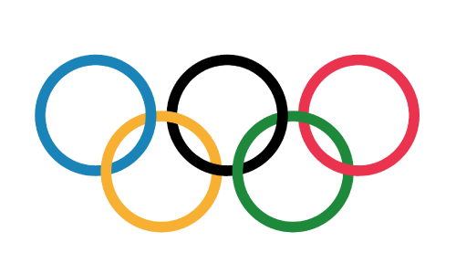
Circular shapes are feminine, smooth and project positive energy. They also represent unity and partnerships. A circle is inclusive. There is no beginning and an end and it is all-encompassing and welcoming. Culturally too, circles represent community, marriage and friendship. The Olympic rings are a great example of overlapping circles denoting unity between different countries.

• Triangular shapes are for power
The sharp angles in a triangle come across as powerful, strong, masculine and are often used by legal, religious and scientific institutions in their logo designs. Triangles also connote a sense of movement.
• Convey a sense of stability through square shapes
Squares and rectangles are thought of as gender-neutral shapes that connote a sense of order, trustworthiness, strength and stability. Businesses that want to convey conservatism and solidity should think of using these shapes in their image. They also create a sense of precision and balance.
Squares convey efficiency, but they may also appear unimaginative and uninspiring. Filling them up with different colors can make them more interesting. Take, for instance, the Microsoft logo.

• Vertical lines denote strength
Vertical lines convey a sense of balance and professionalism, but with a sharper edge. They are usually employed in corporate logos in competitive businesses and connote efficiency and reliability. Designers, however, ought to be careful while using the shape, as the lines can also come across as aggressive, cold and domineering.
• Horizontal shapes for calmness
Horizontal lines in a design can be tranquil and calming. IBM’s brand has a calming effect, especially when combined with blue color. Horizontal lines appear more trustworthy and composed and it can be a safe choice for designers.

• Diagonal lines for dynamism
Diagonal lines have a significant impact on the subconscious mind and designs that have a lot of diagonal lines often convey a sense of vibrancy and liveliness. However, one must be careful to not overuse the shape, as then, the brand might come across as untrustworthy.
The psychology of shapes also extends to the typography that you employ in your design. Examine your chosen typeface and see if it resonates with the message you want to convey. Rounded, soft letters would create the same impression as curves, while jagged typefaces would give out the same message as diagonals.
The shape you employ in your logo design will play a major role in shaping the message that the consumer will receive about the nature of the business. It is imperative that the logo designers are aware of the subconscious signs that their image is sending out.
Different shapes can be combined together too to create a powerful visual message. For example, the Nike swoosh combines a smooth curve with a diagonal line to create a sense of joy and movement.
It is crucial that you work with a professional designer when it comes to creating the perfect shape for your business. Before creating a design, a professional designer will make a list of attributes that the image should convey. All the necessary information is noted and the designers will match the aspects into a combination of colors, shapes and typefaces.
Get the right logo
If you are looking for a great design for your brand, The Logo Design Team is the right stop for you. We have more than ten years of experience in designing logos and have delivered over 1 million logos to clients worldwide over the years.
With 120+ expert designers on board, you can be assured of getting a logo that leaves a lasting impact on your business. Not to forget, you can get a 100% refund, if you are not satisfied with our services!


