A logo symbolizes your brand like nothing else does. It is often the very first thing your customers see when they enter your website, visit your blog, or see your company name when shopping for your products or services.
That’s why it’s important that your logo capitalizes on your brand in the best way. You want it to illustrate the values, credos, and high points of your company. It needs to make a strong statement without being overbearing.
It’s also important to realize that your logo is not static. It will not stay the same. Just like your business itself, you must always be aware of the factors influencing the world market and the motivations behind your customers’ buying decisions. This includes how your logo appears to them online and on mobile devices.
In this post, we examine some of the changes in some key companies’ logo design to see how it has improved (or not improved) over time.
The history of Apple and the evolution of its brand is as fascinating as its logo. The original Apple logo featured a multi-colored apple with a leaf featuring all of the colors of the rainbow.
Over the years, it evolved into a white apple logo with a bite out of it. The more updated Apple logo featured an apple that was more simple and clean-cut than the original designs.
The More Things Change
Sometimes, over time, a company analyzes their logo and looks back at past logos to gain inspiration on the company’s beginnings and to consider how far they’ve come since that time. It’s sometimes to their advantage to incorporate a part of their older look into their modern ad campaigns and company branding.
The More They Stay the Same
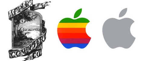
Apple is an example of a company that likes to change their logo quite often. Like their founder and CEO, Steve Jobs, Apple is rarely satisfied with what they do, no matter how good and they seem always to want to improve on perfection. In June of this year, Apple brought back a resemblance of their original rainbow apple logo design and chose each color of the rainbow to illustrate a different favorite app that is popular in the iTunes store.
They created it as a blend of color behind two-eighth notes as the new iTunes icon for iOS users and featured it on their recent iOS 7 operating system rollout. It is believed by many that it was the original logo that inspired this mesh of color, though this version is much more modern and clean-cut than the original.
This attempt to regain the popularity of their original logo is a bold, confident move on the part of Apple and they may be hoping to capitalize on the loyalty of older Apple fans who remember them from their humblest beginnings.
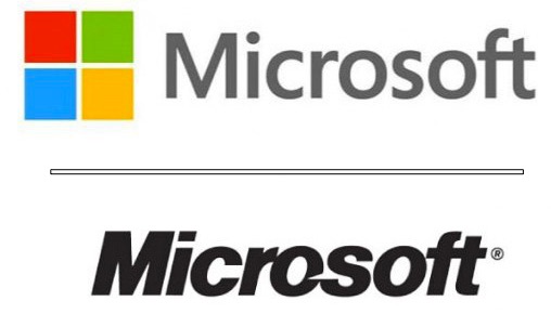
Microsoft, another high-profile company whose history is almost as interesting as Apple’s and whose history also merges in many ways with Apple’s history, has recreated their logo at least five times over the past three decades. Their original logo featured a roughly-sketched boring gray and black design with the “Micro” word elevated and to the left of the “Soft” part of the brand name.
In 1975, they developed a better-looking logo that featured a dark green background with a beige colored lettering and an “O” in the middle that seems to be in motion. This was an attractive logo and served the company well for awhile, as they were developing and improving upon their operating system, Windows.
A few years later, they opted for only black lettering on a white transparent background. It seemed powerful but wasn’t colorful enough.
Then, someone got the bright idea to emphasize on Windows, their staple product. In 2012, they redesigned their logo to feature a multi-colored “window” along with the brand name beside it to the right. This is the logo they still have today, and it seems to emphasize what they’re about more than any of their previous versions.
If Microsoft is not about Windows, what is it about? I’m just surprised they didn’t think of this in their earliest beginnings.

Netflix’s logo hasn’t changed much since it’s inception, though they did alternate from time-to-time between a white on red logo to a red on white version. But, more recently, they have made a more drastic change regarding their mobile app icon, where the company uses a polished-looking “N” in red on a classy black background. This was a more dramatic move away from what customers were used to for Netflix, so the company worked hard to get the word out before the change.
The SnapChat icon is a peculiar one. It’s almost as if someone just put a logo together as an oversight, in our opinion. It features a primitively drawn ghost on a sickly yellow background. Not exactly an eye-catcher. But it hasn’t seemed to reduce the number of downloads of their popular app, which features a social media channel coupled with the ability to take pictures that then disappear seconds after taking them. Thus, the logo.
I found their web page even more strange than their logo. If you go to their site, you feel as though you have suddenly encountered the sun up close and personal and the blinding yellow color hits you like a flare.
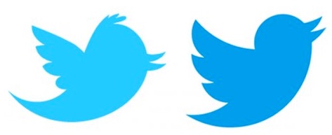
Twitter has stuck to its bird. Let me explain. Twitter began with a blue bird twitting about, except it seemed the bird didn’t twit. It just kind of sat there. I don’t know if users complained that they didn’t like a sitting bird that didn’t move, or if their designers just wanted something to do. But after the initial static bird image, they got busy and designed several variations of their more dynamic “flying, chirping” bird logo that we know and love today. Good job, Twitter. A bird that tweets must be moving!
Well, now that we have examined (and given our opinion on) some of the top brand’s logos and app icons, we hope you get the point. Some are better than others! And logos do change. Often they have to, to hold the interest of their customers. But do also remember that people like familiarity. That means you need to create a logo they are comfortable with, and if you do decide to change it, it should be something that at least resembles your original (or former) logos enough to know it is still your brand.
People can easily get lost in the shuffle when changing your name or app icon logo. You don’t want that to happen.
Here are some quick tips to keep in mind when changing your logo.
- Make it closely resemble your original logo so people won’t be confused on your identity.
- Use colors that are aesthetically appealing when possible
- Do surveys to see what works the best with your target audience.
- Think about how you want your brand to look to the masses.
- Do research on what colors mean.

These are just a few things to keep in mind when redesigning your logo. You don’t want to wait too long to get started if you feel it’s time for a change.
We are logo design professionals here at LogoDesignTeam.com, and we can help you take the guesswork out of your logo design. We have years of experience doing just that for many companies.
Contact us to find out how we can analyze the results you are getting on your logo and make the changes necessary to put your best foot forward.
Thinking ahead in terms of trends and time. We aim to create designs which will remain unique and iconic, in other words – timeless designs. You want it, we’ll give it to you. Give us a buzz here!
Because a logo is one of the first impressions, you make on your customers!

