The identity and brand behind your business are extremely important. For many of the top brands and businesses in the world today, their logo design is what makes them who they are. Some brands have been able to do such as a great job and branding themselves, they don’t even need to include a name within their designs — such as Target, Nike, Apple, and Microsoft. An even better example of how to get creative with a brand design is to look at Google’s logo history and see how they are continually changing up the design every few days on their home page.
However, it would be foolish to just talk about big name brands and the meanings behind their logos. Instead, we wanted to hear from individual entrepreneurs, bloggers, marketers and smaller brands from around the world — asking how they came up with their brand identity and specifically their logo design.
45 Entrepreneurs and Marketing Experts Share the Story Behind their Brand and Company Logo Design

Let’s face it… shoppers/customers don’t become advocates and influence others in order to champion brands out of the goodness of their hearts, or because of a brilliantly-designed logo. So spend way less time focusing on your logo, and way more time focusing on the customer experience.
Shoppers become advocate influencers because something about their experience with a brand influenced them first… and they want to continue that experience.
Ted Rubin – Tedrubin.com
—

My company name “White Glove Social Media” is about two things: 1) what we do (social media marketing) and 2) in the way that my team and I execute (strong attention to details) the work we do for our clients.
The “white glove” business philosophy strives for precision, thoroughness, and attention to even the smallest detail. Whether I am helping a client or doing something in my personal life the “white glove” mindset is always naturally present.
As for the logo design, you can see I’ve included my picture in the design and I chose the colors and fonts because they were beautiful to me. There was no strategy there other than being professional looking and tasteful.
You don’t need thousands of dollars to develop your brand logo. A good direction to take with branding and your logo is to be authentic because otherwise, people will eventually see right through you. And that can be very helpful for building a client base.
Anna Bennett – Whiteglovesocialmedia.com
—

Our brand is called OptinMonster, and we help website owners convert abandoning website visitors into email subscribers. We created Archie (our mascot) which is a green monster eating an envelope. It gives our brand a friendly feeling while communicating the point that we’re a lead-generation company.
Syed Balkhi – OptinMonster
—

While today I’m known for my site and brand at ZacJohnson.com, the real parent company name is MoneyReign, Inc. I actually came up with this name when I was in high school and started sketching a few logo designs. Then it hit me! A dollar sign with a crown tilted to the side. Still, one of my favorite logo designs ever created! As for the Zac Johnson ‘mascot/cartoon,’ that’s also become well established by my brand, I ended up hiring a cartoon design company to create it. No idea who it was back then… but it’s become a pivotable part of my personal brand today.
Zac Johnson of Blogging.org
—

We have a raccoon called Winnie as our logo. We realized that the web hosting industry is pretty dull and we wanted something fun and memorable. We built Winnie into a chatbot that users can talk to to give him a bit of personality and to bring the brand to life. Our hope is that this helps set us apart and appear a bit more approachable.
Marcus Taylor – Website Hosting Insider
—

The brand logo for myself has one very simple message that sets me apart from other real estate agents. The slogan is “incredible real estate marketing like no other Realtor in Massachusetts”. This is a rather simple statement but it’s the truth. If there is one thing about real estate sales that becomes paramount is the marketing your provide your clients. At the top of the list is photography. Real Estate is a very visual business. The focus on any good real estate marketer is providing exceptional photography for their clients. A close second on the list is spending the time putting together vivid descriptions that tell a story about a home. Many agents don’t give a second thought to marketing. It is easy to stand-out in a crowded field when you go the extra mile on everything you do.
A secondary part of my logo is the RE/MAX brand which is one of the most recognizable ones in the world with the balloon. RE/MAX does more business than any other real estate company in the world.
Bill Gassett – MaxRealEstateExposure.com
—

The Blogsmith’s logo design is a bit in-your-face, and that’s on purpose. I’ve always been the loudest voice in the room and known to stir up a bit of controversy for the sake of getting people to talk through the things that might separate them. In a name, “The Blogsmith” is intended to stir up the image of someone who is a creator (much like a silversmith, blacksmith, etc.). The graffiti styling is an attempt to embody my bold and edgy personality and is also a nod to my travels and passion for street art photography. It’s a little crazy, but I couldn’t be happier with how it turned out!
Maddy Osman – The-Blogsmith.com
—

The industry of Search Engine Optimization is a new industry in the last two decades and small business owners are still ages behind. Unfortunately, because of that knowledge gap a class of hucksters & sleezy salesmen mascarade as legitimate professionals. I decided to launch my consulting business as a continuation of my personal branding built over years of participation in social media conversations about SEO. I include a lot of humor, animated gifs and sarcasm in my writing & social posts and my brand and simple logo reflects that choice.

Jeremy Rivera – Jeremyriveraseo.com
—

A developer friend of mine designed my original logo on his own. He posted a black and white selfie of me with my brand name. A few years later I added a palm tree to the design and the Blogging From Paradise logo was born. I just created something that reflected how to retire to a life of island hopping through smart blogging. I was the guy offering the smart blogging tips. The green text and palm trees represented the jungles we often visited in the tropics.
Ryan Biddulph – Bloggingfromparadise.com
—

simpleshow was founded by 2 media graduates in Stuttgart, Germany back in 2008. Initially thought to be a one-time idea for explaining a complex product that customers struggled to understand, the newly created simpleshow format quickly became a real product that other customers requested. Apparently we hit the nerve. Calling it simpleshow felt kind of natural and the hand as our trademark was drawn within 20 minutes. That’s because we love it simple. It took a couple of years to develop the software and the explainer engine to create our online DIY video maker tool mysimpleshow launched in 2016.
Karsten Böhrs – mysimpleshow.com
—

We completed a logo redesign in the past year. In creating the logo, we wanted to preserve some of the history of the company. A key part of our history was the fact that the company name was picked because of my love of ancient temples, and in particular, Stonehenge. That’s the reason that one of the sets of stones from Stonehenge is part of the logo. As for the rest of it, we were looking for a simple, clean, sharp look, that would render well in multiple environments.
For example, the logo had to look good in both high-resolution print environments, and also on web pages. This drives a need for a mix of simplicity and elegance.
Now, the rest of the story, as to why the company is called Stone Temple Consulting. All the way back in 1997, I was planning to start a consulting company, and I needed a name. I was driving down the road listening to the radio, and I hear a song come on, and I said to myself “ah, Stone Temple Pilots … you know I love ancient temples, so maybe I should name the company Stone Temple consulting and have Stonehenge be a part of the company logo.” It’s a good thing that my real inspiration was Stonehenge because as it turns out, the song I heard was not recorded by the Stone Temple Pilots, and my thinking it was by them was a complete mistake.
For us, the Stone Temple (Stonehenge) association brings with it many values too, such as being rock solid, dependable, able to stand the test of time, and also, being innovative. Think of the skill and technology it took to create Stonehenge over 10,000 years ago. We hope to bring the same to our clients today.
Eric Enge – Stonetemple.com
—

SharpRocket’s logo is predicated on skyrocketing online businesses search traffic. Since we provide quality link building and content marketing services to our clients, the logo can speak for itself – helping B2B and B2C entrepreneurs tremendously increase their organic traffic.
Venchito Tampon – Sharprocket.com.ph
—

I must have told this story 100 times. I had just written Climb Your Stairway to Heaven: the 9 habits of maximum happiness. I had accepted to write a column in a brand new magazine, The column was to be called “The Happy Guy”.
One day, I was visiting a BNI meeting. I introduced myself as “David Leonhardt, the Happy Guy”. After the meeting, several people remembered that I was The Happy Guy. Nobody remembered that I was David Leonhardt.
Two hours later, I owned the domain.
The brand tells people that we are good people to deal with. People like happiness, and we aim to make that happen (customer satisfaction). The logo reflects this, working from the broad concept of the traditional “happy face”. We often get repeat business, so it must be working.
David Leonhardt – THGMwriters.com
—

My design blog and studio JUST Creative is an extension of my name, Jacob Cass. (J and C). The type-only ‘JUST’ brand expands into multiple usages… eg. JUST Amazing, JUST Incredible, etc.
Jacob Cass – Justcreative.com
—

We are called Bowler Hat. And I really wish we had a great story here. But the truth is I am no longer sure why I chose Bowler Hat as the brand and logo. At the time I was into programming – black hats, white hats etc. I was also a big fan of Linux and Red Hat in particular. Then there is this concept that all marketers have to wear many hats in this rapidly shifting digital landscape. I guess I just like it. It is classically British. It has ties to business. It is the head were of a British gentleman and businessman. And, you know, it just kind of looks and sounds cool. Certainly, it is memorable and it always gets folks asking – “why Bowler Hat?” and in marketing, if you can start conversations you are half way there.
Marcus Miller – Bowlerhat.co.uk
—

I think like most companies, the HealthJoy.com brand has been in an evolutionary path for the last 2 years. Some of the tweaks have been very slight and I doubt no one other than me would notice them while others have been larger. Our logo has gone through mostly incremental changes in its life and those have been due to changes in our business models. We started our company as a consumer-focused B2C play but our business model has evolved to target businesses (B2B). We actually sell though insurance brokers to companies and our end users are the employees of those companies, so we are kind of a B2B2B2C play. Our brand must work for all those parties. HealthJoy is an employee healthcare decision platform that helps companies control costs and improve employee well-being. The app is powered by JOY, an AI chatbot that guides people across a wide range of health decisions. JOY connects employees with online doctors, insurance experts, medication cost specialists, and curated recommendations. It’s pretty cool technology!
Regarding our logo, we started off with a two color logo with red and grey with a stethoscope in the shape of the Y at the end. We quickly realized that red wasn’t working for our brand as red in healthcare is usually in connection to an emergency. We tried the teal from medical uniforms for a few months but teal is a tough color on a mobile app. We most recently did a brand redesign and settled on purple and blue as our primary colors. They seem modern and fresh together and work in our mobile app. We moved to a single color logo and have done some small kerning and tweaks to the fonts over time. I really like where we are with our brand at the moment and don’t foresee any major design tweaks for quite some time.
Rick Ramos – HealthJoy.com
—

We’re a growth marketing agency. We don’t want to grow your business 5% a year – we want to grow it 50%+ a year. That means fighting to make things happen, but doing it strategically and scientifically.
The logo is actually the chemical structure of Norepinephrine. When you’re body goes into it’s “fight or flight” mode, you release all kinds of crazy hormones. You probably know about adrenaline, but you might not hear about norepinephrine as much.
Norepinephrine increases arousal in the brain allowing you to be more vigilant. It carries the idea of being ready to fight and grow your business, but doing it in thoughtful, intelligent ways
William Harris – Elumynt.com
—

Originally I had a much more complex logo. I liked it a lot, but there were all kinds of problem when trying to print it or use it on different background and it didn’t look good in monochrome.
I decided I wanted a much more simplified and elegant logo, so I had a logo designer take my existing logo and redesign it to be much simpler–almost too simple.
But, simple works–especially when your company is Simple Programmer.
Now the logo is really just an S and a P with a box around it, but it looks clean, simple and elegant and looks good on t-shirts, websites, business cards and everything else.
Plus, people can easily remember and identify it.
John Sonmez – Simpleprogrammer.com
—

Our product logo here represents your personal evolution. It took many iterations (100+) and feedback from countless people to get to this point and create this seemingly simple logo.
Arman Assadi – Superhumanlabs.us
—

I strongly believe that the story behind your brand/company logo design should reflect WHAT YOU BRAND DOES AND HOW YOU DO IT FOR YOUR CUSTOMERS.
E2M is a full-service digital marketing agency specialized in SEO and Content Marketing. I have been into this industry over the decade and I have seen how companies/agencies have used (still using) unethical SEO practices while optimizing their clients’ sites Google search engine to rank them organically in top search results.
When I started E2M back in 2012, I have decided that we would like our brand to talk about what we do, our core values, and our commitment.
But sometimes it’s not easy for your customers to understand everything from just logo so you have to tell the story about your brand/company logo design like we have done at E2Msolutions.com: What is E2M?
Manish Dudharejia – E2Msolutions.com
—

Sending a message with a bird as the messenger is a simple association with sending emails. You have Sparrow and Thunderbird as examples. So we wanted something that was easy to remember and also would be easy to rank well for on search engines. So we went with Mailbird. We used 99designs to create our logo and we had a lot of people say it looks a lot like the Twitter logo, but that was also strategic in itself. Today Mailbird is a well-known email application for those looking at alternatives to Outlook, Thunderbird, EmClient, Postbox or Inky. Mailbird is ranked high for the best email client for Windows, so the brand and logo has evolved over time since we’ve started in 2012.
Andrea Loubier – Getmailbird.com
—

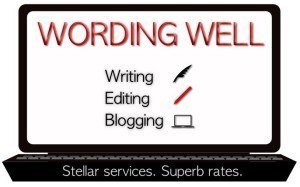
Wording Well is a word-based business that offers writing services, editing services, and author assistant services.
Because the services I offer involve me working on my laptop, I decided to create an image of a laptop computer that listed most of my services on its screen!
Blogging is something I also do (and get paid for, when I write for others or when I earn via affiliate sales), and so I decided to highlight this aspect as well as the stellar services and superb rates I offer!
You can clearly get an idea from what I do and what my company is all about simply by looking at my logo! The laptop says it all!
(Okay, it says MOST of what I do… because I also offer coaching and consulting services, too!)
When you decide to brand your business, you can do this via your logo.
For other branding tips, you can read A 12-Section Guide to Branding Your Business Online.
Your logo, however, is vital to your business, as it is one thing that will mark your business as unique and memorable!
Lorraine Reguly – Wordingwell.com
—

As an expert roundup specialist, I connect bloggers with entrepreneurs and company owners.
I explained my business model to my graphic designer and I sent him a sketch that I made. He then turned it into a stunning looking logo.
Before hiring somebody to create your logo, check other logos he or she made. Don’t choose the cheapest offer that you can find on Fiver. Your logo is important because it represents you and your business. Also, make sure to hire somebody that is creative, capable of coming up with suggestions but in the same is willing to hear you out.
Minuca Elena – Minucaelena.com
—

My logo was designed by Pamela Wilson of Big Brand System. I approached her because I liked the simplicity of the logos I’d seen from her, and I’m a fan of simplicity.
The colors of my logo are purple and orange. I wanted my logo to stand out and be bold, so didn’t opt for a safe corporate blue. I chose purple because it’s my favorite color, and orange because it’s a Dutch color. I’m originally from the Netherlands. The two colors together make a strong brand statement.
As the colors were already bold, the main aim of the logo design was to express professionalism as well as a sense of fun and friendliness. Pamela achieved this by having the g’s of Enchanting and Marketing entwined. It’s like the one G gives the other G a helping hand.

Henneke Diustermaat – Enchanting Marketing
—

I am a designer by trade so I designed the logo and branding for makeawebsitehub.com myself. The logo is very simple showing that my website is a hub of information all connected together. The palette I used for the website is very clean mainly consisting of black, white, grey and light blue. I am a traditionalist when it comes to website design and prefer fonts and colours to be easy to read.
Jamie Spencer – Makeawebsitehub.com
—

We just recently redesigned our site and I love the new logo created by Chee Ching. The minimalist design is to emphasize our site’s no bullshit approach in helping our users find the right web host and blogging better.
Jerry Low – Web Hosting Secret Revealed
—

Our logo is a squared conversation bubble around the letter B with the word “squared” beneath it. This logo represents our company’s marketing mantra of “Think Conversation, Not Campaign.” At B Squared Media, we offer done-for-you social media services with an emphasis on the SOCIAL! Because we believe in two-way conversations online as smart marketing, we knew our logo had to represent the all-important conversation that we aim to deliver for our clients. Think about what we do as social media strategists: connecting with people emotionally is critical because people make business decisions based on who they are, and who they think YOU are. Too many people get focused on the sales and the campaign, when at the end of the day, the sales dollars are tracked back to one person who made a decision to buy; probably based on psychographics, not demographics.
Our logo is a beacon of what we believe in: “think conversation!”

Brooke B. Sellas – B Squared Media
—

The story behind the logo for Blondish.net has been about my slogan, “Helping You Rock Out Your Website Like a Rockstar.” The logo has always been somewhat simplistic, but there have always stars the logo. In the past, I had the letters done in a chrome metallic style, like the metal on some guitars.
I’m a very outgoing person, so the current logo, despite it being somewhat simpler than previous versions, is a crisp and professional- looking font in black, combined with colorful stars, that are fun and sassy. This works, because it fits my personality. Also, with this logo, I can easily create designs for print, and have black and white versions, which makes it flexible for both print and web.
Nile Flores – Blondish.net
—

A company logo should represent the vision a company has. Through the logo, you need to highlight all your strengths, your ambitions, and basically, this image is what people are going to identify and associate with your company. A logo should have all those qualities your company has, and this way you highlight those qualities and in a way present your company values.
With our own logo, we wanted to go for that futuristic vibe, that’s the main theme behind the logo. We’re a company oriented towards the future and we wanted to use a logo that would represent this vision of ours. We always keep up with the trends, we seek new strategies for improving business, and that’s why we’ve decided to go for this kind of logo. This essentially means that we wanted to reflect some of our goals through the company logo. We’re also very direct and straightforward with our efforts and the way we help people with their business, which is the reason why we’ve chosen this simple layout and design.
Albert Mora – Seolution.com
—
 Right now I’m in the transitioning process for coming up with a logo identity for my brand. The site name is “BlogReign”, but the content focus is also on tech, news, business, and media. In the past, we had a logo design that looked like a castle and integrated the word “Blog” into it… but it didn’t mesh well with the site. I think at the end of the day it’s all about finding a WordPress and making sure the colors mesh well with your brand. I’ve been seeing a lot more sites going with a standard text logo design versus a graphic heavy design.
Brandon Johnston – BlogReign.com
—

Our company name and logo are designed to train people to use our website. We are an online real estate brokerage in Colorado Springs. We noticed years ago that more people were using the internet to shop for homes, so we built our whole brand around online consumer habits.
Our company is called Great Colorado Homes, but our logo displays our URL, GreatColoradHomes.com. It reminds people over and over that we are an online company. We also put “Colorado Springs Real Estate” at the bottom of our logo. This was to quickly explain what we do. We work on real estate transactions in Colorado Springs. It’s as simple as that.
I believe it is important to build your logo/brand with simplicity and character. Design can get in the way of interpretation from the consumer. Make sure that your name and message is clear and can be interpreted within seconds. A logo with good design and a clear message can carry a company’s brand very far.

Andrew Fortune – GreatColoradoHomes.com
—

Precision and stealth. Those are the two words that come to mind when I think about a ninja.
Our story comes from the question, “What would happen if an organization had an army of ninjas running its business processes?”
When we were solely based in India, we ran a company called, “SupportMonk”. It worked relatively well, but we wanted to be as competitive as possible so we moved to what at the time, fast becoming the best market.
After moving our BPO offices from India to the Philippines, we noticed that the change in company culture and values also changed the output. The team was more streamlined and positive results were easily repeated. These guys weren’t zen monks — they were ninjas! So a natural evolution from “SupportMonk” to “SupportNinja” occurred.
Our logo had to reflect (pun intended) the idea that the left and the right are identical, because no matter where you’re based, your left processes will mirror your right goals. The processes are so well executed, it’s often hard to believe that we don’t have an army of little robots behind the scenes.
The logo also plays on the visual idea of a ninja; It looks like a cloaked, sword wielding, agent of productivity.
Cody McLain – SupportNinja.com
—

Don’t be fancy! That’s what I learned from successful entrepreneur Gary Vaynerchuk. I applied the same lesson to my brand logo. I used a signature approach in my logo.
The reason why I did that was it looked simple and had a personal approach to it. The best part? It’s free since I have some background in design.
Before using it, I posted it on social media and the feedback I got was amazing. People loved it and some even asked how I did it. Now I use it everywhere from social media cover photos to my email signature.
Aaron Lee – AskAaronLee.com
—

My personal brand and company name (OptimizePrime) is a fun one. I’m a geek at heart and loved Transformers as a little kid, and grew up through SEO into my digital marketing career. I thought of it one day while doing something mundane, and upon searching for it, no one had claimed it yet (of course today, I can name a handful of imposters). So, all my handles are OptimizePrime and I frequently get comments about it. Some people even recognize the handle at conferences or other events but not my real name! The logo I designed by simply finding a font that was free for use and modeled after the Transformers font, and created it out of that.
Harris Schachter – OptimizePri.me
—
 When we started creating our infographic directory site, we wanted to make sure we had a minimalistic feel to the site, mainly with a white and black feel to it. This way it would allow for each of the infographics to pop right off the page. We ended up going with a very clean theme from Genesis Themes, and stuck with a text logo header for the site. It ended up working out really well, as it’s extremely easy to navigate throughout the site and also has the “MarketingInfographics.org” name and brand in bold letters at the top of every page. This is a good example of going very simplistic.
Kristel Staci of Marketing Infographics
—

We took the view that some of the best brands have simple, straightforward logos; we decided to emulate that principle.
We settled for a logo concept with an icon that symbolizes what we do, and our name. Since we are in the business of helping people find love, we selected an icon of interlocked heart, as a prefix to our name. We think the logo is simple and elegant, just as we envisaged it.
Evgeniy Garkaviy – Morak.com
—

I don’t have a logo in the traditional sense. I don’t think every solopreneur needs one, at least not in the beginning (despite many popular articles telling you otherwise).
If your business is 100% online (like mine), the purpose of your logo is to raise awareness of your brand. You will use it in the left top corner of your website, on your images and in your videos. With time, people will associate your logo with particular things, like topics you write about and quality of your content.
But I achieve these goals without a logo.
I use one particular head shot as my profile image across every platform and a distinct photograph of myself when I need a bigger image (in my website header, About page, video thumbnails, etc.). Basically, my logo is my name and my face. Additionally, the featured images of all of my articles use the same distinct style.
Creating a logo takes time and isn’t cheap. And if your only reason to get logo is “because everyone has it”, I would say, your time and money are better spent on something that has a better return on investment.
Gill Andrews – Gillandrews.com
—

I actually had my designer make it. CD stands for Chowdhury’s Digital, which is my last name and the word “Digital”.
Rafi Chowdhury – Chowdhurysdigital.com
—

The story behind my brand logo comes from the message that I want to transmit to my readers and followers: I want to help them grow their online businesses stronger and better so they can reach their online goals.
This idea is also mirrored in the words that make up my brand name.
If we deconstruct “Buzz Nitrous” we’ll be able to understand its meaning. “Buzz” comes from marketing buzz/excitement/stimulus and “nitrous” comes from nitrous oxide/engine boost. So “buzz nitrous” is the fuel that boosts your (online marketing) buzz giving you strength and power to fulfill your objectives.
To that avail, I made sure that the colors (red and orange) and design of my logo together with my brand icon (a flame) would represent a sense speed and energy, something powerful that would help take my readers to the next level.
Louie Luc – BuzzNitrous.com
—

I run a website that is all about the best gear you can find to help you in your daily tasks, be it indoor work or outdoor activities. We talk about (and review) all sort of tools you can think of: from knives to power tools, utensils, machines and all the techie stuff out there. So wanted my logo to reflect what my blog was about: tools and gadgets.
To achieve that, I tried mixing a hammer (representing the tools) and a tablet screen (representing the gadgets). Together (along with some letters, of course) they form my brand’s words “Tool Fever”.
The result is a fun, cool and retro-futuristic kind of logo that makes people understand what my brand is all about just by looking at it.
Tim Blaustein – ToolFever.com
—

My website TattooOy.com is all about the beautiful art of tattooing. Therefore my brand image would forcibly need to send out an idea of art, wildness, beauty, sexiness, and provocativeness. I wanted my logo to be a simple design too, at the same time.
Not an easy job, one might say. Even so, I tried coming up with something of my own creation and got some inspiration from actual tattoos — tribal tattoo designs are my favorite.
Then I searched for those font types that are widely used to ink words on people’s skins and designed my logo with my brand name, a light color gradient for the background and a cool placement of each of the words.
I think it does really look like some type of colorful tattoo that transmits my brand image’s idea.:)
Katy Manniche – TattooOy.com
—
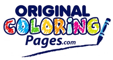
 During one of our latest projects, we decided to create a free coloring book resource site where hundreds of PDF files can be downloaded, printed and colored in by our audience. It was at this point that we knew we really needed to have a great logo created not just for the site and brand, but also to watermark all of these original drawings with as well. We went with a little design agency that threw together a few different ideas and were very happy with the first concepts. We went with a logo design that looked like it was colored in with a variation of markers and crayons — which perfectly represents our brand.
Montgomery Peterson – OriginalColoringPages.com
—

When I launched my website some time ago (now that I think about it, time does fly!) I wanted to create the go-to resource for vacationers looking to travel to and have a good time in my hometown.
Simultaneously, I tried making my blog’s visitors feel that traveling is fun, vacations are meant to be happy times and I wanted to welcome them to my sunny city. My logo design would really need to give me a hand in achieving all of that.
I asked my designer to create something simple, colorful and light. And I got back some white sand, smooth ocean waves and a beautiful blue and sunny sky with my website’s name on it. I think my logo represents all of my thoughts for the brand.
Clara Jeronimos – TravelRedux.com
—

Over the years, I’ve worked towards building up my name into a brand, so it was only natural that I used my name as the logo. I’ve actually changed the design of my logo quite recently because I wanted it to be bolder and more striking – so, I gave up on the previous cursive font and tried for a bolder one and I also made to sure to include a tagline: generate leads that convert. The tagline is now more prominent and the most important word – convert – is in bold, so it stands out. That’s what my business is all about: helping other entrepreneurs and SMEs reach their goals by generating better leads that convert into long-time customers.
Lilach Bullock – Lilachbullock.com
—

My logo is a picture of myself. The reason for such a simple logo was it represented a shift in my business. Before I had always remained under the radar and shifted my business from selling a generic service to selling me as an expert or “guru” of that service. The funny thing is, I really didn’t have a good picture of myself and was so busy I really didn’t have the time to get a professional one taken. So at first, I was using a very substandard image. At the time, as a hobby, I was teaching Judo and one of my students was a photography enthusiast and he kept telling me that I really should get a professional photo taken. I explained my time crunch problem and he offered to take the photo after class. So I brought a suit jacket and shirt to class and threw them on for the picture. I still had my Judo pants on but it was out of the frame so no one would see. The class had been a very physical one, so I was covered in sweat and had mat burns across my face. I stood up against the black wall of the gym and he took a few pictures with his high-end digital camera. Later he photoshopped out the redness of my face and the photo turned out great. The best thing is it that is great a great story to tell handing out my business cards that have my photo on them. I don’t recommend using this method of getting your photo taken or creating your logo. However, often people don’t remember the logo or face but they do remember the story, so make your logo’s story a great one.
Allan Pollett – AllanPollett.com
—
![]()
My brand WPChime.com, a WordPress resource and tutorial site has a very deep yet subtle story behind it and it’s logo.
Out of the millions of bloggers using WordPress, we see a lot having a not so harmonious relation with the CMS due to their lack of knowledge to tackle daily issues they face for the smooth functioning of their blog.
At WPChime which has the word WP (as we discuss only the WordPress CMS) associated with Chime which has a very magical and serene connection with the “pious bell” that chimes when struck.
This sound helps you harmonize your inner self and calm down.
And with WPChime, that is our brand story. To help you harmonize your relationship with WordPress by providing relevant articles and only the ones that help you with your blogging cores.
The logo, too, reflects the same concept that has a bell carved into negative space with the word WPChime.
Swadhin Agrawal – DigitalGYD.com
How to Create an Amazing Logo Design for Your Brand
When you think about the many different brands and companies in the world today, often times that ones that are most recognized and well-known, have a great logo design to go along with them. After reading through any of the logo design stories above, you will quickly understand how meaningful a logo or brand identity can be to an organization or founder when first starting out.
If you are currently in the market for a new logo design or looking to bring some new inspiration or life into a design you currently have, please to contact LogoDesignTeam today and let us show you all of the possibilities in branding and design today!

