Every brand wants to be memorable and recognizable. Achieving this goal requires the use of a well-thought-out marketing strategy. However, it is unthinkable to start your successful path in the market without an outstanding logo.
A logo is something that will always be in front of the target audience. It allows you to identify the company and distinguish it from competitors. But how to make the logo truly memorable and form the right impression about the brand?
In this article, we will share a recipe for designing a logo that will be imprinted in the memory of your consumers.
5 tips for creating a professional brand logo
Quality designers from Awesomic.io platform can help you with creating a professional brand logo. Specialists take care of the originality of the design and that it is attractive and recognizable.
We’ve also compiled fundamental tips to help you develop outstanding branding and break into the minds of consumers. Shall we start?

1. Consider the characteristics of your brand and its values
If you don’t want to get lost in a mass of faceless trademarks, you must look deeper. A logo is not just a collection of random graphic elements, colors and a text part. This is a thoughtful branding element that should reflect the values and principles of your company. Therefore, you should ask yourself the most important questions, such as:
● What is your brand for?
● What values do you share?
● What is your advantage and difference from your competitors?
If you haven’t already, then you should do it right away. Only in this way will you be successful.
Not a problem if you are confused and cannot immediately give answers. The fact that you are in a similar situation tells you that you are on the right track.
The bottom line is that after that, you will find the right path. Understand what image you want to create around the brand and what design techniques to use for this.
2. Know your target audience
Who is your target audience? What worries her? What is he dreaming about? All this is important to know in order to design an outstanding logo. You cannot afford to be guided by your own preferences, otherwise, you risk being left out of the market.
Let’s assume that the core of your target audience is generation Z. These are young people with a clear position. They do not tolerate compromises and expect the same from brands. Therefore, the best thing you can do is find out what is truly important to them. If your target audience is vegans, you must show that you are with them. And in no case should you use elements in the logo design that contradict this.
Your final product should appeal to your target audience, not cause dissonance.
3. Study Your Competitors
One of the most common mistakes entrepreneurs make is ignoring competitors. You need to know what is happening in the market in order to be on its wave and achieve the best results. Therefore, be sure to analyze the players within your field. Pay special attention to market leaders. This can give you a direction and correctly assess what is happening, using the information for your own purposes.
4. Use best practices in design
You don’t need to reinvent the wheel. It is enough to use proven successful design practices. Don’t worry, you will remain an individual. To do this, you should transfer the experience of other people to your brand, but keep your idea.
Grab attention with associations
Being literal is not boring with the right approach. If your business is selling bicycles, you can use a bicycle as a graphic element. Such a logo will inapplicably attract the attention of the target audience. Because it creates the right associations. This allows a potential client to pay attention to your company and understand that he is in the right place.

Take care of readability
Make sure that the text part is readable without any problems and that the graphics are clear and clean. To do this, choose a quality font. Preferably strrchny and without serifs. This will make it easier to achieve the desired result. The graphic element should not be misleading and well drawn. Leave enough lead space for better readability.

Play with monochrome
Monochrome is not only what you might think of first. It is not necessary to use only one color. You can make a logo in several shades. To do this, choose colors in the same spectrum that are best combined with each other.

Create contrast
Color contrast is also a great technique to help you stand out from the competition. For example, you can use combinations such as gray and yellow, pink and black, white and red. The bottom line is that one text does not merge against the background of another, but rather stands out strongly.

5. Consider all placements
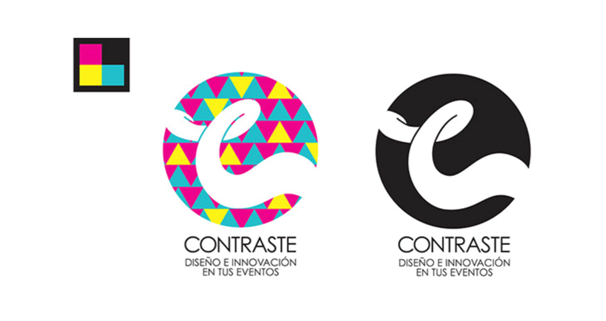
Be prudent and think long term. Your logo should look equally good on all media, from the website to branded caps. You may need to create several writing options – a vertical, horizontal, separate graphic element or a text part. Think about how best to implement this and in the future you will be able to create outstanding designs with a cool logo.

Conclusion
The logo is one of the key points of contact. This is what will be placed on all media and be the face of your brand. Therefore, its creation must be treated with full responsibility. Use our guidelines to create an outstanding end product that will work for your business.


