Designing a website might sound so regular in today’s world as there are over 1 billion websites in 2020.
Everyone wants a website these days.
Businesses use websites.
Even you, probably want a website and that’s why you’re here right?
But you’re thinking:
How do I really put out the perfect design for my website?
Are there certain principles I need to follow in order to have a successful website?
Well, firstly, there are certainly a couple of principles that you must follow to have a successful website design.
You see, we’ve created and designed a bunch of websites for some of our clients and what we’ve noticed is a pattern as to how successful websites work.
And in this walkthrough, we’ll be guiding you through the same principles.
But firstly, what sets this article apart?
It’s simple:
Rather than telling you things like Add a Search bar, create better navigation, create a good menu, we’ll be diving deeper into the real principles that actually affect your website’s success when it comes to your website and user experience.
You see, if you’re a beginner, you’re probably mostly attracted to the “looks” or “beauty” of your website. That isn’t a bad thing to want but an efficient web design goes beyond that.
If you already have a website, you probably find yourself always tweaking your website’s look, design and it never seems to be perfect!
With over a decade’s experience in web design, we’ll be walking you through some of the pillar web-design principles you must follow to ensure a successful website.

How to Design an Effective Website – 3 Principles to Follow & 7 to AVOID AT ALL COST!
Just like I’ve earlier mentioned, rather than just piling up a long list of certain web design principles that your business website should follow, we’ll also look at what you should avoid.
This will not only help you get a successful website but would ensure you stay clear of the mistakes most business websites tend to make even in 2020.
Principles to Follow:
Rather than just stating random design principles, we like to approach web-design from a “functional” basis.
Don’t get it? I’ll explain.
Your website is meant for the users right?
I mean, the usability & functionality of your website are key to having a successful website as users are sort of the reason why we even think of creating these websites.
Correct?
Why not focus all your efforts on that?
If you’ve read the dozens of articles on web-design out there, you’ll see that literally everyone talks about usability and user behavior!
As a result, we’ve broken down our 3 major functional web-design principles as:
1. Search Engine Optimization – if you’re trying to build a website, then you’re most definitely going to need organic traffic. We’ll discuss some key website design elements that you must to get your search engine optimization right!
2. Web Hosting – Surprised to see this here? Well, we’ve noticed that web hosting affects the functionality of your website. I’ll tell you a story of a friend whose web host had a technical issue which led to his 4 years old site crashing thus losing his search traffic within 2 weeks.
Shared hosting is relatively cheaper hosting option but certainly means slower performance for your website as your website’s performance will depend on the load that other websites are putting on the server.
3. Website Structure – this is where people employ principles like menu, navigation, themes etc. but we’ll be given a pretty unique perspective of these.
But before we dive deep, to explain these principles, we first need to understand how users interact with websites, user interface and user interface.
How Users Interact With Websites?
It’s fair to say that different people behave differently on various websites but with the help of data and our vast web experience, we’ll help you understand how people interact with websites and exactly how your business can follow that pattern to ensure a successful website structure.
User Experience is used to describe the role of website design in determining a user’s experience when using a web page or application.
It’s basically every step a web designer takes to ensure that a user gets the best possible experience on their website.
From the homepage design, placement of buttons, menus, links, photos and even what happens after they click on anything on the web page or web application.
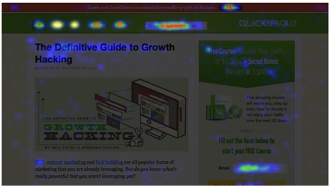
Certain tools like Crazyegg help explain how your users engage with your website.
It shows a hitmap of what your users pay more attention to whenever they’re on your website.
So the very first step to a successful web design is to properly understand how your users behave on different websites.
1) Search Engine Optimization
It’s no news that search engine optimization (SEO) leads have a 14.6% close rate, while outbound leads have a 1.7% close rate.
That’s a huge gap between SEO and Outbound leads in terms of close rates.
And if we’re being honest, most websites fight for organic search traffic. In fact almost every business prefers Google traffic/rankings to any other form of traffic.
This shouldn’t come as a surprise as a good chunk of web visitors that come from Google (organic traffic) convert to buyers or clients.
For this reason, businesses use certain services or tools to ensure their websites are search engine optimized.
Is that correct?
For example using cache tools to ensure site speed which in turn improves your website rankings on search engines.
There are a couple more things you must consider to have a great website that search engines love.
It’s pretty much a different thing to create websites and also a completely different thing to create one Google LOVES!
And we’ll be highlighting a few really important design techniques to ensure a website that is loved by search engines but before that, you must understand that a website’s structure or design can harm its rankings.
CONTENT:
Yes, you heard that right. A website without content is pretty much not going to get loved by Google. Well, I guess it’s no news that search engines prefer websites that get updated constantly.
Correct?
Now content can be the backbone of your entire business. We understand how powerful content & content marketing is.
Over the years, we’ve been able to create a ton of content across our different websites that have ranked on the first page of Google and from our experience, this is what we have to say:
Your website can be as beautiful as possible but without consistent content, you are definitely missing out on a lot of good traffic!
And on the other hand, your website can be looking so normal (or ugly) but get all the rankings possible.
Good content always helps with the rankings. As a matter of fact,
Get the idea?
WEBSITE SPEED:
Over the years, website speed has been key to rankings. 47% of consumers expect websites to load in two seconds (or even less).
We all understand that the faster your website pages load, the better your search rankings.
Is that correct?
Good!
But site speed is a huge topic on its own as there’s a ton of things that determine your website speed. We’re talking about things like page load data, plugins, website structure, website hosting (we’ll be discussing below) and web content.
A key web design principle that we always follow is the type of content (or files) that your web pages have (to load for every user).
Have you tried visiting a website’s homepage but see lots of graphics content? Well, that plays a role in your page’s load time.
As a result, we try to keep all graphic content as minimal as possible.
You can make use of web tools like Google’s speed test or Gtmetrix to check your site speed.
Here are a couple key things to put in place:
- Reduce the number of redirects on your links.
- Reduce or minimize the HTML, CSS and JavaScript codes your pages load.
- Optimize your web images. Images play a huge role in load time too. We notice a lot of web pages use heavy stock images which slow down your website.
2) Website Structure
As we’ve worked with a lot of clients around the globe over the years, we’ve really been surprised at how often businesses overlook site structure.
But first off, what is site structure and why is it important to website owners?
The structure of your website pretty much shows search engines the main components (or pages) of your website.
This is where people employ principles like menu, navigation, themes etc. It’s an important aspect of your SEO strategy.
If you structure your web pages properly then, your visitors or web users will gain from that as they’ll find it easy to move around your web pages.
This increases your Average Time per visitor!
Site structure is very important as search engines crawl every website daily through internal and external links; and Google does this using its bot, Googlebot.
Your site structure doesn’t only improve your rankings, it also improves UX (Users Experience).
As you know, the better or rather, the more appealing your website is to your users, the higher search engine traffic you stand to attract.
How then do you get your site structure right? We have 2 basic steps that we always advise:
1. Plan out all your web pages, categories, sub categories and navigation structure properly.
2. Improve your internal & external link structure (it’s no news that internal linking plays a huge role in improving SERPs).
Don’t worry, I’ll explain…
Before you begin creating your site structure, you must first plan out all your main pages in hierarchy. This will help you a lot in the long run (especially if you’re just getting started).
You can do this anywhere but preferably on a whiteboard or on a piece of paper.
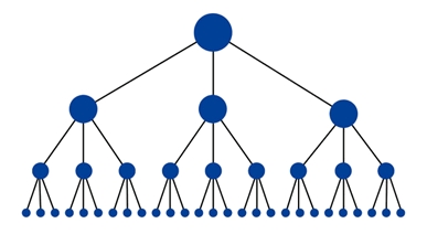
Think about what pages are most important to your business. If you get a website right now and have a 6 figure business, what pages do you think would generate the most revenue?
And that’s why most times, the most important pages on business websites are always different. Take a look at Wandr.

Or Hiplay:

Here’s Webflow.com

Secondly, improving your internal and external linking helps.
Not BACKLINKS THIS TIME!
The links from your websites that point back to your website (internal linking) and the links pointing to other (related) websites (external linking).
3) Web Hosting
Web hosting plays a crucial, yet underlooked role in your SEO performance. Think of your web host as the foundation to an effective SEO strategy.
If you select the best web host, you can spend your entire “business life” happy but if not properly done, can affect your website in the long run.
I, personally, am a victim of bad web hosting. I’d lost my entire work when my web host failed to perform.
Rushing into any web hosting can be a crash mission just like it was for me (I lost 2 years of work due to bad hosting).
Now, if you’ve gone through articles online, you’ll see that the 3 key things that you must pay attention to are:
1. Speed
2. Support and
3. Security.
Your web hosting service must be able to provide all these efficiently. And as you can see, speed is key.
Earlier on when I went into digital marketing, I skipped one important aspect; which is researching about the web hosting service I was going for. Instead, I rushed into the first that popped off Google search and paid for it without putting anything into consideration.
A few months passed, and my website went down because my traffic had passed the threshold for which I’d bought. And as a result, my website’s organic traffic crashed (I remember my best performing post leaving page #1 to about #6 after my site went down).
Thus the first and important thing to consider is your traffic threshold or requirement. How long will you grow this site and how well do you think you’ll be able to grow it?
10,000 monthly traffic?
30,000?
100,000?
1m?
Having a clear understanding of your hosting server will save you a lot too. Shared hosting is relatively cheaper but certainly means slower performance for your website as your website’s performance will depend on the load that other websites are putting on the server.
Get the idea?

Finally, make sure you get your domain name. This is really crucial to SEO as Google tends to reward websites with their custom domain names.
3 Common Web-Design Principles to Avoid in 2020:
To sum up this article, let’s quickly discuss some of the popular web-design principles you must avoid at all costs that may harm your search engine performance or rankings.
1. Too many pages.
This is particularly common with beginners. You may have been advised to add pages on your website but the truth remains less is always better.

What you only need is a few really important pages for your business that you want your target market to easily navigate through.
Rather than having 7 to 10 pages on your site’s navigation menu, it’s better to have around 3 to 5 really helpful pages on your menu.
For instance, what we’ve noticed is that a lot of (small) businesses tend to show every page on their menu. These include About Us, Privacy Policy, Start Here, Contact Us, Hire Us, Past Works, Testimonials, Disclaimers etc.
That’s a lot!
We advise cutting that down to just about 3-5 important pages for your business.

2. Avoid Mobile Pop Ups.
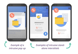
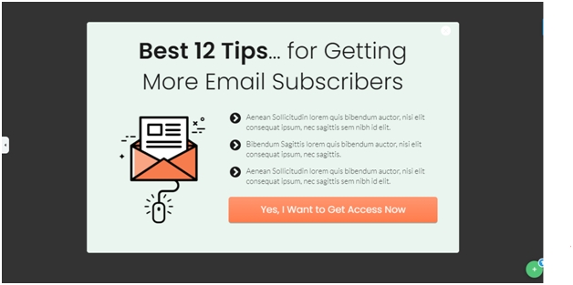
Yes, I’m definitely certain you’ve come across mobile pop ups several times but either closed it or even went out of the site. As a matter of fact, Google frowns at pop ups for mobile users thus can affect your Google rankings negatively.
A mobile pop up is simply a Lead form that covers part or all of the content in which a reader is meant to consume. This could also be a welcome mat or a standalone mobile pop up that a user has to close before accessing the main content of your page.
But here’s the good news:
You can still use Mobile Pop ups the right way. For example, using banner ads that don’t require “closing” or don’t cover the content on the page, then you can still be safe with your rankings. But here’s our ultimate advice…
Be sure to constantly track down your rankings and bounce rates.
If your bounce rates keep increasing, then you might want to reconsider how you use pop ups for your mobile visitors. With the right approach, you can still promote your stuff without getting any penalties from Google algorithm.
3) Avoid One-Page Websites!
One-Page websites have been a thing for quite some time now as it’s pretty easy to put together and you don’t need to put in much work in creating separate pages or content right?
Well, let’s see what Google thinks about these one-Page websites.
Here’s what Matt Cutts, former head of webspam at Google said about one-Page websites:
It’s going to depend on what your particular area is, what the topic is, and what kind of layout you come out with. But if it works for you and for users to have that all on one page, for the most part, it should work for Google as well.
But come to think about it…
How easy would it be for you to build backlinks to one single page?
We here place link building as a priority and you’d agree with me that it’s easier to build backlinks to new, fresh content rather than gain new backlinks to a single page over and over again.
But if you still want to go on with a one page website for your business, having a well defined structure would help your SEO. You can have well defined and structured content sections, highlight each content section with a H1 or H2 tag, use anchor links to different sections of your page etc. to help with your site’s SERPs.
Finally, from our experience, we strongly believe that single page websites are great for special projects or maybe for a new side business.
Conclusion
Website design is a whole broad topic on its own which requires constant attention. You’re probably never going to get the perfect website from the start.
You’ll need to do a ton of testing and optimization. And although, it may be quite difficult to tell what structure best defines your business website, you might want to start with simpler designs and optimize as you test and see what improves and declines your SERPs.

