As the new year has entered and we make plans for better ways to generate leads and customers, our thoughts turn to our email campaigns. How can we make our email campaigns better so that more people will open and respond to them?
Let’s face it: an email does no good if it is never read or responded to. In fact, the ultimate goal in creating email campaigns is to get people to respond. You also hope that, once they see what you are about they will become someone you can market to over and over again.
One thing you can do is to focus on your branding. Branding is that key essential ingredient that defines who we are as business owners and reaches through the hype to connect to that one customers who wants what you have to offer.
If you focus on your branding rather than the email message itself, you will be able to see better results.
Let’s start with your logo. What does your logo look like? Is it powerful and unique or a bit lackluster? Does it reflect the ideas and the products that your brand offers?
It’s good to analyze your logo and see how it could be improved before you launch your email campaigns. People are going to draw conclusions on your brand based on your logo.

Make your logo mobile-friendly.
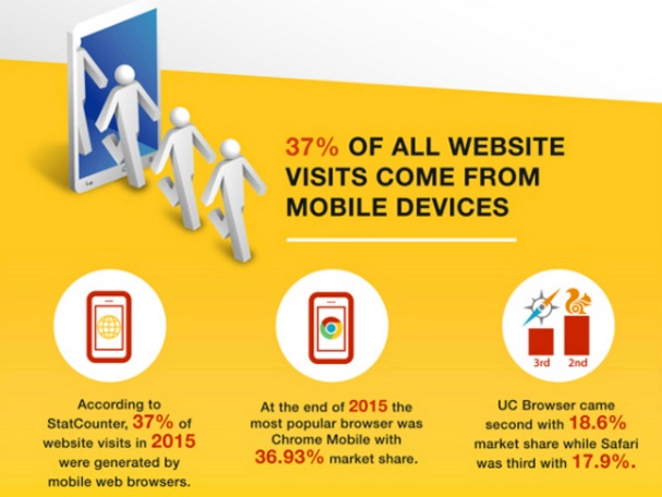
One of the most important things you should do with the new year is to work on making all of your websites, blogs, and logos mobile-friendly. It is estimated that 80% of internet users own a smartphone! (Smart Insights)
This is a huge amount of your market so you need to think of everything you do as a presentation for mobile users. Your logo should be a part of this and should be mobile-friendly as well.
To truly appreciate the massive growth and power of mobile marketing in the coming months and years, check out the mobile numbers infographic below.

How to Make Your Logo Mobile-Friendly
There are a number of ways you can make your logo friendly to mobile users. Here are a few of the techniques you can use that are recommended by top experts in the field such as Webspecdesign.com.
- Keep it simple.– One of the best pieces of advice when you are creating something, is to keep it simple. The same advice applies to your logo. The more complicated something is, the less versatile it can become. It is also more time-consuming to create and may be harder to make it mobile-friendly. So think about the most important aspects of your logo such as color, lines, characters, fonts, and other essential elements and keep it simple. It may be your one chance to make that important first impression.
- Avoid superfluous color use.– Overuse of color can also detract from your message in your logo. Don’t overdo too much color or use bright colors that make it appear less professional.
- Watch lines, bevels, and shadowing.– With people using so many different mobile devices these days, you need to stay away from anything that would influence the way it appears to some of these users. The overuse of shadowing or raised lines, for example, can detract from your logo and central theme.
- Make it versatile.– Make sure you have allowed for all of the different types of platforms people may be using to see your logo. Things appear differently on different devices and platforms. It is a good idea to test them all on the major platforms before you release it to the world so you’ll know how it will look to everyone.
- Make it evergreen.– You should strive to make your logo evergreen like you would any content that you need to use into the future. Your logo is something that you are using to build your brand. So make sure you choose something that you are willing to live with for a long time. It should be something that will attract customers and will do the job you need it to do.
How to Use Email to Promote Your Logo
Once you have applied these tips to your logo and you feel comfortable with your logo design, it’s time to apply some techniques to get your logo across to your primary customers in email.
Create Perceived Value
One of the most important things you should do when using your email campaigns to promote your logo is to create what’s known as “perceived value.”
What is Perceived Value?
Perceived value is the value that people place on your products, services, and brand. It comes from a personal perspective somewhere within the individual rather than through any real monetary amount that is placed on your products or services.
For example, if you are an excellent interior designer, for example, people may pay you $1000 or more for your designs. It’s not that your designs are actually worth this much on the open market. But to your customer, who needs the designs for a new office layout he is planning, they are worth even more. So they are willing to pay a higher price for the value is brings to them.
This is what you need to do with your logo and your brand. Create perceived value through branding that is reflected in your logo. To understand this better, think of a popular brand that you like that you feel a connection to. Coca-Cola, for example. What is the value in Coca-Cola? After all, it’s just a soft drink. But millions of people think of it as the number one soft drink in the world? Why? Because there is a psychological connection (perceived value) between the logo and branding of Coca-Cola and what it means to people. It stands for American values, good times, special moments with friends, and memories.
And that’s what sells Coca-Cola.

How Chevrolet Increase Sales
In the 1980s, Chevrolet came up with a similar branding with their jingle that said: “They go together, in the good ole USA…baseball and hotdogs, apple pie and Chevrolet!”
It was a commercial for Chevrolet cars and trucks that appeal to the working class and people who didn’t need a fancy Cadillac to make them happy. It appealed to their psychological needs and drew an association between their automobiles and family and American values. Now, that’s powerful!
So, as you think about your logo and how you can connect with people in your email campaigns, think about what you can associate with your brand. Does it represent any type of American value or ideal that people will relate to? Can you work in any type of feeling or emotion that your logo can convey?
If you are able to tap into this idea of having your logo be about more than products and services, then you’ll be on the right track to making your logo stand out.
Offer Incentives for More Email Opens
In terms of your email campaigns, you can offer incentives for opening your emails, create eBooks that go along with your theme, and give your customers something free in exchange for looking into your brand.
This will increase the perceived value of your logo and your company name and create more interest in your brand when you send your campaign emails.
Remember that you are not trying to win the entire world with one email. It is a relationship-building process over time. Address things that your customers really need and want and you’ll benefit from it from then on.
Start with your logo
If you need help with your logo, contact us at logodesignteam.com. We can help you focus on the important aspects of your brand and include them in your logo.
Then your email campaigns will really bring you results!


