Linkedin is one of the top marketing platforms for both individuals and businesses. Its easy-to-connect nature allows everyone to strike partnerships and find business opportunities across all industries. You can also export leads from LinkedIn Sales Navigator and reach your audience via personalized email outreach.
But one area where many Linkedin profile owners struggle is making their Linkedin profile visually appealing.
The most common reason for this is that many Linkedin users don’t find this aspect particularly important. However, since the visual aspect is very important for humans, it’s necessary to think about the visual layout of your Linkedin profile, too.
In this article, we’ll provide you with helpful tips to visually improve your Linkedin branding.

Why you should visually brand your Linkedin profile
First of all, let’s address the question of why you should improve the visual appearance of your Linkedin profile.
Even though Linkedin might seem like a more “professional” site, it’s still important to take care of branding. The site and its users might be a bit more formal, but if you don’t capture people’s attention, you won’t be able to attract them to your site – or at least, make them stay.
So before we get into the tips, here are some of the main reasons why you should visually brand your Linkedin profile.
It’s a great way to build brand awareness
First and foremost, you should see Linkedin as another valuable opportunity to build your brand and brand awareness.
Think of Linkedin as another opportunity to show your brand to the world. It’s always good to have many channels open for branding your company. Too many people dismiss Linkedin because of its professional nature, but it can be powerful.
In addition, Linkedin provides you with another chance to tap into millions of potential leads, which you could further improve by creating a top omnichannel customer experience.
You’ll stand out from the rest
Linkedin marketing offers plenty of different strategies to stand out.
The good thing is that some of your direct competitors don’t pay too much attention to the visual aspect of their Linkedin page, either.
So by simply making a few simple adjustments to your Linkedin profile, you’ll be able to stand out from the crowd and get an instant advantage over your competitors.
It’s easy and offers huge ROI
On average, Linkedin offers a conversion rate of around 6.1%, but with the power of visual marketing, you might be able to further increase that number.
Compared to some other channels of marketing such as other social media sites, Linkedin is pretty good for having good conversion rates. But just like with other platforms for marketing, you’ll also need to put a bit of effort into your page to increase conversions.
So if you decide to improve the visual branding of your Linkedin profile, you’ll increase your conversion rates for practically no cost (if you already have all the visual properties necessary, such as a logo).
How to visually brand your Linkedin profile
Let’s take a look at some of the best tips to visually brand your Linkedin profile.
1. Use a good logo/profile image
The first tip will depend on what type of business you are.
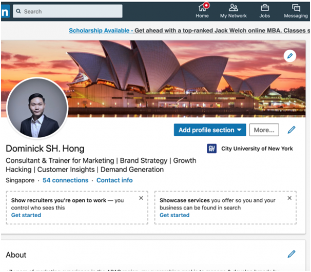
● If you want to create a personal brand, then you’ll need to select a high-resolution image for your profile.
● On the other hand, if you’re a business, then you need to use a professional logo. If you don’t already have one, this is the best time to create it.
To create a good logo, you would need to figure out what sort of logo you want. The key is finding a good balance of colors in your logo while also making sure it represents your brand.
Hopefully, you already did this when you created your Linkedin profile in the first place. But if you don’t have a good profile photo, now’s a good time to update it and improve it.
Linkedin is usually a good place for headshot images, so if you have a personal brand, then you will probably need to have a professional photo of you taken. Ideally, this image should also be unique and memorable so that people can recognize you when they see you in public.
2. Don’t forget the cover photo!
Now, here’s a very important tip to visually improve your Linkedin profile instantly: add an appealing cover photo. Photo editing can make the cover photo more appealing.
Far too many Linkedin profiles either have no cover photo or have a generic one that doesn’t do the profile any favors.
An interesting cover photo could be almost any image, as long as it represents you or your business well. Some examples of cover photos could be:
● Quality images of you or your colleagues
● Artistic or graphically developed images
● Images of you and the products or services you offer
● Colorful photos that fit your profile/your branding

As long as you have a good cover photo that fits your profile and your overall brand, you’ll be able to push your branding to a higher level.
3. Create post graphics
Creating new posts and adding new articles to your Linkedin profile should be one of the top strategies for making your Linkedin profile stand out. However, creating posts might not be enough on its own – you might want to make them visually appealing, too.
To do that, you will need to include post graphics in your Linkedin posts.

For example, here’s how Gary Vaynerchuk uses post graphics to create his personal brand and spread it on Linkedin. If you know a bit of graphic design yourself and can create basic graphics like this, then you’re already golden.
On the other hand, you might need to hire a professional or a branding agency to help you out with such post graphics. However, the payoffs of including post graphics in your posts will be great since you’ll be able to create your brand and further develop it using these graphical elements.
4. Add different types of content
When you create content for your Linkedin profile, you should also think about diversifying your content a little bit. Instead of just publishing articles and short posts on your profile, you could include different types of content and media, such as:
● Images
● Graphs
● Statistics
● Videos
● Stories
You should know that the majority of other Linkedin profiles use blog posts or articles on their profile pages. So if you decide to go down the route of adding different types of posts, you’ll be unique. For instance, you can create how-to guides or even use a webinar on your Linkedin page.
Of course, this strategy will also take a bit more time away from you, but the good thing is that you can share these different types of content on all your social media profiles and marketing platforms.
5. Add logos of companies you’ve worked for in the past
This might seem like a small step towards improving your branding, especially if you’re a personal brand. But to further improve your profile, you should seek to add logos of the companies you’ve worked for in the past.
When you’re adding your information to your profile, you can select the organizations you’ve worked for before from a drop-down list. Sometimes, there are multiple pages of the companies you’ve worked for, so make sure you choose the ones that have a logo.
6. Add videos to your profile
Another great tip to bring your Linkedin branding to a whole new level is to create video content for your site and add it to different parts of the page.
We’ve already talked about how you should create posts with videos on them, but there are many other instances where you could use video content on your Linkedin page.
For example, you can record your own video of your daily life & the way you work then edit it using any online video editor & post it on your feed. Or, you could create how-to or even instructional videos that teach viewers certain things.
If you don’t like to create video content, then you can outsource this to an external agency. This is useful if you’re a company looking to improve its branding on Linkedin.
7. Be creative!
The key to branding is to follow the ideals of your company or your brand. And all of that should also be reflected in everything you do in marketing, be it videos, photos, or other types of visual branding you might do on Linkedin.
You can still follow all the tips we’ve provided here but with an interesting, unique twist to the proceedings.
Don’t be afraid to be bold and try something different. You can afford to be radically different from your competitors if you want to be. If you want to do something because it fits your brand but might appear controversial, sometimes it can pay off to be bold.
Should I still use Linkedin marketing if I already use other channels?
Of course.
Linkedin should not be the only marketing channel you use.
You should view Linkedin as another opportunity to build and enhance your branding. It offers you many ways which we’ve mentioned above to create and amplify the visual image of your brand.
So the best way to use it is in combination with other channels. If you’re a company, you can hire social media experts, but if you want to build a personal brand, you’ll simply need to invest a bit more time into your efforts.
Should I fill in all the sections on my Linkedin profile?
Ideally, you should provide as much information as possible on Linkedin. However, you don’t have to fill in sections of your profile that you don’t see as vital or that wouldn’t necessarily benefit your prospects.
For example, if you use a generic cover photo instead of not using it, you won’t be making much of an improved impression on your followers.
So the goal with your Linkedin profile should be on the quality of your profile – and this includes your images and graphical content which would benefit your branding.
Final thoughts
Visually branding your Linkedin profile is important, and it’s also not that difficult once you get down to it. All you need is some high-quality visual content to help you get the job done, such as profile or cover images, and logos.
As long as you provide something unique and valuable, you should be able to improve your branding and stand out from the rest.
About the author
 Stefan Smulders is a SaaS entrepreneur and a founder of the world’s safest software for LinkedIn automation – Expandi.io. He’s enjoying his family life in the Netherlands being a proud father of a lovely 4-year old son Steef.


