Enhance your graphic design portfolio with the beautiful icon design inspiration and be the most desired visual artist in the industry.
You must have heard the importance of icon design in graphic design, right? But, you don’t know a specific track to follow.
We have developed this article keeping in mind the relevance and usage of icon design in this present age industry perspective. Also, we would like to delve into the matter of how a graphic designer can improve his artistic proficiency and enhance his portfolio by learning to create memorable icons. This informative aims at providing the designers with specific useful icon design guidelines and icon design principles to inspire them and offer a reference point to them regarding the best icons in the industry.
Here’s also some icon design tips to improve a designer’s competence in particular applications by showing how to create versatile designs with the standard tools available in the cyberspace.
Needless to say, with continuous changing designing trends, you might find it quite challenging to make the most creative icons.
But there’s nothing to worry, a little research and information would enable you, the designers to get a clear insight on the icon design principles. As universal design rules are changing, it’s essential for all creators to get along with the icon design workflow.
Before taking a look at the icon design inspiration, here’s a deeper understanding of icon design and its importance for modern brands.
Icon Design – Understanding the What and How
In graphic designing, icon design is an intricate process of creating meaningful symbols that represent some fantasy or abstract motive.
Icons can be categorized into two types – iconic (pictograms) and symbolic (ideograms). Iconic images are those that represent an object – for example; the thumbs up sign to indicate ‘Like’ option. On the other hand, symbolic icons are abstract and hence a viewer must understand their exact meanings.
Icon designs are mainly created as simple with flat, two-dimensional drawings, but sometimes they can also be represented as a black silhouette. Icon design styles are of elaborate presentations too with a combination of graphic design elements like the use of one or more linear and radial color gradients, contour shades, projected shadows and three-dimensional perspective effects.
According to the icon design principles, images are drawn in many different sizes corresponding to the company and product requirements. However, whatever the size may be – whether big or small, a designer while making an icon must comply with the stylistic ethics of icon designing, using the same color palette, perspective and renderings for all icons.
A designer needs to understand that particular attention should be given while creating the best icon design. The design principles make it essential to eliminate unnecessary details, aligning strokes and arrange objects to pixels in small icon sizes so that it doesn’t produce blurred images. As the idea is to present a master artwork, a designer needs to indulge in creating a specific aspect to give the icons a real entity.
Today, a designer needs to understand the primary purpose of creating an icon. Therefore, here’s a basic icon design inspiration: generate an image that communicates fair and understandable representations at every size from the maximum resolution down to the minimum resolution. Expert designers have been guiding that many icon formats allow one icon to include hinting to ensure visual clarity at smaller resolutions even wholly different subsidiary images for smaller sizes.
![]()
Icon design and logo design – Difference in approach
Icons and logos – both have a considerable significance in graphic design. These elements are symbols that represent a brand identity. Although both have similar goals and sometimes are a look alike, yet interestingly a designer cannot use them interchangeably. Each of these designing elements has a specific purpose and mainly the intention of having them is also radically different.
Icons necessarily convey abstract thought and designers artistically summarize an action or operation through these designing elements. When viewers look at an image, they get immediate and specific understanding of what the brand wants to express. Additionally, it helps the audience to have a clear thought and make fast connections with your brand.
On the contrary, a logo is a graphical element that establishes relations amongst the audience, the company and the product/service. Logos are sometimes considered as simplified ads and inspire an immediate recognition of the core values of a brand along with its offered products and services. Interestingly, logos are symbols that also kindle emotions regarding the cultural significance of the brand as well as the quality of customer service of the brand. One of the most significant differences between logo and icon is that- logos convey a much broader message of your brand compared to an image. Despite this, we cannot deny the importance of an icon in graphic design.
Understanding the technical divergence between an icon and logo will give a clear insight in this regard.
Logos are formed within a rectangle or square shape. These elements can be scaled up to fit a billboard or scaled down to fit on marketing collaterals and stationery items (brochures, visiting cards, etc.)
Whereas, icons are mostly always designed quadratically and unlike logos, they are intended to scale within specific dimensions. Icons take in such design features because almost always they are made to fit in square App icon dimensions. Therefore icons are generally small in design.
To put it just, an icon is a symbol that conveys strong values and ideas of the brand. The primary purpose of creating an image is to make the brand all the more memorable and appealing in the eyes of the target audience.
Want more icon graphic design inspiration to create a world-class icon design?
By now we know that like logos, icons also hold a significant position concerning visual aspects in graphic designing. Icons communicate subtle metaphors with a certain level of details incorporated in them. An icon’s style and application depend on many different things. Before you take a leap into designing an icon, take a look at the following guidelines for presenting UI icon design-
It’s essential to keep in mind that icon design incorporates three primary attributes: a form of an icon, aesthetic harmony and recognition/ identification. Experts suggest that while designing a new icon, a designer must consider these attributes in a repetitive approach for producing an enduring result.
Here are some of the guiding principles required for an enduring icon design:
1. Take a Comprehensive Approach while Designing an Icon
Every icon is aesthetically unique and holds a special meaning for each particular brand. So, to make these icons all the more attractive, it’s essential to work on them harmoniously. Do you know that icons are appreciated mainly for their aesthetic solutions? Therefore when you plan to formulate any icon its necessary to focus on its aesthetic aspect. Overall market research would also give you a bright idea about the recent trends and styles. Your goal is to create an icon that is different than that of your competitors and reflects the true subtle meaning.
Leaping Cat in Puma
Puma is a favorite sportswear brand and the company has an attractive logo and icon. An icon designer can receive the best con design inspiration from the beautifully applied symbol of the Puma – the leaping cat. Puma company has taken this image as their brand icon to epitomize their products’ efficiency and durability.

2. Brand Colors Play Vital Role – Match Icon Hues with Logo Colors
Needless to say, colors have a pivotal role to play according to a marketing perspective while attracting the target audience. Hence, here’s one of the best icon design tips, use brand color combinations. Select the colors used in your brand for creating a far-reaching effect and building recognition among your audience. Unleash the real beauty of your brand icons with the right use of colors.
Golden Arch in McDonald’s
McDonald’s golden arch in the shape of ‘M’ has been one of the most prominent icons in the world today. This icon teaches the designers how to visualize a symbol and establish a significant connection between the offered products and their consumers.

3. Focus on Forms while Sketching
In any graphics format, ‘form’ is one of the most significant element of design. It makes the underlying structure of an icon. Hence, the form of an icon should be taken care of to create a masterpiece. Icons can be best organized using the primary geometrical shapes – a circle, a square, a horizontal or vertical rectangle and many other organic shapes. Several tutorials and guidelines are available on the internet regarding the use of forms and what should be the sketch pattern- for example, one might start drawing by sketching the largest but the simplest shapes and then finally refining them towards more extensive detail.
Are you looking for an icon designer inspiration? Start an icon from the simplest shapes and then add more details as required to communicate the concept.
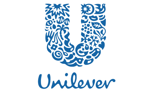
Twenty Five icons in Unilever
Unilever logo is one of the best examples of creativity and aesthetic. The logo contains twenty-five icons that are beautifully woven together to form the Unilever logo U. Unilever is a well-known brand that has been providing products ranging from nutrition, hygiene to personal care.
Following are the meaning and significance of the twenty-five icons-
- Sun: Communicates many of the company products radiant benefits
- Hand/Flower: Symbolize both skin and the softness of the company’s moisturizers provide.
- Bee: Represents the company’s hard work in handling environmental challenges and creating opportunities
- DNA: Depicts that the products have ingredients for a healthy life
- Hair: A significance for beauty, suppleness and cleanliness
- Palm Tree: Portrays the products’ natural resource.
- Sauces or spreads: Suggest the flavor that comes out from mixing and blending these items.
- Bowl: Represents the products – hot drink.soup
- Spoon: a presentation of nutrition, cooking and tasting
- Spice & flavors: identification of fresh ingredients
- Fish: related to food and fresh water
- Sparkle: associated with energy
- Bird: Epitome of freedom depicting relief
- Tea: related to growth
- Lips: representation of beauty and good taste as well
- Ice cream: A symbol of pleasurable treat
- Recycle: shows the company’s commitment towards sustainability
- Particles: portrays scientific products
- Frozen: it’s a transformational symbol – representing freshness as well as freezing
- Container: shows the importance of packaging
- Heart: a symbol of healthy caring life
- Clothes: Provides a sense of having perfect looks
- Wave: associated with freshness and vigor
- Liquid: Evokes the feeling of using clean and purified water

4. Understand the Contextualization
Icons can be appealing if you create them while understanding the context of the icon usage. Knowing what the brand wants to deliver and convey a message will enable any icon designer to create the best artwork. Remember that icon design is related to UI. So design icons with the contextual look, color and specific meaning.
5. Sizing – Most Important Element to Consider
Icons ideally should always be slightly larger than the text for more appeal. Every designer needs to pay attention to the icons’ size. Experts say that if the icons are of the same height as that of the texts, they might create an optical illusion for the viewers and they might miss its importance on a logo. Hence, it’s recommended that icons should be of a typical size and height maintaining consistency for increased emphasis.
By now we have come a long way, but the process does not end just yet. We need to perform research on the icons to see if they convey what we want them to. Based on the results, we often need to do several iterations and adjustments and check again to really make sure that the icons work well in their context.
Rounding off
Designing icons are the most challenging part while creating a logo. So, when a graphic designer learns the nitty-gritty of designing an icon he gets introduced to the most intriguing part of the logo designing process. It’s worth saying that a lesson learned and hands tried out in icon designing can enhance the designing portfolio of the creator giving him maximum scope to explore his latent talents.
Creative designers at Logo design team have the experience of designing most excellent quality icons complementing the brand logos. A company can be benefited holistically if they choose our team for designing and branding.


