A logo is crucial for a brand as it reflects the inner meaning of a brand. Logo color psychology forms the thoughts and emotions of a consumer and influences his buying decision. A human mind responds to color and studies show logo color affects his mood inadvertently. Colors influence our body, mind and thoughts. While the shape of a logo is crucial to its success, the color is equally important as well. A logo’s color or logo color schemes can influence people to think in certain ways and to perceive an image in certain ways.
Color psychology in logo design invokes motivation amongst marketers when it comes to arranging for advertising and marketing campaigns. Research reveals that when brands use best logo color combinations, they are sure to influence consumers’ mind subtly. Hence, when creating a logo, it’s important to consider psychological effects of color and how they influence our emotions and thoughts. In case of corporate logos, advertisers should usually be more concerned about business logo color psychology and identify how color affects a viewer’s thinking and emotions.
In this article, let us take a look at 10 of the most important colors and the logo color psychology.
1. Red
Red is a color that has appeals to every mind. It is related to the physicality of our existence. This color has a stronger effect on a viewer’s mind. Red is the color of power; it signifies basic survival, warmth, energy, physical strength, sensuality, masculinity and excitement. Researchers are of the view that red is among those logo colors that sell more. If your logo seeks to be more actionable, red is probably a color you would want to choose. Some designers also use 3 color combinations for logos to provide more appeal.
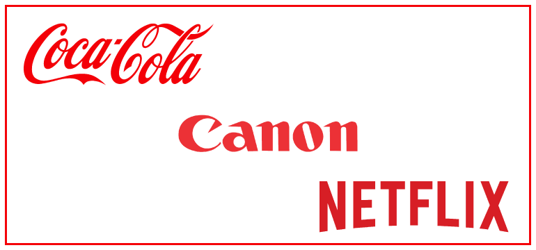
The popular brands that use red color scheme in logo: Kitkat, Coca Cola, Canon, Netflix.
2. Blue
Color blue often appeals to our intellect. This is a color that is widely used by corporations because it stands for trust, communication, reliability, depth and logic. Ocean and the skies are blue and that strikes us at a subliminal level and tells us that the color which represents these basic elements must also be trustworthy. Blue is among those branding color schemes that create an aura of trust, calmness and coolness. Companies mainly use the blue color in their logos to convey clarity and security in their service.
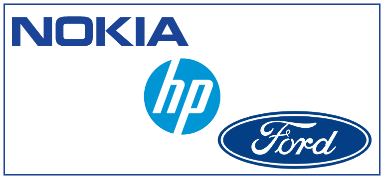
Popular brands that use blue color scheme in logo: Nokia, Dell Technologies, IBM, Ford.
3. Yellow
Yellow appeals to our emotions and it usually signifies optimism and self-esteem. This is one of the reasons why we see some logos that are designed in various shades of yellow. Being a bright color, when a company uses yellow, that company is perceived to be creative, friendly and confident. This color continues to be a popular choice among corporations in the logo color palette. This color is considered for being creative and optimistic. Sometimes companies use professional logo color combinations to bring out the most engagement in people.
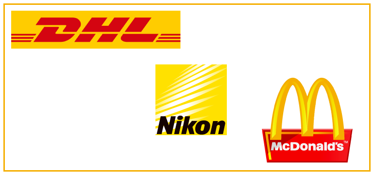
Popular brands that use yellow color scheme in logo: McDonald’s, DHL, Nikon, Shell.
4. Grey
Grey logos are surprisingly common and many companies use grey. It is psychologically neutral and tends to project a sense of stability. It is used by premium corporations and also by legal advocacy groups.
Brand using grey logo color scheme: Swarovski AG, Lexus.
5. Green
Green is always a symbol of balance, restoration, rejuvenation and environmental awareness. Companies that have something to do with health, environment, peace and other concepts will do well with a green logo. It appeals to people across genders, ages and cultures. Green is a versatile color and hence it can be used in various shades to achieve the desired effect.
Popular brands that use green color scheme in logo: Starbucks, Tic Tac, Tropicana.
6. Violet
Violet is one of the more royal and luxurious colors. It also evokes emotions related to spirituality as it has the shortest wavelength among all colors in the spectrum. Researchers believe that violet can encourage higher levels of thought and thus, represent qualities such as truth, authenticity, quality and luxury. The color violet is always associated with royalty and thus, it is also associated with class and affluence.
Popular brands that use violet color scheme in logo: Hallmark, Cadbury, Yahoo.
7. Orange
Orange is popular color among logo designers as the best color for logo design. Companies that sell FMCG products often use orange in their logos. This is because, orange is associated with physical comfort, food, warmth and abundance. Being a bright color, it also attracts attention easily. Orange is an ideal logo color, especially for those who sell household products.
Popular brands that use orange color scheme in logo: Indian Oil, The Timberland Company, JBL, Nickelodeon.
8. Pink
In recent years, pink has assumed some qualities. It is most commonly associated with femininity, love and sexuality. Some organizations that promote women’s health have adopted pink logos. However, it is sometimes a good idea to avoid pink as it evokes extreme emotions. Unless one is sure why he or she wants to use pink, there are always other options to choose from.
Popular brands that use pink color scheme in logo: LG Electronics, Cosmopolitan, Barbie.
9. Black
Black is perhaps the most enduring and most stylish color in the design. Anything that looks black immediately catches people’s attention. The color oozes luxury, sophistication and security. Psychological; research points at black being a color that reveals security and efficiency. It is among the best colors for logos 2018- most critical corporate colors when it comes to designing logos.
Popular brands using black logo color scheme: Louis Vuitton, Puma, Adidas, WWF.
10. White
White reflects innocence and purity and it’s usually used against a darker backdrop in logos. People often look at white as a sterile, pure and clear color that symbolizes sophistication and simplicity.
Key Takeaways
Psychology and color go hand in hand. While there are no right or wrong colors, colors certainly influence our thoughts and emotions. Choose a color depending on what you want your target audience to think and feel. If we must design great logos, we need to understand how colors play in our psyche. A well-designed logo in a great color is a sure-shot formula to achieve success.
What are your views on colors and logos? Has the color of a logo influenced your opinion about a company or its products? If you want professional ideas on creating logos appropriate to your company, visit Logo Design Team. Here you can get access to a world of beautiful designs to choose from along with specific color combinations.

