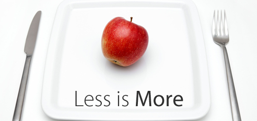
Sometimes less looks much more attractive than 101 colors and details. Good designers know that minimalist design can achieve very beautiful results. Indeed! Especially when this style – minimalism – is extremely popular at the moment.
However, it is not that easy to create minimalist design. It is not only difficult to make this design look good, but also to look “complete”. If you are about to create a minimalist design for your website the following tips and advices from design professionals will be more than useful.
Who is Mr. Minimalist Design?
Minimalism is a design trend started in the 20th century and still popular nowadays. It is a “trademark” of many companies, for example Apple, and various graphic and visual designers. It is a style stripped down to only its essential elements. Not surprisingly the design’s motto given by architect Ludwig Mies is “Less is more”.
Its principle is simple and universal for any type of objects – from image to website, from jewellery to house – you are removing the unnecessary or “doing more with less” (Buckminster Fuller, designer).
Why it’s become trendy in web design?
Because early days of Internet were not at all minimalist. With its rotating logos, animated banners, bright colors and enormous content, website designs used to be mostly cluttered and overbearing. However, people in 21st century have less and less free time to acquire and analyze information they receive. And minimalism helps to bring the most important content to the forefront while minimizing distractions for the user.
Since the design’s minimalist nature, any splash of color on a black-and-white design or a bit more complex element is sure to get the user’s attention, focusing squarely on the necessary content. Keeping the content to a minimum, the perfect balance is achieved – content on the page stays noticeable and at the highest importance.
How to minimize content
It is not only about the form, but also about the content. Just by minimizing the number of graphic elements, your goal won’t be achieved. You should start with rethinking the content and striping it to the bare requirements. Only then the minimalist style of your website will achieve its intended effect.
Plan your website. What are the essential elements to be included? Logo, introduction, navigation, etc. Cut out anything else that is not essential. The idea here should be not to make the website less functional, but to avoid including unnecessary elements to your website. A well-working option could be combining sections into a simpler layout. Or dividing content into separate pages, giving each piece of content more attention.
How to simplify the design
Simplify it as much as possible. Your minimalist web design should have little texture, color, shape, lines, type or content. But don’t go too bare, otherwise you are risking to become boring. Instead of dumping everything out, make the design appealing by making just one important feature the focal point. In other words, choose what the focus will be and keep the tips below in mind while working through the minimalist web design.
Focus can be achieved by adding visual interest with subtle bursts of color, unique typography or interesting shapes. Also it is essential to create a unique wireframe. To create a great one, follow these steps:
1. Choose the content you absolutely need.
2. Prioritize it.
3. Sketch a few wireframes, based on your prioritization, to experiment with the best visual hierarchy.
Also don’t forget about balance, alignment, and contrast. You will succeed if choosing one of the following symmetry options:
1. Horizontal Symmetry
2. Approximate Horizontal Symmetry
3. Radial Symmetry
4. Asymmetry
So, as you may see, it is both easy and difficult to design minimalist website. We wish you that over-designing won’t become your habit. Try following the tips above to come up with a great minimalist web design. It’s worth it, believe us! And if you need any advice or want to share your experience, feel free to do so in the comments below. Keep It Short & Simple!!! 🙂
Order a Custom Logo or Graphic Design to Enhance Your Brand
No matter what type of personal brand, business or organization you are running, having a great first impression means everything. One of the best ways to deliver a lasting impression is through the use of a high-quality logo and professional images and designs throughout all of your products and branding.
True certainty of success comes from working with a partner you trust to provide the insight, support and expertise that will propel your business forward. Experience the LogoDesignTeam.com advantage. Contact our design team today!


