When working with more than one typeface of a different style, designers have lots of choices to make. Some cool fonts are easy and some are harder. How many typefaces should you use? Should they be serif or sans serif? Or maybe both? What’s the difference between combining two fonts of the same typeface versus mixing two different typefaces?
These choices will affect how successful your typography design is. And although we’ve all seen effective and ineffective results, I’m sure we haven’t always been quite sure why – it’s time to explore this topic in more detail. It may be a little technical but I hope you’ll bear with me. There are some great reasons to learn about pairing typefaces. If you want to know what they are, read on.
So what are the differences between combining two typefaces vs mixing two different typefaces?
Mixing Two Typefaces
First, let’s take a look at when you should use more than one typeface. When there is enough contrast between the letter fonts, very often it will work well to use two different typefaces to get an interesting effect.
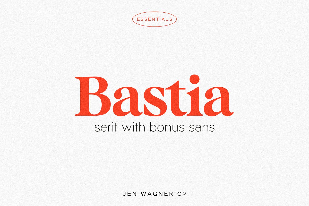
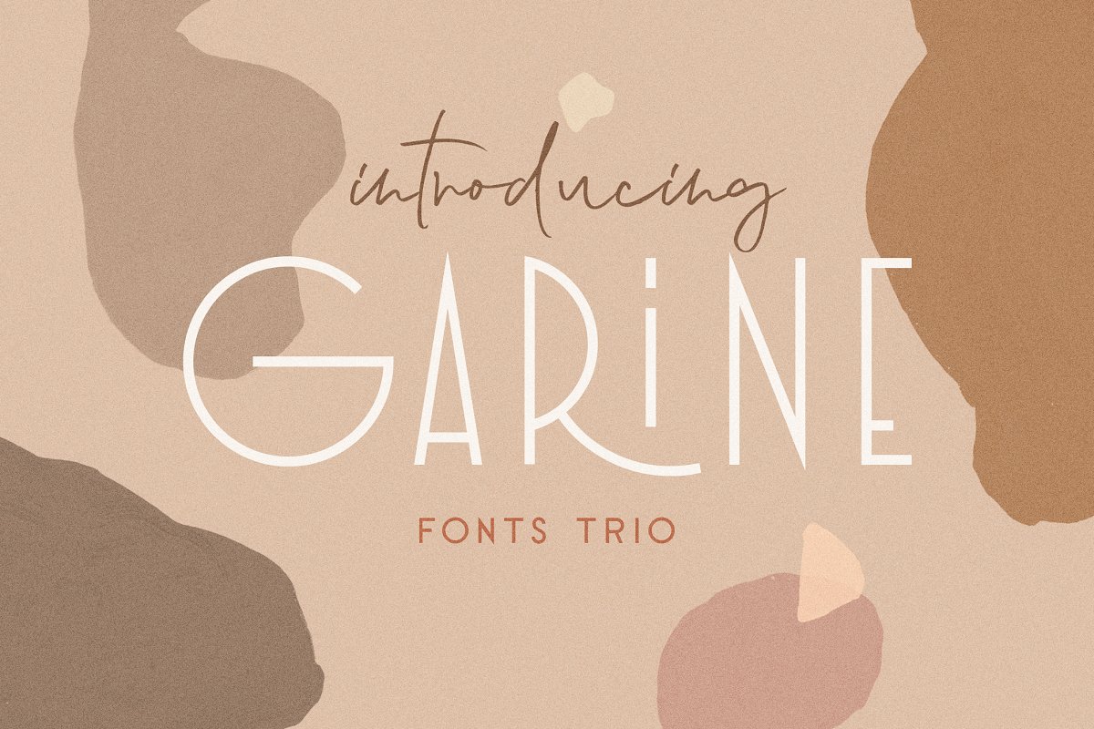
For example, you could use a sans serif font for your headings and a serif font for your body copy. Or vice versa (using a different heading in the same typeface).
However, there are many situations when this is not appropriate. For example, if you were to combine two fonts of the same typeface – say Garamond and Garamond. Although they are different, we’d consider them of the same “style” so it wouldn’t be appropriate to mix them. They would likely look unprofessional or amateurish if you did that.
Instead, keep in mind that when choosing typefaces that you want to contrast with each other, but want to be of a similar style.
For example, you might use a classic serif font for your headings and a modern sans serif font for your body copy. Or vice versa (using a different heading in the same typeface). But it’s important when mixing typefaces like this that there is enough contrast between them so they don’t look like they’re from the same family.
Combining Two Typefaces
On the other hand, when you’re trying to achieve a similar style with your type but want more than one font in a design, it’s a good idea to combine two different fonts of the same typeface. For example, if you wanted to use Garamond for your heading, but also wanted to use it for your body copy, you’d want to choose another font that is similar to Garamond. If you were then going to mix them within the same design and on the page (rather than simply using a different typeface), then you’d likely be more successful if those two fonts were different from each other.

Creative Market
For example, you could use a classic serif font for your headings and a modern sans serif font for your body copy. Or vice versa (using a different heading in the same typeface).
The important thing to remember is that if you want to combine two fonts of the same typeface – say Garamond and Garamond – then choose fonts that are different enough that they don’t look like they’re from the same family.
So what about if you want to achieve a similar style with your type but want more than one font in a design? It’s important when choosing typefaces for this purpose (if you were going to mix them in the same design and on the page) that they are not too similar.
For example, you should avoid using two serif fonts, two sans serif fonts, or a combination of both. Generally, you’ll be able to get away with using a classic serif font for your headings and a modern sans serif font as your body copy as this is a very common combination.
However, what if you want to use a classic serif font for your headings and a modern sans serif font as your body copy? In that case, you should choose fonts that are different enough from each other so they don’t look like they’re from the same family.
If you want to achieve a similar style but use more than one font, think about what other fonts may be suitable for your design and always try to ensure they are different enough so that they don’t look like they’re from the same family. Visit Creative Market for more font styles and designs.

Creative Market
Takeaway Point on Font Styles
To summarize, if you want to combine two different fonts that are of the same style, then choose ones that are different enough that they don’t look like they’re from the same family. But if you want to achieve a similar style but use more than one font, think about what other fonts may be suitable for your design and always make sure they are different enough so that they don’t look like they’re from the same family. Good luck and keep designing!


