Redesigning a logo can breathe a new life into your business or product, but it has to be executed with a focus on strategy. It requires a clearly understood process, creative vision & thought. If not done right, it might prove fatal to a business or firm or event- whatever you call it.
A logo is often the most recognizable tool used to communicate with the target market, which is why a logo is often the only element that a lot of firms concentrate on while rebranding.
However, when it comes to redesigning a logo of an awaited annual Grand Slam event such as the Australian Open 2017, it takes quite a brave move, since the premier sporting event has been witnessing the January sun for many decades. Why? Because it puts many things globally at stake – the image, the spectators, the fans, the merchandising and much more.
The Twitter Troll
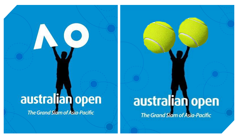
We all know, when something really amazing is being done, it’s never complete without ‘the naysayers’. And this time there were a few. Surprisingly, it was the social media giant Twitter- who did not stop criticizing. The ‘new’ logo depicted a figure holding up a stylized version of the letters ‘A’ and ‘O’ — a change from the old silhouette logo.
A user on Twitter wrote; “@AustralianOpen Who did your new logo? It’s horrible. We want to see tennis not a comedy show….????”
Another mentioned; “@AustralianOpen New logo is terrible. It doesn’t have anything to do with tennis. Why take the tennis out??? Could be a logo for anything.”
It’s true. We absolutely agree with these disappointed fans, they took the new logo at heart and were quite outraged by it.
But that didn’t quite happen with the 105th edition of the Australian Open. To our surprise, the new logo was actually a fake one. It was a prank played by the event organizers before revealing the real rebranding the following week. It certainly fooled most of Twitter. The new Australian Open logo has actually achieved more than expected.

The New Look
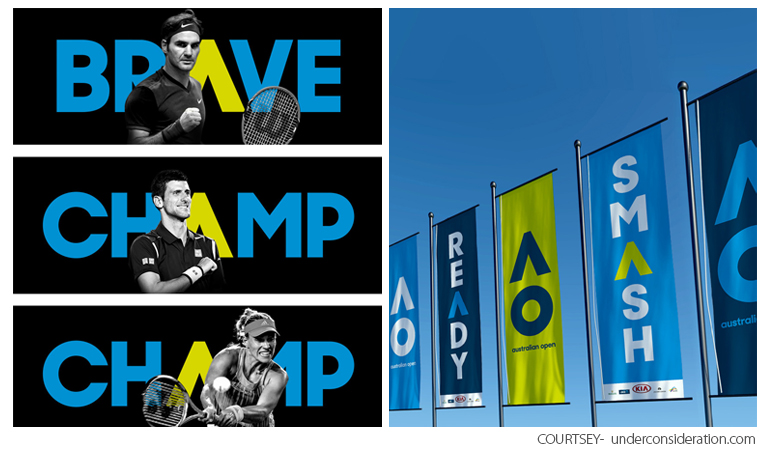
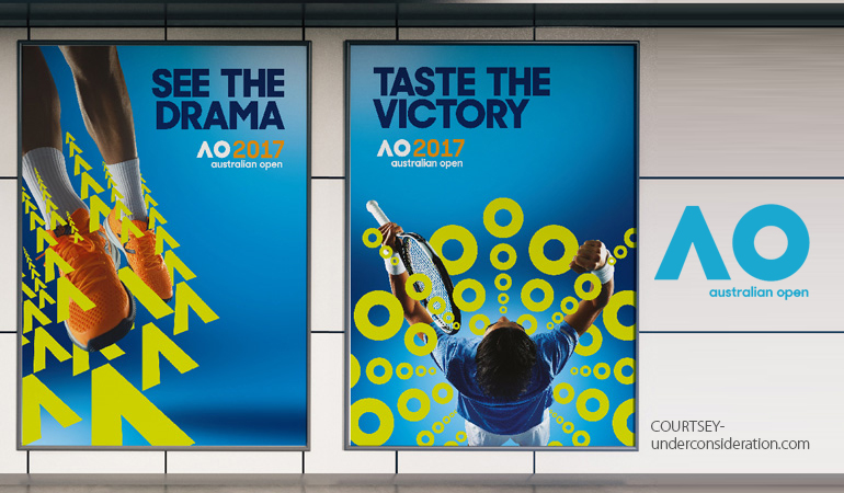
Certainly going by the rule – Less is More, the new logo features the “AO” abbreviation. The new identity was in support of the Australian Open’s reputation for innovation. It certainly let go of the long terms and went in for a shorter version, in a country famous for affectionate abbreviations. The dynamic new identity focused on reinforcing the event’s reputation for delivering a world-class experience to the fans and players. This resulted in a dynamic new look, which gave the flexibility to engage more deeply with the fans, the partners and the players. The vibrant blue color perfectly gelled with the summer sky. It rendered freshness, fun and playful, just like the Australian Open itself.
On the contrary, the old logo bordered on being offensively bad. The silhouette of the player serving against the sunset was literally a very stereotyped image and the holding shape of the racquet was pretty absurd. The wordmark featured a loathed sans-serif style, which was not really in sync with the aura of the prestigious sporting event. It was also gender specific, which doesn’t make much sense in a tournament where men and women both play and where women make up the majority of the spectators in the stands.

What it Indicated
Moving over to the new logo, the simplicity of the mark gives it the license to do almost anything. Creative Director, Mike Staniford stated; “It’s not only a shorthand to the Australian Open, but also an icon that is a timeless and can be the vehicle of constant reinvention.” The new logo could animate and move in accordance by the dynamics of the game itself. This bold, energetic and active identity, reflected the leading sporting experience that embodies Australia. Unlike the old logo, the new design reflected everybody, as this game features men’s and women’s singles, mixed doubles, junior’s championships; as well as wheelchair, legends and exhibition events. The redesign also got rid of the tagline: The Grand Slam of Asia-Pacific, as the game catered to players and spectators around the world like the North and South America, Europe and so on.

The Effect on Viewership & Web Traffic
The men’s final between Federer and Nadal was the ‘most-watched’ ESPN telecast ever in that time slot, which saw an 80% viewership increase over last year’s final. The women’s final between the Williams sisters also witnessed a 17% growth in viewership than that of 2016. Big headlining matches in the Australian Open helped the tournament get massive ratings in the United States. International broadcasters attracted tons of viewers, too.
The men’s final observed 4.4 million viewers in Oceania, twice that of the last year. The women’s final had around 1.7 million viewership, and the second week of the event was the top broadcast of the day.
According to tennis.com, across Europe, it pulled as many as 11 million viewers on Eurosport and affiliated channels, including record figures for Spain, where it got as many as 1.3 million viewers. 800,000 watched in Britain, making it the second-most-watched Australian Open final in the country. The Spanish broadcast had as many as 1.3 million viewers, making it the second-most-watched Grand Slam final in the network’s history. National networks in Switzerland and France also had above a million on average for the five-set encounter.
As per IBM, the official Australian Open website saw more than1,000,000+ visitors throughout the tournament. Also, 14 million online spectators got closer to the action, with real-time analysis and the event observed tons of social shares. The Vice President of Global Sponsorships Noah Syken stated;”Data is at the heart of the Australian Open digital experience.”

The Success
Unveiling the new look vastly contributed in carrying the business forward and be a suitable identity for the event. The logo also went hand in hand with the advertising and promotions too. It fit perfectly with some captions as well and sold a record merchandise too as compared to the previous years. The Australian Open 2017 saw the biggest turnout ever, by setting an attendance record of 728,763 spectators at the Melbourne Park during the two week period. This showed an average growth rate of 7%, compared to the 3% for the same period for the other Grand Slam attendances.

The Logo Design Team Factor
From the data and facts above, one can surely agree that a logo of a business is as important as the brand’s name. Your logo serves as the leader through which you must communicate value and worth to your intended audience. If you need help developing or improving your image via your brand’s logo, see us at LogoDesignTeam.com. We are a staff of professional graphic artists, creative engineers, and technology experts who work to promote your brand in a way that will be remembered among your primary fan base. Take a tour of our portfolio, featuring diversified industries.

We are LogoDesignTeam.com! We can improve your branding with your logo and a clearly defined plan to take your business to a higher level.
Buzz us now.


