A graph is a powerful graphical element that helps you and your users visualize relevant data and statistics in an appealing and interesting way.
There are different types of graphs, and you’ll often see them on websites and social media with different styles.
The problem is, many of those data visualizations have been seen thousands of times and are no longer able to attract viewers’ attention and persuade them to stop by and go deeper into the analysis.
It explains why graphs need to be creative and original to get noticed and be successful.
Keep reading if this sounds interesting to you. Throughout this blog post, we will provide you with 11 creative graph ideas that will help you create outstanding graphs.
Let’s get right to it.
1. Use a graph maker that allows you for wide customization

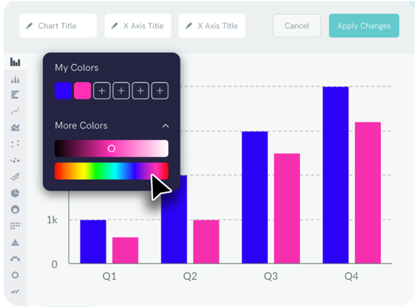
From Piktochart’s website
In creating graphs, the most important consideration you should keep in mind is finding a graph maker that can allow you to create original and never-before-seen graphs.
Hence, you should ensure that you’ll have access to and have the ability to customize your graph endlessly.
When choosing a graph maker, make sure it:
- Integrates well with Google Sheets and Excel
- Allows you to change the colors, font styles, etc.
- Provides the ability to add branded elements, such as logos
- Lets you add graphs directly to infographics, PowerPoint presentation slides, etc
- Keeps all your graphs and allows you to access them at any time
2. Experiment with different graph types

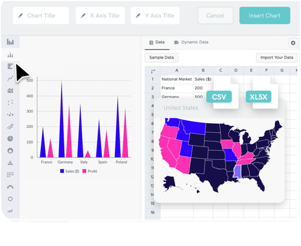
From Piktochart’s website
Based on the data you need to represent and the data you have available, you can choose which graph type to use.
The following are examples of common graph types:
- Pie chart – to show divisions of a whole into its individual parts (like the budget).
- Bar chart – to show numbers that are independent of each other (e.g. statistics referred to different countries).
- Line graph – to show you how numbers have changed over time.
- Scatter plot – to show the relationship between items based on two different variables.
- Gauge chart – to show whether data values fit on a scale of acceptable (good) to not acceptable (bad).
Even though each of these serves a specific purpose, you can also choose to stay away from the most common graphs and choose something more original that will intrigue the viewer. If you do decide to include a graph, ensure that it is easily understood by people who aren’t experts.
3. Sort bar graph data to make it easier to understand
As opposed to displaying data randomly, which can look quite chaotic, you can order it and display it so that it is arranged in ascending or alphabetical order.
Users will be able to easily find their way around your graphic and get a better sense of what you want to convey.
It is also important that you make your graphs as intuitive as possible. Make sure to use different, well-distinguishable colors, and include labels, so viewers can instantly comprehend the graph.
If you include multiple charts, ensure you use the same colors to indicate the same variables. As a result, the users won’t lose the thread and the analysis will be easy and enjoyable.
4. Keep your graphs on-brand
A good way to make your graphs original and effective is to have them match your brand.
For example, you can use the color that identifies your company or the font that you use on your website and for all social media content you post.
In addition, you can add other elements that represent your brand identity, such as specific icons or images.
Creating a branding graph will help you increase your brand awareness and authority within your niche.
5. Keep y-axis labels short
Y-axis labels (the text that marks major divisions on a chart) too long will make it look cluttered and confusing, and will not attract the viewer’s attention.
The ideal solution is to keep them short while ensuring that they are still understandable and relevant. As an example, symbols or abbreviations can be used to represent the variable.
6. Add a title and source line

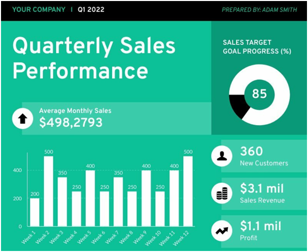
From Piktochart’s website
What does the graph show? To what end does it aim? The point of your graph cannot be understood without a title that explains it in a few words.
Hence, ensure that all your charts or content relating to the same topic have a short, but effective headline.
Also, people may be curious to know where you got your data from or want to know more about it. It, therefore, makes sense to include it and link to it below each of your graph. Moreover, your graph may lose credibility if you don’t include a source.
7. Remove background grids and lines
Graphs are sometimes displayed with lines and grids in the background. Though these might be useful as a way to orient the data, they’re actually not very pleasant to look at.
Since they are usually omitted from modern graphs for style purposes, you should do the same when you create one of your own.
Consider using a white background for all of your graphs instead.
8. Better avoiding 3D effects
A graph with 3D effects is out of date and makes it hard for viewers to understand the graph clearly.
For instance, 3D pie charts have the problem that the bottom slice has more surface area than the other slices. It can make the bottom slice appear more valuable than other slices. Often, it is hard to determine the relative size of slices when using 3D effects.
Additionally, 3D bar charts can make it difficult for the reader to determine the numerical values of the bars. There is no clear-cut way to tell where the zero line begins, or whether to compare the top of the bar either at the front or the back.
As a result, if you don’t want your graphs to look unappealing, you should avoid such 3D effects.
9. Add graphs to appealing content format
Graphs by themselves are not very attractive, as you can imagine.
When incorporated into other content, such as infographics, videos, or newsletters, they can add visual and informative value, enriching your content, and making you seem more professional.
Below is a list of some relevant content ideas for integrating graphs.
Infographics

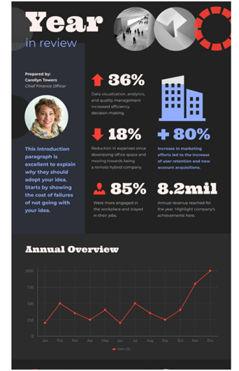
From Piktochart’s website
One of the most appealing forms of visual content at the moment is the infographic. With them, you can mix text, visuals, and graphs to convey complex topics in an engaging manner.
Infographics are shared on social media 3x more than any other type of content.
Therefore, they make great content for placing graphs and making them more visually appealing.
GIFs and animated content
Using GIFs is another great option for displaying your graph in a more unique and interactive way. It is possible to animate each part of the graph and show each of them at different times.
Social media posts
Incorporating graphs into social media graphic posts is also a great way to draw attention more easily and encourage people to look at your graphs. By adding graphs to your content, you will make it more appealing, likeable, and shareable.
Newsletter
Your newsletter is another place where you can include graphs. For example, you can send an email containing statistical data or other content that includes data.
You can take inspiration from these newsletter layout ideas or directly use them as templates.
10. Avoid making users do visual maths
If the chart makes it difficult to see an important relationship among variables, make some more calculations and visualize them as well.
The use of pie charts with wedges too similar to each other is not recommended, for example.
If you distinguish them, your viewers will not get annoyed with reviewing your graphs or the content in which they are embedded.
11. Avoid relying solely on standard chart sizes
Experiment with chart size and scale to find the right fit for your data.
Especially for slope-based charts, such as line charts, area charts, and scatter plots, the aspect ratio of a chart can have a significant impact on how the data is perceived.
By way of example, the same data can look dramatically different when viewed in a different aspect ratio.
Conclusions
The use of graphs is a great way to illustrate data and other statistical information in a more direct and impactful way.
However, in order for a graph to be effective, it needs to be designed according to some best practices.
We provided you with 11 creative graph ideas to make your graphs more original and appealing to your audience in this blog post.
Putting them all or some of them into action will surely help you get the results you expect more quickly.
We appreciate you taking the time to read this blog post. Hopefully, you found it informative.
If you want to read more, check out this guide to design thinking.
Author
Flavia Silipo is a skilled SEO copywriter and digital marketing specialist with over two years of experience. You can find her on LinkedIn.


