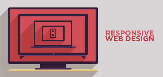
Let’s start our story with a definition of the term for more clarity. Responsive Web Design or RWD is a “web design approach aimed at crafting sites to provide an optimal viewing experience – easy reading and navigation with a minimum of resizing, panning, and scrolling – across a wide range of devices (from mobile phones to desktop computer monitors)” (Wikipedia). In simple words, it uses “media queries” to figure out what resolution of device it is being served on so that the website can appear exactly the same, whatsoever be the screen size.
So why has it become vital to have a responsive website? PC sales start declining for the first time since 2001. In contrary, smartphones and tablets are becoming more and more popular all over the globe increasing the mobile share of web traffic.
Also the sizes of various computers, tablets and smartphones are expanding and shrinking day by day pushing developers to create responsive websites for all display sizes. So it is highly advisable that your website works on all devices in order to create a consistent experience for all kinds of users.
Responsive web design shouldn’t be confused with mobile design. Definitely, responsive websites can be viewed on mobile devices with resolutions of 1920×1080, 800×600 and 1024×768 pixels. But, as already mentioned earlier, mobiles aren’t the only place to refer while choosing the responsive web design.
Responsive web design should be flexible
What is the key of a good responsive design? Its flexibility. This includes photos, typeface, and grid. Flexibility may be achieved, for example, by hiding content and images for a mobile website or by creating a simpler layout that will help to maintain a uniform look for all devices.
Website navigation should be also flexible. It should guarantee a simple navigation even from mobile devices. Since drop down menu doesn’t go well with touch screens, its days are gone. In contrary, swing style navigation is gaining a high amount of popularity. Nowadays it is important that navigation elements are large enough for a user convenience. So the minimum size of 44×44 pixels or more for each navigational element should work well and be convenient for tapping purpose.
Grid as the starting point of your responsive design
Your responsive web design should be grid based. Every website is divided proportionately on a scale with each number known as a grid stop. Most feasible grids are found in three different browser widths – 320×480 pixels, 480×768 pixels, 760 pixels or more – and additional width of more than 1000 pixels.
Most commonly found fluid grid covers the screen space which is left over. Or you can make use of fluid breakpoints which don’t make use of predetermined stops but are dictated by the overall design.
Images and Fonts
Regardless of the size, images for your responsive web design should be always of a high quality. However, loading speed is also extremely important, especially for mobile users with a limited speed of the Internet. In that case, you should try to reach a balance between the two by optimizing the picture, full-size image avoidance, using scaling properties related to height and width in CSS:
1. Crop images before actually uploading them;
2. Reduce the image size to the smallest possible extent while maintaining its visual quality;
3. Image number should be reduced for a responsive layout – mobile frameworks should be used, multiple file sizes and versions should be made available. Additionally, mobile environment should allow hiding of the images.
A responsive typeface is also highly important for responsive web design. The typeface that looks pretty on the desktop is usually not working the same for mobile cases. Here the readability is critical as human eyes can’t handle so many letters as well as gaps with ease. So the key here is the length of the line, point size and line spacing. For example, 50-75 characters per line are ideal for desktops vs. 35-50 work well for mobiles. Then the point size should be such that multiple blocks of words could be easily read vertically by scrolling down. Line spacing that is 140% of the text blocks point size is typical for websites viewed on the desktop which should be adjusted by adding extra space in case of smaller screens. Finally, various letter forms, unusual lettering and novel typefaces look very nice on large screens but not on mobile devices. So better use some standard fonts and styles for your responsive design.
Long-term benefits
As you may understand, it is usually time-consuming to create a responsive website. But it definitely benefits your business for a long duration. First of all, due to the features of the responsive web design, there is no need for too many redirects or different websites. Which makes the work of developers much easier in future – since only one update will be needed. Also, images remain the same regardless of the size. This helps in building brand identity and credibility. Additionally, responsive web design helps in elevating SEO. It becomes possible because a responsive web design is common with a unique URL and in this case, link building remains quite simple. Finally, a single responsive website also makes the analytics option easier.
Future of RWD
Obviously, responsive web design is evolving day by day. And it should since it is very hard to create a perfect responsive web design that satisfies all users. So developers are in continuous search of programming techniques that will allow a responsive design to live up to all devices, platforms and sizes. But even though RWD is still not perfect, implementing it nowadays will help you position your website to all kinds of users which increase the ROI of your website and benefits your business multiplex!
Order a Custom Logo or Graphic Design to Enhance Your Brand
No matter what type of personal brand, business or organization you are running, having a great first impression means everything. One of the best ways to deliver a lasting impression is through the use of a high-quality logo and professional images and designs throughout all of your products and branding.
Avail our best selling packages and let us help you create the ultimate user experience and company branding message you’ve always dreamed of! Or contact our graphics design team today. We will be glad to listen you out.


