Starbucks is a famous brand that is synonymous with coffee. Though they’ve had their weak points, the Starbucks brand brings the pleasant times in mind, with friends and co-workers while enjoying a Latte or Grande. And starbucks logo history is another food for thought for theorists and brand evangelists across the world.
In face of all the success Starbucks have garnered, the unusual history of its logo doesn’t let us forget its humble beginnings. But going back into the history of the company’s logo helps us to understand how they got to where they are today and how their logo has played a role in this success.
So let’s take a plunge in Starbucks’s seafaring journey.

The Birth of a Legend
Starbucks was founded in Seattle, Washington in 1971 by three partners: Jerry Baldwin, Gordon Bowker, and Zev Siegl. They initially named the company “Pequod.” This strange first name of the now-famous cafe chain was inspired by a Herman Melville classic, Moby Dick. It was the name of the whaling ship navigated by Captain Ahab, the protagonist of the book.
They liked the inspiration that they derived the name from but it lacked the kind of gusto that they needed to launch their brand, so they changed it to “Starbuck,” the name of the chief mate on the Pequod.
Later, they added an “s” at the end to become “Starbucks.”
History of the Starbucks Logo
The making of Starbucks logo, is in itself a fascinating tale. Once the founder trio had decided on a better name for their brand, they started to work on their logo. The original logo featured a mermaid with two tails, (also known as a “siren”) from Greek mythology, which lured the sailors to their deaths with their enchanting song!
Speaking of the Starbucks logo creator, this legendary logo was the brainchild of Terry Heckler, who scoured through the old marine archives to instill a seductive sea imagery. Since the name was derived from a nautical character, the logo also had to imply something from deep down the sea. Thereafter, Heckler came up with the iconic logo that was based on an Old Norse woodcut, dating back to the 16th Century.
While the drive-thru brand is steeped in history and literature, Starbucks logo history has a fair share in kindling that tale and history. Many people played on this and featured the story.
Several speculations brewed up regarding the hidden meaning of Starbucks logo. It has fascinated theorists since its inception. And needless to say, numerous conspiracy theories have also surfaced. Some traced the logo back to the Illuminatis, some paralleled it with menacing Zionist plots.
However, meaning for this legendary logo is not something one can pull out of the thin air. Theorists have all jointly opined about the nautical allegory that the logo reflects. In fact, one of the founders once said that, like the ancient sirens, Starbucks was meant to lure coffee lovers from everywhere.
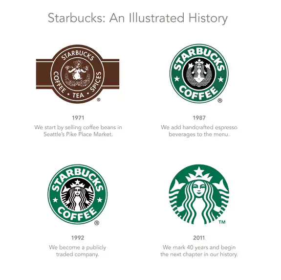
With time and in the following years, the Starbucks vintage logo got some facelift. The first changes in the Starbucks logo came in 1987 when the company was purchased by Howard Schultz. His first move was to change the name from Starbucks Coffee, Tea, and Spice, to Starbucks Coffee and he also cleaned up the original logo and added a more polished look.
The once vintage logo and the 500-year old sea siren got a modern makeover. And that’s how we got our Starbucks logo! They maintained the original Mermaid icon that was present on the previous designs but upgraded the overall look to be a bit more modern.
Analyzing the Popularity of the Logo
One of the things we noticed about the Starbucks logo is that they evolved their brand along with the logo. Each change in the name of the business resulted in a change in the logo, or so it seemed. The Starbucks logo evolution is a burgeoning theme for the conspiracy theorists ab initio.
The initial logo was more historic looking and looked aged, to match the original business idea of “coffee, tea, and spice.” But, as the brand evolved, the logo followed with a fresher, more modern look. One thing stayed the same though: the mermaid.
Why did Starbucks keep the mermaid?
One question that comes to mind when it comes to analyzing the Starbucks logo and brand is why they kept the mermaid on the latest Starbucks logo. Perhaps it is because they felt it was attractive or they wanted to hang onto the brand idea of “luring people to coffee” that the founders first envisioned.
Or perhaps it was the fact that a mermaid is such a universal symbol of the sea, the fishing climate and a good ole’ coffee shop by the sea, that it had become immersed in their brand. The mermaid is a universal symbol and one that is tied to ancient fables, mythology, and stories. Starbucks is a place where people can feel free to tell their stories, be themselves, and share ideas with friends.
Perhaps the mermaid is a symbol of the historical connection we all have with the past, ancient history, and ancient stories. Storytelling is one of the oldest art forms on the planet. When you go to a Starbucks, you are instantly reminded of the finer things, including the quality of the coffee, the excellent service, and the relaxed atmosphere that is prevalent in the Starbucks environment.
This is all about the Starbucks logo history that can fairly be deduced from all the aspects the coffee brand covers.

What can we learn from Starbucks?
Analyzing the success of Starbucks, it can be safely said that a logo and a brand is effective for businesses that want to promote their brand and create an identity. Starbucks has created a logo that complements their brand, and it emanates a genuine spirit of connection to the past that resonates with their target audience.
By looking at the success that Starbucks has experienced with their logo over the years, business owners can look at the components of their success and break it down into these aspects:
- History of the brand– The history of the Starbucks brand has its roots in ancient literature and history, and it shows. Upon viewing the logo, customers are automatically drawn to the mermaid, a universal symbol of beauty, freedom, and intrigue. Even if you do not know the story of the sirens or the classic works of Herman Melville, you feel a connection to the brand due to the familiarity of the symbol. The Starbucks logo design wouldn’t have beguiled so many people over the years, had it lacked a romantic history behind it.
- Timelines– It’s good to include timelines when you can when it comes to promoting your brand. While it’s impossible to put all of this into your logo, you can use other assets that complement your brand such as infographics and photos. Using the graphics space available in creating an infographic, you can include information on your company timeline and inform people about the history of your company in a way that will interest them.
- Professional graphics– The use of professional graphics can increase the credibility of your infographic and help people to understand the significance of your business. Creating professional infographics is important if you want to gain the respect of your target audience, especially if you have some B2B customers that enjoy seeing attractive, colorful graphics.
- Key aspects of the company– When you create a logo (as well as an infographic), you need to include the primary characteristics and strengths of your company. Think about what you want to communicate to your audience and do it as simple a method as possible.
- Personality of the brand– Capturing the personality of your brand is important whether you are creating an infographic or a logo. In fact, you should make this a rule, no matter what type of digital asset you are creating for your brand.
- Quality of services– Your logo and your infographics should indicate that you have a high-quality aspect to your brand. This is how both Apple and Starbucks have been successful in promoting their brands. By associating quality and “story” with their logo and branding, they were able to pull in thousands of loyal customers with their branding.
Remember, your logo is not the only thing that helps you monetize your brand and create a brand out of a company. It’s everything you do that represents your brand, including videos, photos, infographics, podcasts, and more.
When you think about your brand, what image immediately comes to mind? Do people associate your logo with your website and other assets? If not, try creating an infographic that explains what you’re about to your viewers. If you don’t know where to start with a logo design, contact us.
We are logo design experts, and we can also help you create the perfect infographic, branded to your company just like Starbucks did with their logo. One can learn a lot of things from the Starbucks logo history, and the cultural impact it has etched down the years.
Grow Your Brand with a Memorable Logo Design
Remember, logos are important. But so are the other digital assets that you create for your brand. So create a separate page for your infographic and use it as one of your primary advertising tools. You’ll be amazed at how fast you can create a sales magnet when your brand is backed up by significant digital assets like your logo and infographics.
Contact us today for a free quote. We look forward to meeting you.

