The intuitiveness of a website platform signifies its ability to interact with the audience with easy to use design and architecture. To put it in easier words, it is a design that implies the next step of what to do to the users who want to get their desired information. The success of an intuitive design depends on how, without stopping, the user can focus on completing a task. It goes without saying that intuitive design of a website calls for undivided attention for providing the user unparalleled surfing experience, that is the ultimate intuitive meaning.
Designs themselves can’t be intuitive—it’s whether the person using it feels it’s intuitive.
– Source
Intuitive design is not visible; that is, people cannot see any elements of it, but they can only experience it with links that provide unhindered browsing. In the case of an unintuitive design, the people come across browsing elements that are not related to the information they need.
The website designers set up the architecture of the interface with the intention of them being able to click with the user until the end. It is unfortunate, but the truth is that an average developer seldom spends time in analyzing the right elements for making the website intuitive, which is a significant prerogative for the skilled professionals.
The key is to envision and design the interface from the view of the end-user. The common people, a majority of them do not have the same level of computer skill or knowledge that will enable them to use a complex website. All they want is to work with a website that will comply with the conventional norms of user-friendliness.
The perfect intuitive design architecture is the one that focuses on the operation that does not stop the user even for a single step. The second there appears a hindrance in the flow, the intuitiveness gets hindered, hampering the experience.
Why Do Websites Aim For Unparalleled Intuitiveness For Its Users?
There are thousands of websites that make people confused and somewhat puzzled and the only reason being their complicated intuitive user interface. Here’s a thing, not every website need to be intuitive in the first case. It is, in fact, never a competition. The key is to be unique and different from others without losing the objective of the website. What may be intuitive to one person may not be to another.
A majority of websites are formed with good intentions- to attract the audience, provide them with their required information and then lead them to the final stage of making a decision in favor of the brand. It is important first to understand the current knowledge and its difference with the target knowledge.
Current Knowledge vs. Target Knowledge: A Deeper Understanding
When a person visits a website, he or she comes with the existing knowledge or current knowledge from the previous webpages they have visited. Target knowledge is the experience they will be getting from using the website they will use from a new one. The difference between these two experiences is known as the knowledge gap. The job of the intuitive architecture designer is to fulfill the gap between these two pieces of knowledge for the user for fulfilling many business goals; like:
- Increased sales
- Maximum customer retention
- Greater reach
- Fruitful position in the search engine
- More organic traffic
& many more.
It goes without saying that even in the cases of the slightest complicacy of design, there will be a lot of users who will still find the most comfortable design to be critical for them to understand and use. Everyone has a basic understanding of using a website from their previous uses, which is known as a conceptual model. For example- only a few people are left who do not have any knowledge of operating an e-commerce website and the ones who have not, they have the idea of making offline purchases. The challenge for e-commerce websites is to educate the newbies, thereby enabling them to make a purchase.
There are other causes as well, like for example- a person may be making a new online purchase from a completely new website. So here as well, the challenge remains the same, to educate them and fulfilling the aim to make a purchase from them.
Before Designing A Website- Know Your User
You have to have a strong knowledge of current and target learnings of the customers. There are two significant ways to find out:
- What users know –
By conducting surveys, analyzing their social media profiles, analyzing their feedbacks and opinions about any product or service they have previously used from you or from your adversaries’ brands. - What they want to know-
This survey is more effective when you communicate with the people in the field. Talk to them, let them try out your new product and then give demo on your website to feed them with more information. Their interest will be able to tell you what kind of knowledge they are actually seeking.
In both these cases, always take notes which will help you to identify their main issues and concerns; it is found that at least ten of the subjects will be able to reveal more than 90% of the persistent challenges. These steps of knowing the customers help the brands build personas.
When Does A Brand Build An Intuitive Website?
Speaking by the formula, an intuitive architecture fulfills its objective when the target knowledge is at par with the current knowledge. Below are the two conditions that signify an interface to be intuitive:
- When Target & The Current Knowledge Points Are Identical:
The point where the user when comes across the website will automatically know how and for what to perform it. - When The Target & Current Knowledge Points Are Separate:
In cases like these, the contextual design of the website has to be brilliantly competent and effective so that the gap between the two can be eliminated and used to provide the user seamless paths to complete any transaction or any other objective.
The 4 Steps To Building A Great Intuitive Website
1. Always Design For The Brain:
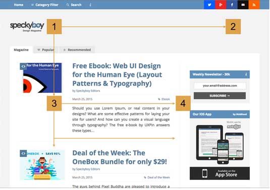
Design for anything requires to be studied first. A thought is counted as the pre-requisite of any design for the internet. If history is scoured through, it is found that many designers have followed significant yet important rules to be followed or modified that allowed them to create masterpieces of their own. The human brain follows definite patterns for registering any kind of information. It can be a pattern, or a contrast or the placement of any element that catches the attention of the brain. Break long columns or insert a graphical image, the scope of creating a pattern for brain is endless.

2. Using The Golden Rectangle:
Also known by another name- the Golden Ratio, this element is the sea-shell shapes tactical method of discovering the best spot for installing the most relevant element in the website. The formula is based fully on mathematical conception; therefore, professionals find its usage to be fruitful. Here’s how you can use it:
- Start with a diagonal line drawn from the top left corner to the low right corner.
- Draw another line from the low left corner to the diagonal line at a 90-degree angle.
- Repeat the 2nd step from the upper right corner.
You can also try the intuitive software that can shorten your learning curve for the same through:
- Measuring custom ratios for many shapes
- Identifying re-sizeable ratio rectangles
- Setting the golden ratios in CSS
3. Ro3 Or The Rule Of Third:
This step is also known as the ‘design to nine.’ As a common layout pattern, it is used by the professionals that creates a sectioning design on the website and divided it into 9 areas.
4. Using The Grid Pattern:
A series of straight lines intersecting the other set of straight or curved lines for structuring the content is known as grid. This is a geometrical guide that enables the professional to implement the graphical elements in an unconventional and rational manner. It helps organize the page in accordance to:
- Relating to the page
- Relating to the graphic elements on the page
- Relating to the same graphic elements on other page, the same page or other parts of the page.
Needless to say, this system is definitely confusing for many professionals to understand.
5. Learning When To Break Rules:
Following rules is fine, but as a designer, one should also make a place for implementing elements out of the rules. Many renowned designers like Saul Bass, Paul Rand, Josef Muller and others have created their niche in their respective areas by breaking the rules.
6. Using A User-Friendly Language:
Last but not the least, always use simple and easy to comprehend language that an average user can understand while scrolling through the website. Any irrelevant or technical term used anywhere on the internet can backfire in the objective of the webpage and bombard the entire reach of the brand online.
All You Need Is A Professional Assistance
Professional website design agencies like the Logo Design Team stand as an excellent help to the businesses who are intending to build a website keeping the customer experience in mind. The professional designing agencies, keeping every tips and tricks in mind can build the most perfect design for the clients based on results from the latest market research on trends. What are you waiting for? Consider the wise option of partnering an agency and see your brand take the higher route to success with intuitive design.


